
功能菜单多选组件 FuncsSelector
注意事项
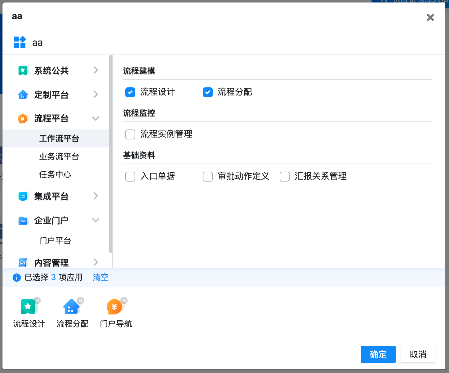
仅提供了功能多选组件 FuncsSelectorComponent (lib-funcs-selector) 。
虽然包含了模态框的 header、footer 按钮,但并不包含 modal 弹窗相关的功能(打开、关闭弹窗);可以用任何 modal 组件/服务库实现弹窗打开,然后订阅 FuncsSelectorComponent 的 confirm, cancel 事件来关闭弹窗。
使用
安装
npm i @gspwidget/funcs-selector引用 NgModule
import { FuncsSelectorComponent, FuncsSelectorModule } from 'projects/funcs-selector/src/public-api';

@NgModule({
  entryComponents: [
    FuncsSelectorComponent,
  ],
  imports: [
    FuncsSelectorModule,
  ],
 }
使用(拿 ngx-bootstrap/modal 举例)
// 用其他 modal 服务打开弹窗
const modalRef = this.modal.show(FuncsSelectorComponent, {
  initialState: {
    initSelectedFuncIds: ['WF0202', 'WF0203'],
    maxSelectedAmount: 8,
    title: 'aa'
  }
})
// 订阅确定、取消点击事件
modalRef.content.confirm.subscribe((selectedFuncs) => {
  console.log('User selected funcs: ' + selectedFucns)
  this.modal.hide()
})
modalRef.content.cancel.subscribe((selectedFuncs) => {
  this.modal.hide()
})
API
component FuncsSelectorComponent
| 属性 | 类型 | 说明 | 默认值 |
|---|---|---|---|
| @Input() title | string |
标题文字 | '功能选择' |
| @Input() maxSelectedAmount | `string[] | Observable<string[]>` | 最大能选菜单数量 |
| @Input() initSelectedFuncIds | number |
初始选中的功能 id 列表 | Infinity |
| 事件 | 输出类型 | 说明 |
|---|---|---|
| @Output() confirm | Func[] | 点确定按钮 |
| @Output() cancel | - | 点关闭按钮 |
interface Func
| 属性 | 类型 | 说明 |
|---|---|---|
| id | string |
id |
| name | string |
名称 |
| layer | string |
从1开始的层级 |
| parentId | string |
父级 id |