Overview
The @glue42/feedback-ui-react library enables you to create your own Feedback App for Glue42 Enterprise. The library allows complete customization of the Feedback Form. The provided default components can be replaced or extended with your custom ones.
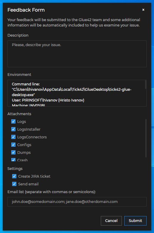
The default Glue42 Feedback Form:
Prerequisites
For a Glue42 Enterprise project, you must have Glue42 Enterprise 3.18 or later.
Install
To use the library in your project, execute the following command:
npm install @glue42/feedback-ui-reactConfiguration
To use your custom Feedback App built with the @glue42/feedback-ui-react library, modify (or add) the "form" property to the "issueReporting" top-level key in the system.json file of Glue42 Enterprise located in %LocalAppData%\Tick42\GlueDesktop\config. Set the "url" property of the "form" object to the URL of your custom Feedback App:
{
    "issueReporting": {
        "form": {
            "url": "http://localhost:3000"
        }
    }
}
The "form" object has the following properties:
| Property | Type | Description |
|---|---|---|
"url" |
string |
URL pointing to the location of the Feedback App. Defaults to "file://%GDDIR%/assets/issue-reporting/index.html". |
"width" |
number |
Width in pixels for the Feedback Form. |
"height" |
number |
Height in pixels for the Feedback Form. |
"showEnvironmentInfo" |
boolean |
If true, the Feedback Form will show a field with details about the Glue42 environment. |
For more available customizations of the Feedback App through configuration, see the Issue Reporting > Configuration documentation.
Usage
The @glue42/feedback-ui-react library enables you to create your own Feedback App for Glue42 Enterprise. The library provides hooks and default components which you can use to build your own Feedback App by using, modifying or replacing the available components and functionalities.
Hooks
The useIssueReportingContext() hook provides context information about the Feedback App, as well as methods for the default Feedback functionalities which you can use directly in your custom components:
const {
    close,
    config,
    onThemeChanged,
    openUrl,
    setBounds,
    submit,
    submitCompleted,
} = useIssueReportingContext();| Property | Type | Description |
|---|---|---|
close() |
function |
Closes the Feedback App. |
config |
object |
Object describing the configuration for the Feedback Form. |
onThemeChanged() |
(callback: (theme: string) => void) => void |
Method that can be used to track theme changes. The callback parameter is invoked every time the theme changes and receives as an argument the name of the new theme. |
openUrl() |
(url: string) => void |
Opens a URL in the default browser. Can be used to open the URL of the newly created Jira ticket after the issue report has been submitted. |
setBounds() |
(left: number, top: number, width: number, height: number) => void |
Sets the bounds of the Feedback Form. |
submit() |
function |
Submits an issue report. |
submitCompleted |
boolean |
Boolean flag indicating whether the issue report submit process has been completed. |
The config object has the following properties:
| Property | Type | Description |
|---|---|---|
allowEditRecipients |
boolean |
Flag indicating whether the user is allowed to manually add or remove email recipients. |
applicationTitle |
string |
Title of the Feedback App. |
attachments |
object[] |
Array of objects each with id, name and category properties describing the available attachments. |
attachmentsViewMode |
"file" | "category"
|
Describes how the attachments are displayed in the Feedback App. |
buildVersion |
string |
Platform build version as specified in the "build" top-level key of the system.json file of Glue42 Enterprise. |
createJiraTicket |
boolean |
Flag indicating whether a Jira ticket will be created when the issue report has been submitted. |
env |
string |
Platform environment as specified in the "env" top-level key of the system.json configuration file of Glue42 Enterprise. |
environmentInfo |
string |
Platform environment details. |
errorMessage |
string |
Error message sent by the platform. |
isError |
boolean |
Flag indicating whether the submitted feedback is about a platform error. |
mailingList |
string |
List of default email recipients. |
region |
string |
Platform region as specified in the "region" top-level key of the system.json configuration file of Glue42 Enterprise. |
selectedCategories |
string[] |
List of selected attachments or attachment categories. |
sendEmail |
boolean |
Flag indicating whether an email with the issue report will be sent to the specified recipients. |
showEnvironmentInfo |
boolean |
Flag indicating whether the Feedback App will show a field with environment details about the platform. |
theme |
string |
The name of the current theme. |
version |
string |
Platform version. |
Components
All default components can be reused and composed with custom code. If usage of such component has been detected, its default behavior will be applied. For instance, if you use the <SubmitButton /> component, it will automatically submit the issue report when the button is clicked, without the need of custom code to induce this behavior. If you pass the same component more than once, an error will be thrown.
To remove a component, pass a <Fragment /> component. If you want to use a default functionality (e.g., for closing the Feedback Form) in your custom components, use the useIssueReportingContext() hook to acquire it and pass it to your component.
In your custom Feedback App, you should place the <Feedback /> components in the <IssueReportingProvider /> component. This component is a React context provider component that provides feedback-related data and functionality accessible through the useIssueReportingContext() hook.
The following example demonstrates a basic usage of the library:
import React from "react";
import { IssueReportingProvider } from "@glue42/feedback-ui-react";
import CustomFeedback from "./CustomFeedback";
const App = () => {
return (
<IssueReportingProvider>
<CustomFeedback />
</IssueReportingProvider>
);
};
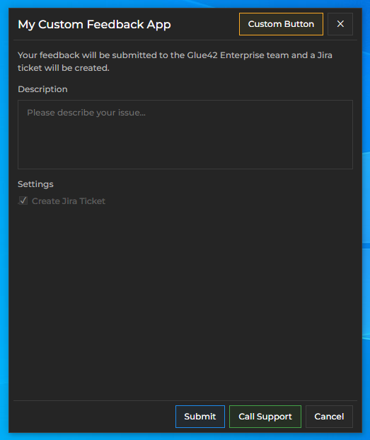
export default App;The <Header /> component holds the <Title /> and the <CloseButton /> button components. The following example demonstrates creating a header for the Feedback App with a custom title and an additional custom header button. The default <CloseButton /> component is used with its default functionality for closing the Feedback App:
import React from "react";
import {
    Title,
    CloseButton,
    ButtonGroup,
    useIssueReportingContext
} from "@glue42/feedback-ui-react";
import CustomButton from "./CustomButton";

// Custom header title.
const CustomTitle = () => {
    const { config } = useIssueReportingContext();
    const { applicationTitle } = config;
    const title = applicationTitle ? `My ${applicationTitle}` : "My Custom Feedback App";

    return <Title className="draggable" text={title} />;
};

// This component holds the header buttons.
const CustomHeaderButtons = () => {
    // Get the deafult funactionality for closing the Feedback App.
    const { close } = useIssueReportingContext();

    return (
        <ButtonGroup>
            <CustomButton />
            <CloseButton onClick={close} />
        </ButtonGroup>
    );
};

// Custom header for the Feedback App.
const CustomHeader = () => {
    return (
        <div>
            <CustomTitle />
            <CustomHeaderButtons />
        </div>
    );
};

export default CustomHeader;
To use the custom header for the Feedback App, pass it to the <Feedback /> component:
import React from "react";
import { Feedback, IssueReportingProvider } from "@glue42/feedback-ui-react";
import CustomHeader from "./CustomHeader";

const App = () => {
    return (
        <IssueReportingProvider>
            <Feedback
                components={{
                    Header: CustomHeader
                }}
            />
        </IssueReportingProvider>
    );
};

export default App;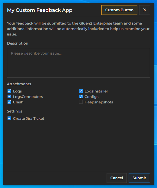
You can use the <Body /> component to create a body for the Feedback App containing the desired issue reporting options - e.g., issue description field, attachments, Jira ticket and email options. The @glue42/feedback-ui-react library provides various components to choose from when constructing the view of your custom form: <TextArea />, <Checkbox />, <Block />, <Input />, <Select /> and more.
The following example demonstrates creating a body for the Feedback App containing custom text informing the user what will happen when they click the "Submit" button, a text area for describing the issue, and a "Settings" section containing only a single restricted option for creating a Jira ticket:
import React from "react";
import {
    Block,
    Textarea,
    Checkbox,
    useIssueReportingContext
} from "@glue42/feedback-ui-react";

// Custom body for the Feedback App.
const CustomBody = ({ handleSubmit, submitting }) => {
    const { config } = useIssueReportingContext();
    const { buildVersion, createJiraTicket } = config;
    const customText = `Your feedback will be submitted to the ${buildVersion} team`
        + (createJiraTicket ? " and a Jira ticket will be created." : ".")

    // The body contains the custom text, a text area for describing the issue, and a "Settings" section.
    return (
        <div>
            <form onSubmit={event => handleSubmit(event)}>
                <Block text={customText} />

                <Block text="Description">
                    <Textarea disabled={submitting} />
                </Block>

                {createJiraTicket &&
                <Block text="Settings">
                    <Checkbox
                        disabled={true}
                        defaultChecked={createJiraTicket}
                        label="Create Jira Ticket"
                    />
                </Block>}
            </form>
        </div>
    );
};

export default CustomBody;
To use the custom body for the Feedback App, pass it to the <Feedback /> component:
import React from "react";
import { Feedback, IssueReportingProvider } from "@glue42/feedback-ui-react";
import CustomHeader from "./CustomFooter";
import CustomBody from "./CustomFooter";

const App = () => {
    return (
        <IssueReportingProvider>
            <Feedback
                components={{
                    Header: CustomHeader,
                    Body: CustomBody
                }}
            />
        </IssueReportingProvider>
    );
};

export default App;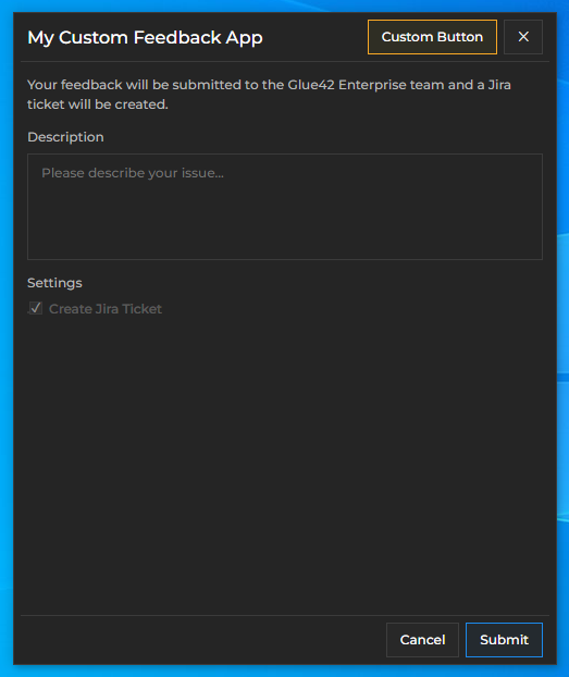
By default, the <Footer /> component holds the <FooterButtons /> component that renders conditionally either the <SubmitButton /> and the <CancelButton /> components, or a "Close" button based on whether submitting the issue report has been completed. During submission, the <Footer /> component renders the <Progress /> component showing the submission progress. When the submission is completed, the <Footer /> component renders an <Alert /> component showing the status of the submission, and if creating a Jira ticket has been enabled in the system configuration, a URL pointing to the created Jira ticket is also shown to the user.
The following example demonstrates adding a custom footer button:
import React from "react";
import {
    SubmitButton,
    CancelButton,
    ButtonGroup,
    useIssueReportingContext
} from "@glue42/feedback-ui-react";
import CallSupportButton from "./CallSupportButton";

// This component holds the footer buttons.
const CustomFooterButtons = () => {
    const { close } = useIssueReportingContext();

    return (
        <ButtonGroup>
            <SubmitButton form="feedback" type="submit" />
            <CallSupportButton />
            <CancelButton onClick={close} />
        </ButtonGroup>
    );
};

// Custom footer for the Feedback App.
const CustomFooter = () => {
    return (
        <div>
            <CustomFooterButtons />
        </div>
    );
};

export default CustomFooter;
To use the custom footer for the Feedback App, pass it to the <Feedback /> component:
import React from "react";
import { Feedback, IssueReportingProvider } from "@glue42/feedback-ui-react";
import CustomHeader from "./CustomFooter";
import CustomBody from "./CustomFooter";
import CustomFooter from "./CustomFooter";

const App = () => {
    return (
        <IssueReportingProvider>
            <Feedback
                components={{
                    Header: CustomHeader,
                    Body: CustomBody,
                    Footer: CustomFooter
                }}
            />
        </IssueReportingProvider>
    );
};

export default App;