React Calendar Timeline
A modern and responsive react timeline component.
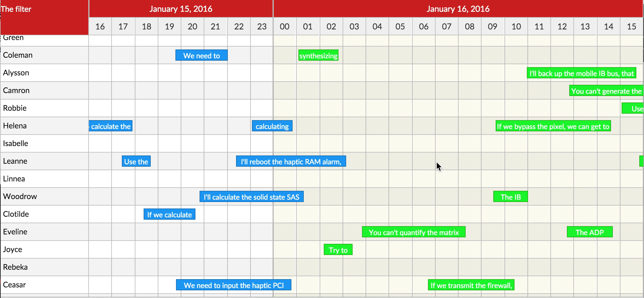
Demo here: http://namespace.ee/react-calendar-timeline/
Getting started
# via yarn
yarn add react-calendar-timeline

# via npm
npm install --save react-calendar-timeline
react-calendar-timeline has react, react-dom, moment and interact.js as peer dependencies.
You need to install them separately:
# via yarn
yarn add react react-dom # you probably already have these
yarn add moment interact.js

# via npm
npm install --save react react-dom # you probably already have these
npm install --save moment interact.js
Usage
At the very minimum:
import Timeline from 'react-calendar-timeline'
import moment from 'moment'

const groups = [
  {id: 1, title: 'group 1'},
  {id: 2, title: 'group 2'}
]

const items = [
  {id: 1, group: 1, title: 'item 1', start_time: moment(), end_time: moment().add(1, 'hour')},
  {id: 2, group: 2, title: 'item 2', start_time: moment().add(-0.5, 'hour'), end_time: moment().add(0.5, 'hour')},
  {id: 3, group: 1, title: 'item 3', start_time: moment().add(2, 'hour'), end_time: moment().add(3, 'hour')}
]

ReactDOM.render(
  <div>
    Rendered by react!
    <Timeline groups={groups}
              items={items}
              defaultTimeStart={moment().add(-12, 'hour')}
              defaultTimeEnd={moment().add(12, 'hour')}
              />
  </div>,
  document.getElementById('root')
);
API
NB! All props need to be immutable. For example, this means if you wish to change the title of one of your items, please pass in a whole new items array instead of changing the title in the old array. Here's more info.
The component can take many props:
groups
Expects either a vanilla JS array or an immutableJS array, consisting of objects with the following attributes:
{
  id: 1,
  title: 'group 1',
  rightTitle: 'title in the right sidebar'
}
If you use right sidebar, you can pass optional rightTitle property here.
items
Expects either a vanilla JS array or an immutableJS array, consisting of objects with the following attributes:
{
  id: 1,
  group: 1,
  title: 'Random title',
  start_time: 1457902922261,
  end_time: 1457902922261 + 86400000,
  canMove: true,
  canResize: false,
  canChangeGroup: false,
  className: 'weekend',
  itemProps: {
    // these optional attributes are passed to the root <div /> of each item as <div {...itemProps} />
    'data-custom-attribute': 'Random content',
    'aria-hidden': true,
    onDoubleClick: () => { console.log('You clicked double!') }
  }
}
The preferred (fastest) option is to give unix timestamps in milliseconds for start_time and end_time. Objects that convert to them (JavaScript Date or moment()) will also work, but will be a lot slower.
selected
An array with id's corresponding to id's in items (item.id). If this prop is set you have to manage the selected items yourself within the onItemSelect handler to update the property with new id's. This overwrites the default behaviour of selecting one item on click.
keys
An array specifying keys in the items and groups objects. Defaults to
{
  groupIdKey: 'id',
  groupTitleKey: 'title',
  groupRightTitleKey: 'rightTitle',
  itemIdKey: 'id',
  itemTitleKey: 'title',    // key for item div content
  itemDivTitleKey: 'title', // key for item div title (<div title="text"/>)
  itemGroupKey: 'group',
  itemTimeStartKey: 'start_time',
  itemTimeEndKey: 'end_time'
}
sidebarWidth
Width of the sidebar in pixels. If set to 0, the sidebar is not rendered. Defaults to 150.
sidebarContent
Everything passed here will be displayed above the left sidebar. Use this to display small filters or so. Defaults to null.
rightSidebarWidth
Width of the right sidebar in pixels. If set to 0, the right sidebar is not rendered. Defaults to 0.
rightSidebarContent
Everything passed here will be displayed above the right sidebar. Use this to display small filters or so. Defaults to null.
dragSnap
Snapping unit when dragging items. Defaults to 15 * 60 * 1000 or 15min. When so, the items will snap to 15min intervals when dragging.
minResizeWidth
The minimum width, in pixels, of a timeline entry when it's possible to resize. If not reached, you must zoom in to resize more. Default to 20.
fixedHeader
How does the header (the scrolling part with dates) behave if not all of the groups fit on the page, resulting in a vertical scrollbar.
-
fixed- the header is always fixed to its initial position -
sticky(default) - the header follows the scroll of the page to be always visible -
none- the header is always at the top of the component and doesn't stick with scrolling
stickyOffset
If fixedHeader is sticky, at what height from the top of the screen should we start floating it? This is useful if for example you already have
a sticky navbar. Defaults 0.
fullUpdate
If your calendar has large items compared to the zoom level (e.g. multi week events when viewing one day at a time), set this to true (default).
If you have many small events compared to the zoom level (e.g. hundreds of 30min events and viewing one week at a time), set this to false.
When set to true we update the dimensions of the items on every scroll event. This looks nicer, as 1) item labels
are always fully on the screen, even if the start or end of the items is off screen, 2) item stacking also reflects what's on the screen.
When set to false, we update the dimensions of the items only when the scrolling canvas updates. This makes scrolling much faster, but labels can go off screen.
lineHeight
Height of one line in the calendar in pixels. Default 30
headerLabelGroupHeight
Height of the top header line. Default 30
headerLabelHeight
Height of the bottom header line. Default 30
itemHeightRatio
What percentage of the height of the line is taken by the item? Default 0.65
minZoom
Smallest time the calendar can zoom to in milliseconds. Default 60 * 60 * 1000 (1 hour)
maxZoom
Largest time the calendar can zoom to in milliseconds. Default 5 * 365.24 * 86400 * 1000 (5 years)
clickTolerance
How many pixels we can drag the background for it to be counted as a click on the background. Defualt: 3
canMove
Can items be dragged around? Can be overridden in the items array. Defaults to true
canChangeGroup
Can items be moved between groups? Can be overridden in the items array. Defaults to true
canResize
Can items be resized? Can be overridden in the items array. Accepted values: false, "left", "right", "both". Defaults to "right". If you pass true, it will be treated as "right" to not break compatibility with versions 0.9 and below.
useResizeHandle
Append a special .rct-drag-right handle to the elements and only resize if dragged from there. Defaults to false
showCursorLine
Show a vertical line at the snap point when you mouse over the calendar
stackItems
Stack items under each other, so there is no visual overlap when times collide. Defaults to false.
traditionalZoom
Zoom in when scrolling the mouse up/down. Defaults to false
itemTouchSendsClick
Normally tapping (touching) an item selects it. If this is set to true, a tap will have the same effect, as selecting with the first click and then clicking again to open and send the onItemClick event. Defaults to false.
timeSteps
With what step to display different units. E.g. 15 for minute means only minutes 0, 15, 30 and 45 will be shown.
Default:
{
  second: 1,
  minute: 1,
  hour: 1,
  day: 1,
  month: 1,
  year: 1
}
onItemMove(itemId, dragTime, newGroupOrder)
Callback when an item is moved. Returns 1) the item's ID, 2) the new start time and 3) the index of the new group in the groups array.
onItemResize(itemId, time, edge)
Callback when an item is resized. Returns 1) the item's ID, 2) the new start or end time of the item 3) The edge that was dragged (left or right)
onItemSelect(itemId, e)
Called when an item is selected. This is sent on the first click on an item.
onItemClick(itemId, e)
Called when an item is clicked. Note: the item must be selected before it's clicked... except if it's a touch event and itemTouchSendsClick is enabled.
onItemDoubleClick(itemId, e)
Called when an item was double clicked
onItemContextMenu(itemId, e)
Called when the item is clicked by the right button of the mouse. Note: If this property is set the default context menu doesn't appear
onCanvasClick(groupId, time, e)
Called when an empty spot on the canvas was clicked. Get the group ID and the time as arguments. For example open a "new item" window after this.
onCanvasDoubleClick(groupId, time, e)
Called when an empty spot on the canvas was double clicked. Get the group ID and the time as arguments.
onCanvasContextMenu(group, time, e)
Called when the canvas is clicked by the right button of the mouse. Note: If this property is set the default context menu doesn't appear
moveResizeValidator(action, itemId, time, resizeEdge)
This function is called when an item is being moved or resized. It's up to this function to return a new version of change, when the proposed move would violate business logic.
The argument action is one of move or resize.
The argument resizeEdge is when resizing one of left or right.
The argument time describes the proposed new time for either the start time of the item (for move) or the start or end time (for resize).
The function must return a new unix timestamp in milliseconds... or just time if the proposed new time doesn't interfere with business logic.
For example, to prevent moving of items into the past, but to keep them at 15min intervals, use this code:
function (action, item, time, resizeEdge) {
  if (time < new Date().getTime()) {
    var newTime = Math.ceil(new Date().getTime() / (15*60*1000)) * (15*60*1000);
    return newTime;
  }

  return time
}
defaultTimeStart and defaultTimeEnd
Unless overridden by visibleTimeStart and visibleTimeEnd, specify where the calendar begins and where it ends. This parameter expects a Date or moment object.
visibleTimeStart and visibleTimeEnd
The exact viewport of the calendar. When these are specified, scrolling in the calendar must be orchestrated by the onTimeChange function. This parameter expects a unix timestamp in milliseconds.
headerLabelFormats and subHeaderLabelFormats
The formats passed to moment to render times in the header and subheader. Defaults to these:
import { defaultHeaderLabelFormats, defaultSubHeaderLabelFormats } from 'react-calendar-timeline'

defaultHeaderLabelFormats == {
  yearShort: 'YY',
  yearLong: 'YYYY',
  monthShort: 'MM/YY',
  monthMedium: 'MM/YYYY',
  monthMediumLong: 'MMM YYYY',
  monthLong: 'MMMM YYYY',
  dayShort: 'L',
  dayLong: 'dddd, LL',
  hourShort: 'HH',
  hourMedium: 'HH:00',
  hourMediumLong: 'L, HH:00',
  hourLong: 'dddd, LL, HH:00',
  time: 'LLL'
}

defaultSubHeaderLabelFormats == {
  yearShort: 'YY',
  yearLong: 'YYYY',
  monthShort: 'MM',
  monthMedium: 'MMM',
  monthLong: 'MMMM',
  dayShort: 'D',
  dayMedium: 'dd D',
  dayMediumLong: 'ddd, Do',
  dayLong: 'dddd, Do',
  hourShort: 'HH',
  hourLong: 'HH:00',
  minuteShort: 'mm',
  minuteLong: 'HH:mm'
}
For US time formats (AM/PM), use these:
import { defaultHeaderLabelFormats, defaultSubHeaderLabelFormats } from 'react-calendar-timeline'

const usHeaderLabelFormats = Object.assign({}, defaultSubHeaderLabelFormats, {
  hourShort: 'h A',
  hourMedium: 'h A',
  hourMediumLong: 'L, h A',
  hourLong: 'dddd, LL, h A',
})

const usSubHeaderLabelFormats = Object.assign({}, defaultSubHeaderLabelFormats, {
  hourShort: 'h A',
  hourLong: 'h A',
  minuteLong: 'h:mm A'
})
... and then pass these as headerLabelFormats and subHeaderLabelFormats
onTimeChange(visibleTimeStart, visibleTimeEnd, updateScrollCanvas)
A function that's called when the user tries to scroll. Call the passed updateScrollCanvas(start, end) with the updated visibleTimeStart and visibleTimeEnd (as unix timestamps in milliseconds) to change the scroll behavior, for example to limit scrolling.
Here is an example that limits the timeline to only show dates starting 6 months from now and ending in 6 months.
// this limits the timeline to -6 months ... +6 months
const minTime = moment().add(-6, 'months').valueOf()
const maxTime = moment().add(6, 'months').valueOf()

function (visibleTimeStart, visibleTimeEnd, updateScrollCanvas) {
  if (visibleTimeStart < minTime && visibleTimeEnd > maxTime) {
    updateScrollCanvas(minTime, maxTime)
  } else if (visibleTimeStart < minTime) {
    updateScrollCanvas(minTime, minTime + (visibleTimeEnd - visibleTimeStart))
  } else if (visibleTimeEnd > maxTime) {
    updateScrollCanvas(maxTime - (visibleTimeEnd - visibleTimeStart), maxTime)
  } else {
    updateScrollCanvas(visibleTimeStart, visibleTimeEnd)
  }
}
onTimeInit(visibleTimeStart, visibleTimeEnd)
Called when the calendar is first initialised. visibleTimeStart and visibleTimeEnd are unix timestamps in milliseconds.
onBoundsChange(canvasTimeStart, canvasTimeEnd)
Called when the bounds in the calendar's canvas change. Use it for example to load new data to display. (see "Behind the scenes" below). canvasTimeStart and canvasTimeEnd are unix timestamps in milliseconds.
itemRenderer
React component that will be used to render the item content. Will be
passed the item as a prop. Using complex components may result in
performance problems.
let items = [
  {
    id: 1,
    group: 1,
    title: 'Title',
    tip: 'additional information',
    ...
  }
]

itemRenderer = ({ item }) => {
  return (
    <div className='custom-item'>
      <span className='title'>{item.title}</span>
      <p className='tip'>{item.tip}</p>
    </div>
  )
}
groupRenderer
React component that will be used to render the content of groups in the
sidebar. Will be passed the group and isRightSidebar as props.
let groups = [
  {
    id: 1,
    title: 'Title',
    tip: 'additional information'
  }
]

groupRenderer = ({ group }) => {
  return (
    <div className='custom-group'>
      <span className='title'>{group.title}</span>
      <p className='tip'>{group.tip}</p>
    </div>
  )
}
resizeDetector
The component automatically detects when the window has been resized. Optionally you can also detect when the component's DOM element has been resized.
To do this, pass a resizeDetector. Since bundling it by default would add ~18kb of minimized JS, you need to opt in to this like so:
import containerResizeDetector from 'react-calendar-timeline/lib/resize-detector/container'

<Timeline resizeDetector={containerResizeDetector} ... />
children (plugins)
If you give the component any children, they will be passed some extra props. Use this to render anything on the timeline (custom backgrounds, arrows, etc).
See the plugins demo (code) for an example.
NOTE! This API is still experimental and will change in the next versions, as we move toward unifying the internal and external APIs. Keep an eye out for the changelog!
The children gets passed the following props:
-
canvasTimeStart,canvasTimeEnd- start and end of the scrolling canvas in Unix timestamps -
canvasWidth- width of the scrolling canvas in pixels -
visibleTimeStart,visibleTimeEnd- start and end of the currently visible area -
groups,items,keys- groups, items and keys as passed to the timeline -
height,headerHeight- height of the entire calendar (includesheaderHeight) or just the header -
groupHeights,groupTops- arrays of heights and tops for the groups -
dimensionItems- an array of objects{ id, dimensions: {...} }describing positions of all the items -
selected- an array of selected items -
timeSteps- steps for displaying time
FAQ
How can I have items with different colors?
Items have a "className" parameter. For example if you have "standard" items and "analysis" items, then you can just add an "analysis" class for your analysis items and then change the css backgroundColor property for them.
You will then need to override the default CSS rule:
.react-calendar-timeline .rct-items .rct-item.analysis {
  backgroundColor: #68efad;
}
How can I add one more sidebar on the right?
The library supports right sidebar.

To use it, you need to add two props to the <Timeline /> component:
rightSidebarWidth={150}
rightSidebarContent={<p>Second filter</p>}
And add right_sidebar prop to the groups objects:
{
  id: 1,
  title: 'group 1',
  right_sidebar: 'additional info about group 1'
}
I'm using Babel with Rollup or Webpack 2+ and I'm getting strange bugs with click events
These module bundlers don't use the transpiled (ES5) code of this module. They load the original ES2015+ source. Thus your babel configuration needs to match ours. We recommend adding the stage-0 preset to your .babelrc to make sure everything works as intended.
If that's too experimental, then the minimum you need is to add is the transform-class-properties plugin that's in stage-2 and possibly the transform-object-rest-spread plugin from stage-3. However in this case it's easier to make sure you have at least stage-2 enabled.
See issue 51 for more details.
Alternatively you may import the transpiled version of the timeline like this:
// import Timeline from 'react-calendar-timeline'  // ESnext version
import Timeline from 'react-calendar-timeline/lib' // ES5 version
However doing so you lose on some of the features of webpack 2 and will potentially get a slightly larger bundle.
It doesn't work with create-react-app
It's the same issue as above. See issue 134 for details and options.
What are the zIndex values for all the elements?
This is useful when using the plugins (that you pass as children to the component). Override the CSS to change:
- Horizontal Lines: 30
- Vertical Lines: 40
- Today line: 50
- Cursor line: 51
- Items: 80-88 (depending on selection, dragging, etc)
- Header: 90
Behind the scenes
The timeline is built with speed, usability and extensibility in mind.
Speed: The calendar itself is actually a 3x wide scrolling canvas of the screen. All scroll events left and right happen naturally, like scrolling any website. When the timeline has scrolled enough (50% of the invisible surface on one side), we change the "position:absolute;left:{num}px;" variables of each of the visible items and scroll the canvas back. When this happens, the onBoundsChange prop is called.
This results in a visually endless scrolling canvas with optimal performance.
Extensibility and usability: While some parameters (onTimeChange, moveResizeValidator) might be hard to configure, these are design decisions to make it as extensible as possible. If you have recipes for common tasks regarding those parameters, send a PR to add them to this doc.
Interaction
To interact and navigate within the timeline there are the following options for the user:
shift + mousewheel = move timeline left/right
alt + mousewheel = zoom in/out
ctrl + mousewheel = zoom in/out 10× faster
meta + mousewheel = zoom in/out 3x faster (win or cmd + mousewheel)
Plus there is a handling for pinch-in and pinch-out zoom gestures (two touch points).
The pinch gesture on a trackpad (not a touch device) works in Chrome and Firefox (v55+) because these browsers map the gesture to ctrl + mousewheel.
Contribute
If you like to improve React Calendar Timeline fork the repo and get started by running the following:
$ git clone https://github.com/namespace-ee/react-calendar-timeline.git react-calendar-timeline
$ cd react-calendar-timeline
$ npm install
$ npm start
Check http://0.0.0.0:8080/ in your browser and have fun!
Please run npm run lint before you send a pull request. npm run jest runs the tests.