
Extended Select component for Angular Material
Extended Select component, with searchbox and multi-line items, based on Angular Material
Demo code
·
Demo
·
Stackblitz demo (with code)
·
Report Bug / Request Feature
Table of Contents
About The Project
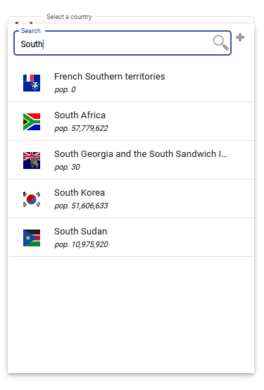
This is an extended Select component, offering the following features not available in the standard Angular Material mat-select component. Note that this component currently only offers a single-select model.
- Optional searchbox, with the drop down list being searched in either a filter or a find mode.
- Multi-line select items, with icons and individual line formatting.
- Virtual scrolling to more efficiently manage large drop-down lists.
A number of options are available to customize how the component appears and behaves (see API description below).
Getting Started
Prerequisites
This library requires that the host project is running Angular 13+.
As well as the standard Angular packages that are automatically installed, please ensure that your project also has the following optional Angular packages correctly installed.
- @angular/forms
- @angular/material
- @angular/cdk
In addition the following package(s) will be automatically installed if not already available.
- @fgrid-ngx/mde
- @fgrid-ngx/mat-searchbox
Installation
- Install NPM package
npm install @fgrid-ngx/mat-ext-select
- If you wish to clone the project
git clone https://github.com/plongrigg/ext-select.git
Usage
-
Import the module as follows:
import  {  CommonModule  }  from  '@angular/common';
import  {  NgModule  }  from  '@angular/core';
import  {  BrowserModule  }  from  '@angular/platform-browser';
import  {  BrowserAnimationsModule  }  from  '@angular/platform-browser/animations';
import  {  NgxMatExtSelectModule  }  from  '@fgrid-ngx/mat-ext-select';
import  {  AppComponent  }  from  './app.component';

@NgModule({
declarations: [AppComponent],
imports: [
  CommonModule,
  BrowserModule,
  BrowserAnimationsModule,
  NgxMatExtSelectModule,
],
bootstrap: [AppComponent]
})
export  class  AppModule  {  }
-
To include the component in a template, use the ngx-mat-ext-select tag.
<ngx-mat-ext-select
  [selectItems]="selectItems"
  (itemSelected)="itemSelected($event)">
</ngx-mat-ext-select>
There are a number of inputs which can be used to control the behavior and appearance of the component. At a minimum, supply an input for the list of items to be selected. The select data supplied is in the form of a SelectItems type. Please refer to the exported definition of this type. If not defined as a control within an Angular form, also supply a function to respond to the results of a selection change. The (itemSelected) output function passes a SelectedItem type in its parameter, which can then be used to perform the required action for a selection change. This component also implements the ControlValueAccessor interface, which means it can be defined as a control in an Angular form (reactive or template). If defined as a FormControl within a reactive Angular form, the selected value change can be obtained by subscribing to the valueChanges observable of the FormGroup or FormControl, rather then relying on the (itemSelected) emission.
API
| @Input | Default value(s) | Description |
|---|---|---|
| selectItems | empty Map | SelectItems type, which defines the select items. It is a Map with signature Map<string | number, SelectItem>. The key is a unique identifier per select item, and the value is a SelectItem type which defined the content of the select item to be displayed. |
| selectPlaceholder | 'Select item' | The placeholder in the field and for the floating label above the field. |
| selectItemHeight | 55 | The total fixed height in pixels of each select item. The default approximates a reasonable value for a two-line display. |
| selectFieldWidth | 350 | The width in pixels of the field displaying the selection. |
| selectDDWidth | 350 | The width of the drop-down panel. If not defined it equals the width of the selection field. |
| selectNoItemsVisible | 5 | The number of items that will be visible in the scrolling drop-down panel (if item count exceeds this value) |
| selectDisplayIconInField | true | If there are icons associated with the select items, this determines whether the icon is also displayed in the select field. |
| selectDisabled | false | Determines whether the component is disabled. If there are no select items specified, it will be automatically disabled. Note that this is not effective if the component is part of a FormGroup, in which case the disable() and enable() methods on the FormControl representing the component should be utilized for this purpose. |
| selectedItem | undefined | Determines the currently selected item. This is useful for either setting the initial selected item, or for dynamically setting the selected item from outside the component. If this is not set, the initially selected item is determined by looking for an item in the supplied data with the selected field set to true, or alternatively it initially selects the first item in the select data. |
| selectFieldAppearance | outline | These correspond to the Angular Material appearances, 'outline', 'standard', 'fill' or 'legacy'. When used with Angular Material 15+, only 'fill' and 'outline' appearances are available. |
| selectFieldSize | small | Options are 'small' or 'default'. If 'small' then the field has a font of 9pt and the margins, padding etc. are reduced so that the field can comfortably fit on a toolbar. If default, will use the standard sizing mechanism for Material components, where the font size is basically inherited from the parent component, and the margins, padding etc. are calculated accordingly. |
| selectDDOffsetY | selectFieldSize = 'small' 15 else 20 | Determines the vertical offset of the drop-down panel relative to the top of the select field |
| selectDDOffsetX | 0 | Determines the horizontal offset of the drop-down panel relative to the left of the select field |
| selectVirtualScroll | true | Determines if virtual scrolling should be used for list. Virtual scrolling is more efficient in terms of DOM usage for large lists, but scrolling might not be as smooth for smaller lists - repainting is slower. |
| selectPropogateBackdropClick | false | When the dropdown list closes in response to a click outside the component, determines whether to propogate the click to an underlying component. If set to true, a single click both closes the dropdown and operates on the component on which the click occurs. If set to false, a second click is needed on the underlying component. |
| selectSearch | true | Determines whether the searchbox is included on the drop-down panel. |
| searchExtended | true | Determines if options for extended search are available i.e. startsWith, caseSensitive and range. |
| searchExtendedPopupDelay | 1000 | Panel to enter extended search parameters opens on hovering over extended (+) button. This determines how long the delay is in milliseconds prior to the panel appearing. |
| searchExcludeChars | [ ] | Strip these characters out of the target values prior to comparing to search string. |
| searchTerms | object with key/values representing standard terms | Can be used to localize / translate the terms used in the searchbox UI. This is an object with key value pairs. Valid keys are SEARCH_PLACEHOLDER, SEARCH_RANGE_PLACEHOLDER, SEARCH_STARTS_WITH, SEARCH_STARTS_WITH_TOOLTIP, SEARCH_CASE_SENSITIVE, SEARCH_CASE_SENSITIVE_TOOLTIP, SEARCH_FROM, SEARCH_TO, SEARCH_RANGE_LOWER, SEARCH_RANGE_UPPER, SEARCH_RANGE. So for example if you wished to override the search placeholder the supplied object would be as follows {SEARCH_PLACEHOLDER, 'your term'}. The object may contain as many valid key / value pairs as required to be translated / localized. |
| searchContinuous | true | Determines if search occurs on each key stroke (throttled by searchDebounceMS) or whether the search only occurs when the search icon button is clicked. |
| searchMultiple | false | Determine if the search looks for first match and then on each click of the search icon button looks for next match, or whether all occurrences are searched for in each search request (=true). If false, only one (or none) SearchResult will be reported via the searchResults @Output, otherwise there could be multiple matched results in an array. Always set to true of searchFilter = true |
| searchFilter | false | If set to true, will only show items which match the search criteria in the drop-down panel. If set to false, will instead highlight the matched items with a red border, and scroll to the first matched item |
| searchNextRow | true | When searching for next match, skip other matched entries in cells on same row. This is only applicable if searchMultiple = false. |
| searchDebounceMS | 200 | When doing continuous searches, the debounce time in milliseconds to be applied to key stokes. |
| searchCaseSensitive | false | Determines if searches are case sensitive by default. |
| searchStartsWith | false | Determines if search string is to be identified only at the start of the searched value, otherwise it can occur anywhere in the value. |
| searchData | [ ] | SearchData type, supplying the datasource for the search. This can be dynamically changed e.g. by connecting the input to an Observable. If searchData is not independently supplied, it is automatically built from the value / label text extracted from the select items. |
| @Output | Description |
|---|---|
| itemSelected | Emits details of select item as a SelectedItem type. |
Known issues
The initial drop-down action in Firefox shows a slight delay compared to other browsers.
License
Distributed under the MIT License. See LICENSE for more information.
Contact
Peter C. Longrigg: plongrigg@gmail.com
Project Link: https://github.com/plongrigg/ext-select