
@farfarawaylabs/react-native-beautiful-ui
Beauitful UI for React Native projects
Installation
npm install @farfarawaylabs/react-native-beautiful-uiYou should also install react-native-elements (https://react-native-elements.github.io/)
If you plan on using the screen component, you should also install react-native-safe-area-context library (https://github.com/th3rdwave/react-native-safe-area-context) for better safe area handling (recommended anyways).
This package is also using our own Layout package which you can find here: https://github.com/farfarawaylabs/react-native-easy-flex
Example
Under the exampel folder you will find a project you can run on your phone or simulator. The file App.tsx has one function for each component. Simply call it to showcase a demo of that component.
Components in this library:
- Overlay
- Rounded Button
- Social Buttons
- IconButton and ImageButton
- Spinner
- BackgroundImageView
- Screen
- AnimatedListItem
- Typography
- Carousel
Overlay
This control allows you to show an overlay above all other UI on the screen. It blurs the contents of the screen and uses simple animation to show the overlay.
You can control all of this with the following props:
-
appearAnimationDuration: The duration it takes the overlay to fully appear in milliseconds.
-
disappearAnimationDuration: The duration it takes the overlay to fully disappear in milliseconds.
-
blurAmount: The strength of the bulr effect
-
blurType: The type of blur to use

import React, { useState } from 'react';
import { Overlay } from '@farfarawaylabs/react-native-beautiful-ui';
import { Button, Text } from 'react-native';

export default function App() {
  const [visible, setVisible] = useState(false);
  return (<>
    <Button
          title="Show Overlay"
          onPress={() => {
            setVisible(true);
          }}
        />
    <Overlay visible={visible} blurAmount={8}>
          <Text>Just a random text</Text>
          <Button
            title="Hide Overlay"
            onPress={() => {
              setVisible(false);
            }}
          />
        </Center>
      </Overlay>
    </>);
}
RoundedButton
Simple big roudned buttons allowing you to easily customize them. Main props:
-
Title: The button title
-
effectType: Choose if the effect the button will use: opacity, highlite or will default to native implementaion
-
width: The width of the button
-
Height: The height of the button
-
backgroundColor: The color of the button
-
textColor: The color of the title of the button
-
textStyle: Additional styles to add to the title of the button
-
style: Allowing you to add or override the button style

import React, { useState } from 'react';
import { Button } from '@farfarawaylabs/react-native-beautiful-ui';
import { View } from 'react-native';

export default function App() {
  return (
    <View style={{ marginTop: 200, alignItems: 'center' }}>
      <RoundedButton
        backgroundColor="#ffd8a6"
        title="This is a button"
        width={300}
        effectType={ButtonEffectType.Opacity}
        textColor="#ff427f"
        onPress={() => {}}
      />
    </View>
  );
}
Social Buttons
These components are basically pre-styled buttons for login actions using different social platforms. The buttons don't include any actual login functionality at the momemnt.

import React, { useState } from 'react';
import {
  FacebookLoginButton,
  GoogleLoginButton,
} from '@farfarawaylabs/react-native-beautiful-ui';

import { View } from 'react-native';

export default function App() {
  const demoBgImage = require('../demoImages/demoBG.jpg');
  return (
    <>
      <Center horizontal vertical>
        <FacebookLoginButton onPress={() => {}} />
        <GoogleLoginButton onPress={() => {}} />
      </Center>
    </>
  );
}
IconButton and ImageButton
import React, { useState } from 'react';
import {
  IconButton,
  ImageButton,
} from '@farfarawaylabs/react-native-beautiful-ui';

import { View } from 'react-native';

export default function App() {
  const demoBgImage = require('../demoImages/demoBG.jpg');
  return (
    <Center horizontal vertical>
      <IconButton
        type="material"
        name="bookmark-border"
        size={32}
        color="red"
        effectType={ButtonEffectType.Opacity}
        onPress={() => {}}
      />
    </Center>
  );
}
Simple wrapper compoenents to display an image or icon based buttons.
Spinner
Very simple component to display a simple spinner in the middle of the screen and on top of any other UI
Props:
-
isVisible: Show or hide the spinner. Defaults to true
-
color: The color of the spinner
-
size: The size of the spinner. Defaults to 'small'
import React from 'react';
import { Screen, Spinner } from '@farfarawaylabs/react-native-beautiful-ui';

export default function App() {
  return (
    <Screen name="demo_screen">
      <Spinner size="large" color="pink" />
    </Screen>
  );
}
BackgroundImageView
This is just a simple wrapper around React Native ImageBackground giving it the required style in order to dispay an image across the all background.
Screen
The Screen component encapsulate some common functionality that most screens needs like supporting for an image as a background, using safe areas and reporting onFocus (can be used to report a screen viwe for analytics services)
Props:
-
name: An easy to understand name that can be used later when reporting events to analytics services
-
shouldUseSafeArea: Should the screen use safe area to avoid UI over notches
-
backgroundImage: Image to be used as a background for the screen
-
backgroundColor: Color to be used as a background of the screen
-
onFocus: Event handler to be called when screen gets into focus. Can be used to report a screen view event to analytics services. Works just if you are using React Navigation library.
-
style: Any additional style you want to use to add to or override the default style
AnimatedListItem
In many apps you will find yourself adding and removing items from a FlatList component. Use AnimatedListItem to wrap your own items and provide your list with nice add and remove animations for each item. When you remove an item, the rest of the items in the list will arrange themselves using animation instead of just "jumping" up.
Run the following code example to see the animations in action:
import React, { useState } from 'react';
import { AnimatedListItem } from '@farfarawaylabs/react-native-beautiful-ui';
import { View, Button, FlatList } from 'react-native';

export default function App() {
  const [indexToRemove, setIndexToRemove] = useState(-1);
  const [items, setItems] = useState(['joe', 'moe', 'merry', 'buck']);

  return (
      <Button
        title="Add Item"
        onPress={() => {
          setItems([...items, 'new item']);
          console.log(items);
        }}
      />
      <FlatList
        data={items}
        renderItem={({ item, index }) => (
          <AnimatedListItem
            isRemoved={index === indexToRemove}
            onRemoveAnimationEnded={() => {
              const newItems = items.splice(index, 1);
              setItems(newItems);
            }}
          >
            <TouchableOpacity
              style={{
                height: 50,
                width: 200,
                marginBottom: 20,
                borderWidth: 1,
              }}
              onPress={() => setIndexToRemove(index)}
            >
              <Text>{item}</Text>
            </TouchableOpacity>
          </AnimatedListItem>
        )}
        keyExtractor={(item) => item}
      />
  );
}
Typography
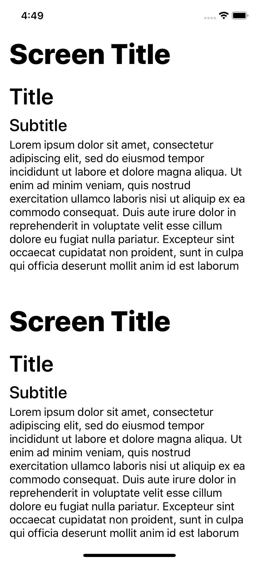
Sensible typography components and styles which are responsive related to the screen height. If you see the screenshots following this text you can notice that although they were taken on the iPhoneX and iPhone SE whcih is a lot shorter, all the text went into the screen on both devices.
See code example for two ways you can use these in your apps: Directly through styles or through compoenets that basically wrap the React Native Text compoenent and apply these styles to it.
Note that as for React Native 0.62 there is a bug on Android that allow just for one type of bold strength to be set on text which is why both the screen title and the title has the same amount of bold on Android but different on iOS.

import React, { useState } from 'react';
import { Typography, Styles } from '@farfarawaylabs/react-native-beautiful-ui';
import { View, Text } from 'react-native';

export default function App() {
  const demoBgImage = require('../demoImages/demoBG.jpg');
  return (
    <Screen>
      <Row>
        <Col>
          <View style={Styles.MainTheme.screenHeader}>
            <Text style={Styles.MainTheme.screenTitle}>Screen Title</Text>
          </View>
          <View style={Styles.MainTheme.defaultScreenHorizontalMargin}>
            <Text style={Styles.MainTheme.title}>Title</Text>
            <Text style={Styles.MainTheme.subTitle}>Subtitle</Text>
            <Text style={Styles.MainTheme.paragraph}>
              Lorem ipsum dolor sit amet, consectetur adipiscing elit, sed do
              eiusmod tempor incididunt ut labore et dolore magna aliqua. Ut
              enim ad minim veniam, quis nostrud exercitation ullamco laboris
              nisi ut aliquip ex ea commodo consequat. Duis aute irure dolor in
              reprehenderit in voluptate velit esse cillum dolore eu fugiat
              nulla pariatur. Excepteur sint occaecat cupidatat non proident,
              sunt in culpa qui officia deserunt mollit anim id est laborum
            </Text>
          </View>
        </Col>
      </Row>
      <Row>
        <Col>
          <View style={Styles.MainTheme.screenHeader}>
            <Typography.ScreenTitle>Screen Title</Typography.ScreenTitle>
          </View>
          <View style={Styles.MainTheme.defaultScreenHorizontalMargin}>
            <Typography.Title>Title</Typography.Title>
            <Typography.Subtitle>Subtitle</Typography.Subtitle>
            <Typography.Paragraph>
              Lorem ipsum dolor sit amet, consectetur adipiscing elit, sed do
              eiusmod tempor incididunt ut labore et dolore magna aliqua. Ut
              enim ad minim veniam, quis nostrud exercitation ullamco laboris
              nisi ut aliquip ex ea commodo consequat. Duis aute irure dolor in
              reprehenderit in voluptate velit esse cillum dolore eu fugiat
              nulla pariatur. Excepteur sint occaecat cupidatat non proident,
              sunt in culpa qui officia deserunt mollit anim id est laborum
            </Typography.Paragraph>
          </View>
        </Col>
      </Row>
    </Screen>
  );
}
Carousel
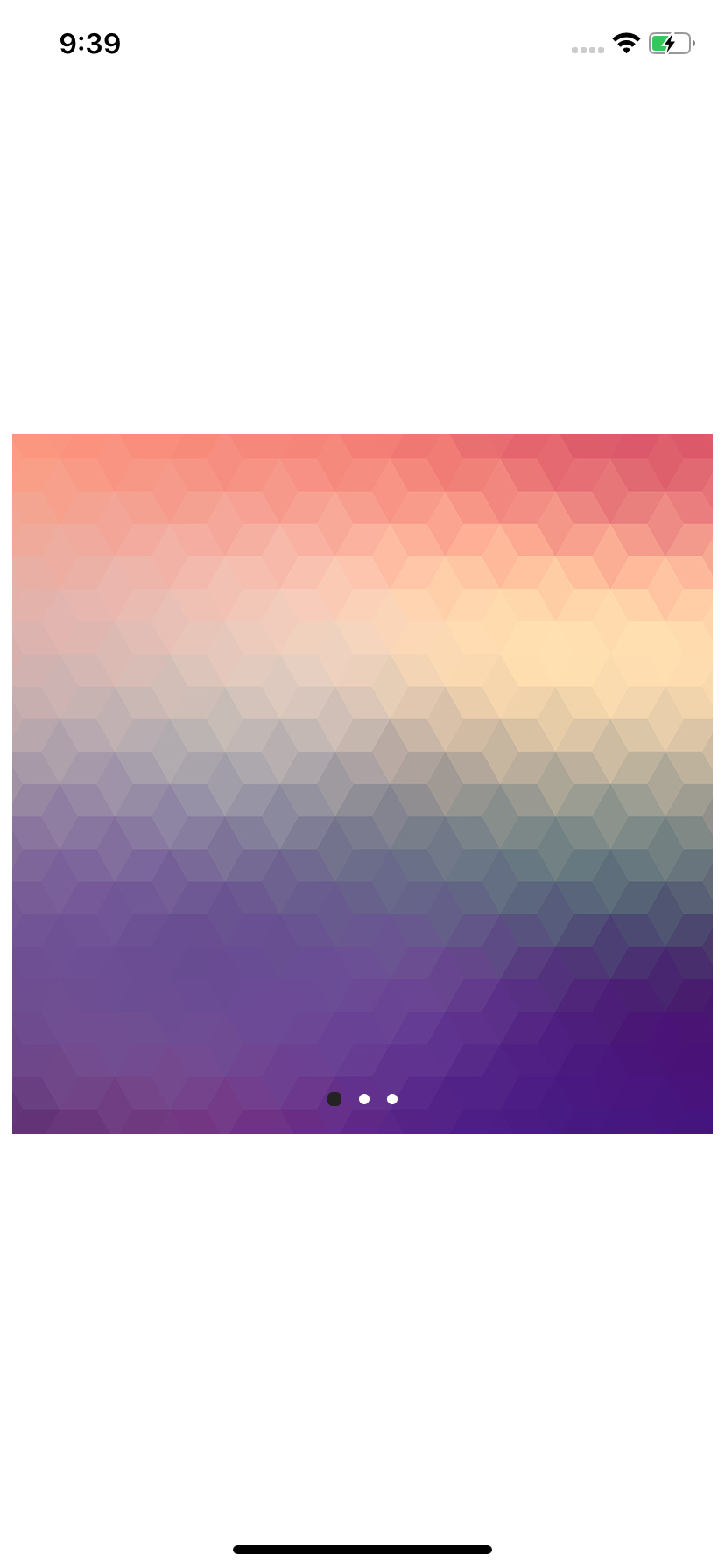
Use this component to show simple Carousel. Set the width and height to display full screen slideshows or in page carousel style display. The Carousel can take any views (including Image) as slides. The Carousel is built using compound component pattern so for example if you don't want to display the navigation dots on the bottom, you can simply emit them or replace them with your own implementation.
Props of Carousel.Container
-
width: The width of the carousel. This will also set the width for each of the child views
-
hegiht: The height of the carousel. This will also set the height for each of the child views
-
selectedSlide: The index of the slide to show in the Carousel (zero based). Defaults to 0
Props of Carousel.Slides
- onSelectedSlideChanged: event handler to be called when the selected slide changes
Props of Caousel.Navigation
-
dotColor: The color of a dot represnting a slide. Defaults to '#FFF'
-
activeDotColor: The color of the active dot. Defaults to '#232323'
-
onDone: Event handler to call when the done button is pressed
-
doneButtonTitle: The title of the done button. Defaults to 'Done'
-
shouldShowDoneButtonOnAllSlides: Should the done button be showed on all slides or just on the last one. Defaults to false
-
doneButton: Provide your own custom done button component
import React, { useState } from 'react';
import { Carousel } from '@farfarawaylabs/react-native-beautiful-ui';
import { Image } from 'react-native';

export default function App() {
  const demoBgImage = require('../demoImages/demoBG.jpg');
  return (
    <Center horizontal vertical>
      <Carousel.Container width={400} height={400}>
        <Carousel.Slides>
          <Image source={demoBgImage} />
          <Image source={demoBgImage} />
          <Image source={demoBgImage} />
        </Carousel.Slides>
        <Carousel.Navigation />
      </Carousel.Container>
    </Center>
  );
}
Contributing
See the contributing guide to learn how to contribute to the repository and the development workflow.
License
MIT