
SwitchToggle


Simple switch toggle component for react-native. This component supports horizontal switch toggle with animation with several options like start/end background colors, start/end circle colors, and duration for animation.
Props
| necessary | types | default | |
|---|---|---|---|
| switchOn | ✓ | boolean | false |
| onPress | ✓ | func | () => {} |
| containerStyle | ViewStyle | { width: 72, height: 36, borderRadius: 18 ... } | |
| circleStyle | ViewStyle | { width: 30, height: 30, borderRadius: 15 ... } | |
| backgroundColorOn | string | 'rgb(227,227,227)' | |
| backgroundColorOff | string | 'rgb(215,215,215)' | |
| circleColorOn | string | 'white' | |
| circleColorOff | string | 'rgb(102,134,205)' | |
| duration | number | 300 | |
| type | number | 0 - Normal switch, 1 - Switch with a text | |
| buttonText | string | Text on-top of the button | |
| backTextRight | string | Text to appear in right side when button toggled to left | |
| backTextLeft | string | Text to appear in left side when button toggled to right | |
| buttonTextStyle | StyleProp<TextStyle> |
Styles for text on the button | |
| textRightStyle | StyleProp<TextStyle> |
Styles for text in right | |
| textLeftStyle | StyleProp<TextStyle> |
Styles for text in left | |
| buttonStyle | StyleProp<ViewStyle> |
Styles for the button | |
| buttonContainerStyle | StyleProp<ViewStyle> |
Styles for button container | |
| rightContainerStyle | StyleProp<ViewStyle> |
Styles for right text container | |
| leftContainerStyle | StyleProp<ViewStyle> |
Styles for left text container |
Installation
yarn add @dooboo-ui/nativeor
yarn add @dooboo-ui/native-switch-toggleUsage
import React, { ReactElement, useState } from 'react';
import { SwitchToggle } from '@dooboo-ui/native';
// or
import SwitchToggle from '@dooboo-ui/native-switch-toggle';
import styled from 'styled-components/native';
const Container = styled.View`
flex: 1;
background-color: #f5fcff;
flex-direction: column;
align-items: center;
justify-content: center;
`;
function Page(): ReactElement {
const [switchOn1, setSwitchOn1] = useState(false);
const [switchOn2, setSwitchOn2] = useState(false);
const [switchOn3, setSwitchOn3] = useState(false);
const [switchOn4, setSwitchOn4] = useState(false);
return (
<Container>
<SwitchToggle
switchOn={switchOn1}
onPress={(): void => setSwitchOn1(!switchOn1)}
/>
<SwitchToggle
containerStyle={{
marginTop: 16,
width: 108,
height: 48,
borderRadius: 25,
backgroundColor: '#ccc',
padding: 5,
}}
circleStyle={{
width: 38,
height: 38,
borderRadius: 19,
backgroundColor: 'white', // rgb(102,134,205)
}}
switchOn={switchOn2}
onPress={(): void => setSwitchOn2(!switchOn2)}
circleColorOff="white"
circleColorOn="red"
duration={500}
/>
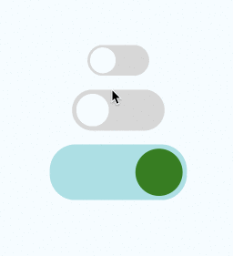
<SwitchToggle
containerStyle={{
marginTop: 16,
width: 160,
height: 65,
borderRadius: 30,
padding: 5,
}}
backgroundColorOn="#a0e1e5"
backgroundColorOff="#e5e1e0"
circleStyle={{
width: 55,
height: 55,
borderRadius: 27.5,
backgroundColor: 'blue', // rgb(102,134,205)
}}
switchOn={switchOn3}
onPress={(): void => setSwitchOn3(!switchOn3)}
circleColorOff="#ff11ff"
circleColorOn="green"
duration={500}
/>
<SwitchToggle
buttonText={switchOn4 ? 'Hour' : 'Day'}
backTextRight={switchOn4 ? '' : 'Hour'}
backTextLeft={switchOn4 ? 'Day' : ''}
type={1}
buttonStyle={{
alignItems: 'center',
justifyContent: 'center',
position: 'absolute',
}}
rightContainerStyle={{
flex: 1,
alignItems: 'center',
justifyContent: 'center',
}}
leftContainerStyle={{
flex: 1,
alignItems: 'center',
justifyContent: 'flex-start',
}}
buttonTextStyle={{ fontSize: 20 }}
textRightStyle={{ fontSize: 20 }}
textLeftStyle={{ fontSize: 20 }}
containerStyle={{
marginTop: 16,
width: 160,
height: 65,
borderRadius: 30,
padding: 5,
}}
backgroundColorOn="#fff"
backgroundColorOff="#fff"
circleStyle={{
width: 80,
height: 55,
borderRadius: 27.5,
backgroundColor: 'blue', // rgb(102,134,205)
}}
switchOn={switchOn4}
onPress={(): void => setSwitchOn4(!switchOn4)}
circleColorOff="#e5e1e0"
circleColorOn="#e5e1e0"
duration={500}
/>
</Container>
);
}
export default Page;