Desinax Vertical Grid (LESS)
LESS module implementing a semantic, fluid and responsive vertical grid with options for max width.
The grid is meant to be applied using mixins, without fixed grid classes applied to the html. But those who prefer fixed css-classes, like .column-3, can adapt the grid and add style with that type of classes.
The basics for the grid is to wrap columns in rows and apply a max-width for each row.
This is how a testpage can look like when using the grid.
Table of content
- Documentation online
- Install
- About grid.less
- Configure grid.less
- Using grid.less
- More examples on usage
- History
- License
Documentation online
You can read this README and try out the example files htdocs/*.html by using GitHub Pages.
Viewing this documentation on GitHub Pages makes it easier to both read this documentation and try out the examples on the same time.
Install
You can install using npm to take advantage of version management. Semantic versioning is used to label the various versions.
npm install @desinax/vertical-grid
Or clone this repo and use it as is.
About grid.less
The actual grid is in src/less/grid.less.
Use it by importing it into your own stylesheet, adapt the path to your own environment.
/**
 * Import the vertical grid.
 */
@import "less/grid.less";
Configure grid.less
You can choose between a flex and a float implementation of the grid.
You can set up the grid width of the columns, the gutter and the number of columns.
The following are the same as the defaults which you can override to fit your own environment and liking.
/**
 * Import the vertical grid.
 */
@import "less/grid.less";

// Default grid, change to fit your requirements.
@columnWidth:   30;
@gutterWidth:   10;
@columns:       24;
@gridType:      "float"; // "flex"
Using grid.less
This is how you can use and implement the grid into your own style. The example code can be tested by pointing a browser to htdocs/float.html (Less source). An equal example using "flex" is available in htdocs/flex.html (Less source).
Prepare with HTML
Prepare your html code with some divs, some are really needed by the grid and some are useful for general styling together with the grid.
<div class="inner-wrap inner-wrap-header">
    <div class="row">
        <div class="region header1">header1</div>
        <div class="region header2">header2</div>
    </div>
</div>

<div class="inner-wrap inner-wrap-flash">
    <div class="row">
        <div class="region flash">flash</div>
    </div>
</div>

<div class="inner-wrap inner-wrap-main">
    <div class="row">
        <div class="region sidebar-left">sidebar-left</div>
        <div class="region main">main</div>
        <div class="region sidebar-right">sidebar-right</div>
    </div>
</div>

<div class="inner-wrap inner-wrap-footer">
    <div class="row">
        <div class="region footer">footer</div>
    </div>
</div>
Any columns must be wrapped in a div which we call "row". I prepared my html with a div that is wrapping all the columns. I gave it a class .row to make it easy to style all rows.
Style the row
I style the rows, to prepare them to contain grid columns.
.row {
    #desinax-vgrid.row();
    background-color: #0f0;
    margin-bottom: 12px;
}
The mixin #desinax-vgrid.row(); sets the display, width and margins for left and right, do not overwrite them.
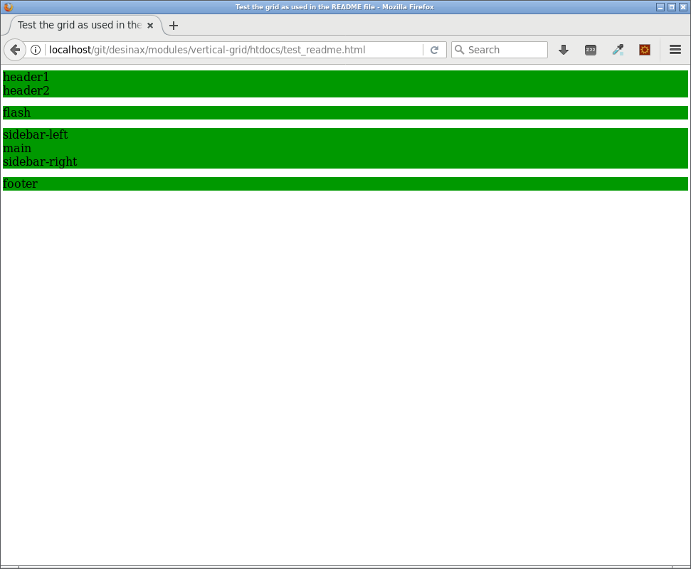
For now the testpage might look like this.
Style the columns
I have some columns in my testpage. They all need to be styled as a columns to get a width and left/right margin. They also get a style of display/float or flex, depending on the type of grid you are using. Do not overwrite those properties.
This is how I can add grid style to the columns.
.header1,
.header2 {
    #desinax-vgrid.column(@columns / 2);
}

.flash {
    #desinax-vgrid.column(@columns - 4);
    #desinax-vgrid.push(2);
}

.sidebar-left,
.sidebar-right {
    #desinax-vgrid.column(@columns / 4);
}

.main {
    #desinax-vgrid.column(@columns / 2);
}

.footer {
    #desinax-vgrid.column(@columns);
}
Each row can have at most @columns column in it, otherwise it will wrap and continue on the next line within the current row.
Lets add som extra style, just to make the example look a bit better, this has nothing to do with the actual grid and is just for show.
.region {
    height: 80px;
    background-color: lighten(#0f0, 20%);
}
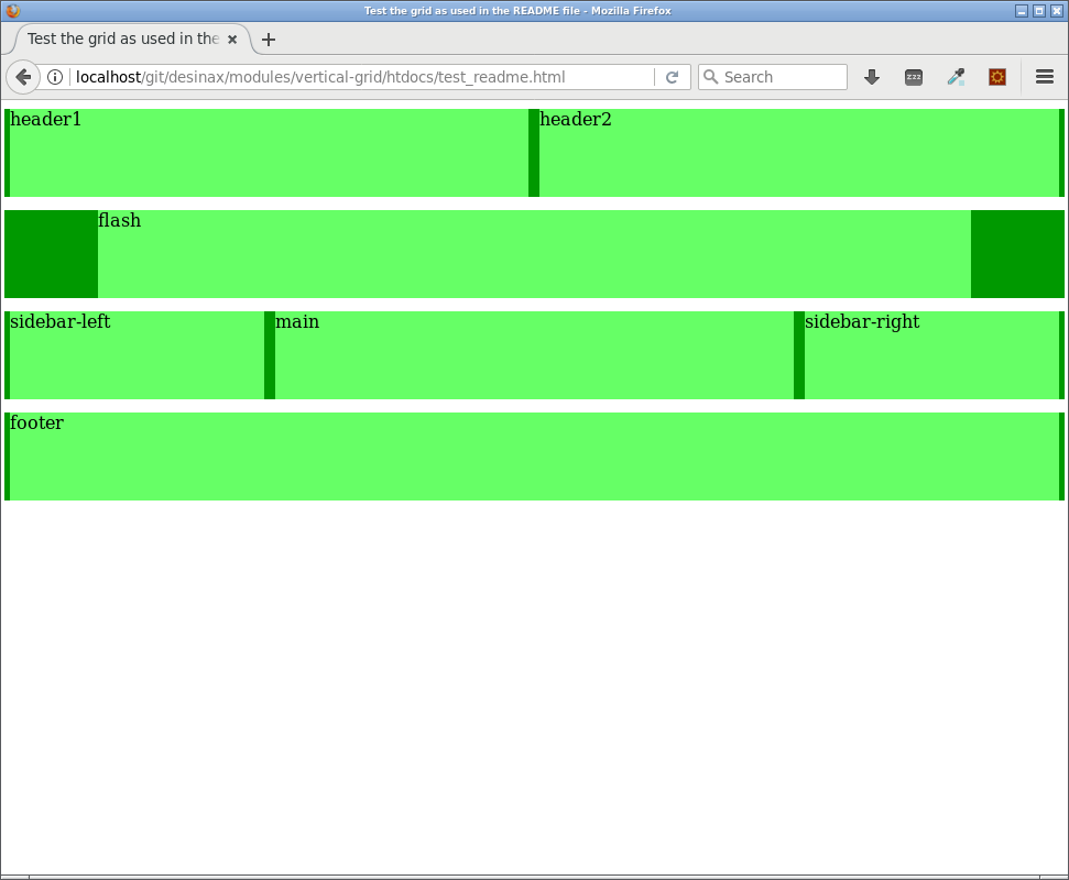
For now the testpage might look like this.
Grid wrapper
For now the grid is fluid and wrapping 100% of the width. The grid contains a utility mixin that can set the max width on a row wrapper. In our example we have the .inner-wrap as the row-wrapper.
Lets say that the header and footer should be 100% wide and the other rows should have a max width of 1100px.
Lets apply that style.
.inner-wrap {
    #desinax-vgrid.grid(1100px);
}

.inner-wrap-header,
.inner-wrap-footer {
    #desinax-vgrid.grid(100%);
}
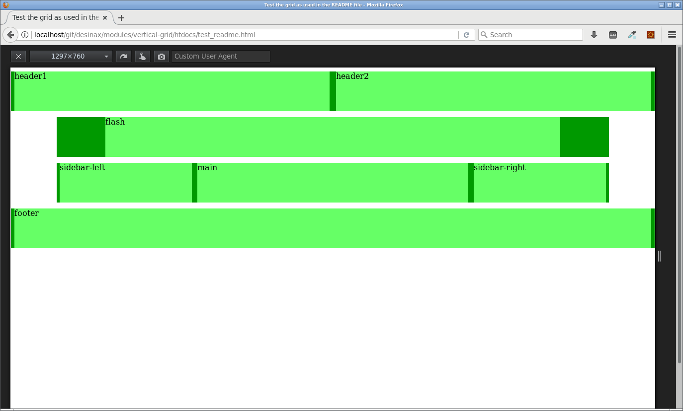
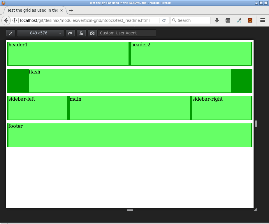
For now the testpage might look like this when the browser is wider than 1100px.
When the width is less than 1100px then all rows appear to have the same size to 100%. We now have a fluid grid with a max width for some rows.
Responsive grid
A fluid grid, like the one we have, adapts nicely to the width of the browser. To enhance its responsiveness one can add media queries to allow the columns to have different width. Well, different width means that they span a certain set of columns.
Lets look at an example which makes the grid more responsive.
@media screen and (max-width: 700px) {
    .flash {
        #desinax-vgrid.column(@columns);
    }

    .sidebar-left,
    .sidebar-right {
        #desinax-vgrid.column(@columns / 2);
    }

    .main {
        #desinax-vgrid.column(@columns / 2);
    }
}

@media screen and (max-width: 600px) {
    .sidebar-left,
    .sidebar-right,
    .main {
        #desinax-vgrid.column(@columns);
    }
}
The idea is to wet the breakpoints where needed, however, this is not a grid issue, you can use whatever tactic you choose for setting the breakpoints.
Here follows a couple of images that show how the grid adapts for the media queries.
First how it looks like when no media query is active.
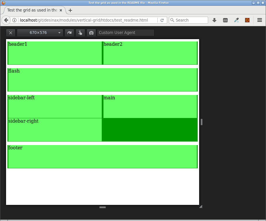
Then how it looks when the first media query is applied when the width is less than 700.
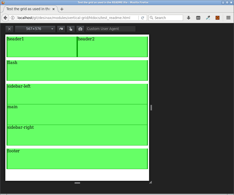
Ant then last, how it looks like when the second media query hits in.
We now have a fluid grid, with a max width and the grid being responsive at selected breakpoints.
Show the grid
When developing for the grid it might be helpful to show the grid to see that the rows and columns actually maps to the intended grid.
Here are a couple of html pages where you can see the grid.
- Float with show grid (24 columns) (Less source)
- Float with show grid (12 columns) (Less source)
- Flex with show grid (24 columns) (Less source)
- Flex with show grid (12 columns) (Less source)
This is how its done.
The following style adds a background image that represents the grid.
.vgrid .inner-wrap {
    @gridImage: "../../img/grid_24x30x10-nomargin.png";
    //@gridImage: "../../img/grid_12x60x20-nomargin.png";
    #desinax-vgrid.showGrid(@gridImage, 1100px);

    &.inner-wrap-header,
    &.inner-wrap-footer {
        #desinax-vgrid.showGrid(@gridImage);
    }
}
The grid images are just an image representing the grid.
This is the 24 column grid image.
This is the 12 column grid image.
You will need your own grid image if you have your own setup for the grid.
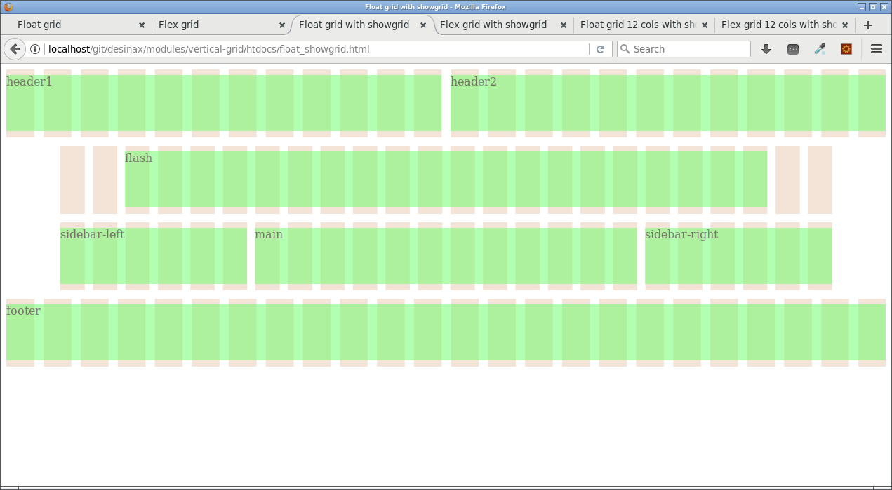
This is how it can look like when using a 24 column grid and applying the grid image.
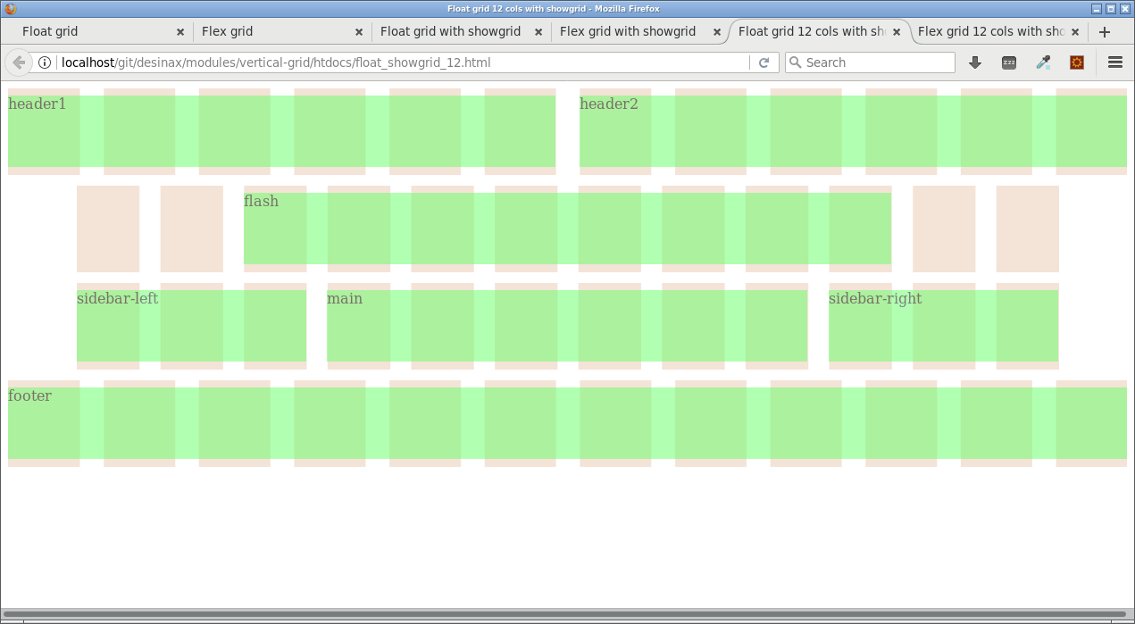
This is the same when using a 12 column grid.
The grid image is added to the .inner-wrap and it can be added with an optional specific max width, the same max-width used for wrapping the row.
The intention is to add the class .vgrid to some parent element to make it easy to turn on or off the visible grid. For example adding the class to the html-element would activate that the grid is shown.
<html class="vgrid">When using background images and colors it might be hard to see the grid. Here is some constructs that make it easier to see the grid in the example files.
.row {
    // Add some style to make it easier to see the structure of the grid
    padding-top: 8px;
    padding-bottom: 8px;
    background-color: transparent;
}

.region {
    // Add some style to make it easier to see the structure of the grid
    opacity: 0.5;
}
The constructs for .row and .region are just to make the example more visible.
Avoid styling the grid row or grid column
The divs we now have applied the grid style to should we avoid to style further. This is a general recommendation to keep out of trouble and by mistake overriding the grid layout.
An easy way to avoid such mistakes is to add wrappers around the grid and a wrapper for the content. These can then be styled more freely.
Here is an example.
<div class="outer-wrap outer-wrap-header">
    <div class="inner-wrap inner-wrap-header">
        <div class="row">
            <div class="region-header">
                <div class="region header1">
                    <div class="content-header1">header1</div>
                </div>
                <div class="region header2">
                    <div class="content-header2">header2</div>
                </div>
            </div>
        </div>
    </div>
</div>
This might seem to be a lot of wrappers, but the intention is to prepare for several differente types of styles for the website. You can use less wrappers, but in the long run you might come to love wrappers. I do. It makes it easy to add (without messing with the grid divs) background-color, borders, padding, margins, different width and add content to all these div "holders", perhaps to use positioning to have items break out of the grid flow.
Another technique is to use box-sizing on the columns to allow styling with border and padding.
* {
    box-sizing: border-box;
}
But still, I prefer a well structured amount of wrappers to allow for all kind of styling and having well defined regions where content can be inserted. This makes it easier to live up to the expectations of the designer and the customer.
More examples on usage
The followig examples contain more example on how to use the grid.
History
The idea behind this grid was originally, to the best of my knowledge, implemented by Tyler Tate and it was called "The Semantic Grid System".
This is how the website looked when it was live and running (I saved it for educational purpose).
The first commit in the project was made 2011 according to GitHub. The project now seems to be dead. The latest commit was made in July 2015. The original license was Apache License 2.0.
I was using the "The Semantic Grid System" for both educational purpose and for production purpose. I liked the smallness of the grid and that there was no need for specific html classes.
So, for personal use I took the code and the idea behind the grid and rewrote the code to become src/less/grid.less, now supporting "float" and "flex" and I did som other minor edits to the code. I added a grid-mixin to wrap rows at certain max widths and a showGrid mixin with grid images and a pull-right mixin. I removed the clearfix mixin and namespaced the module and versioned it and published it as a npm package. I rewrote the mixins for row() and column() to make it more readable what css-constructs are used.
The basic idea behind the code for the row() and column() mixin is still based on the same initial princip developed by Tyler.
License
The license is MIT, review it in LICENSE.
 .
..:  Copyright (c) 2016-2018 Mikael Roos, mos@dbwebb.se
