@depack/form
@depack/form is The Bootstrap Form Component For Entering Data.
yarn add -E @depack/formTable Of Contents

API
The package is available by importing its default and named functions:
import Form, {
  FormGroup, Input, TextArea, Select,
} from '@depack/form'

Form
Creates the form that maintains the values of each field that is found inside its children. Any additional properties will be passed down to the form. Each child component will receive values in its context.
_depackForm.FormProps: Options for the Form component.
| Name | Type | Description |
|---|---|---|
| onChange | !Function | The callback to call when a change is made to any of the inputs inside of the form. |
| formRef | !Function | The function to call with the reference to the form HTML. |
| onSubmit | !Function | The function to call on form submit. |
import Form, {
FormGroup, TextArea, Input, Select, SubmitButton, SubmitForm,
} from '@depack/form'
class ExampleForm extends SubmitForm {
render({ onChange, ...props }) {
const { formLoading, error, success } = this.state
return (<Form {...props} onSubmit={this.submit.bind(this)} onChange={values => {
this.reset()
if(onChange) onChange(values)
}}>
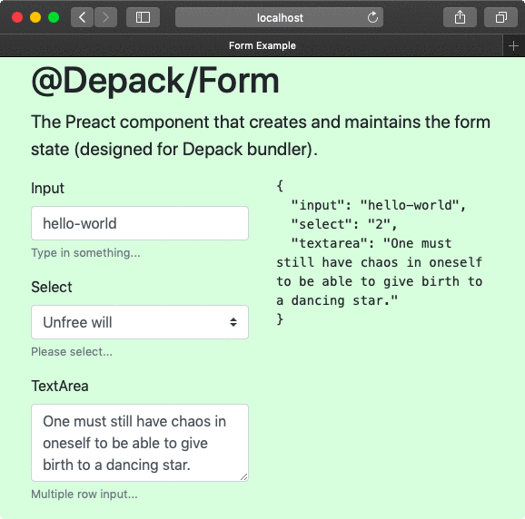
<FormGroup label="Input" help="Type in something...">
<Input name="input" value="hello-world" />
</FormGroup>
<FormGroup label="Select" help="Please select...">
<Select name="select" value="2" options={[
{
title: 'Free will',
value: '1',
},
{
title: 'Unfree will',
value: '2',
},
]} />
</FormGroup>
<FormGroup label="TextArea" help="Multiple row input...">
<TextArea name="textarea">
One must still have chaos in oneself to be able to give birth to a dancing star.
</TextArea>
</FormGroup>
<SubmitButton loading={formLoading} type="warning"
confirmText="Submit Data" />
{error && `Error: ${error}`}
{success && `OK`}
</Form>)
}
}
export default ExampleForm<form>
<div class="form-group">
<label for="i70984">Input</label>
<input name="input" class="form-control" value="hello-world" type="text"
aria-describedby="hi70984" id="i70984">
<small id="hi70984" class="form-text text-muted">Type in something...</small>
</div>
<div class="form-group">
<label for="i97426">Select</label>
<select name="select" class="custom-select" id="i97426"
aria-describedby="hi97426">
<option value></option>
<option value="1">Free will</option>
<option selected value="2" selected>Unfree will</option>
</select>
<small id="hi97426" class="form-text text-muted">Please select...</small>
</div>
<div class="form-group">
<label for="i20008">TextArea</label>
<textarea name="textarea" aria-describedby="hi20008" class="form-control"
id="i20008" rows="3">One must still have chaos in oneself to be able to give birth to a dancing star.</textarea>
<small id="hi20008" class="form-text text-muted">Multiple row input...</small>
</div>
<button class="btn btn-warning" type="submit">Submit Data</button>
</form> |
FormGroup
The form group is used to represent a logical combination of a label, input, help text and validation error message. The FormGroup component generates id and hid values and passes them to children components in the context.
_depackForm.FormGroupProps: Options for the FormGroup component.
| Name | Type | Description |
|---|---|---|
| label | string | The label to display for the group. |
| className | string | The additional class name to add to form-group. |
| labelClassName | string | The additional class name to add to the label. |
| col | string | If any of the col properties are passed (e.g., col-12, col-sm-8, etc), they will be set on the label. |
| row | boolean | Whether the group should be displayed in a row. Children must manually be wrapped in divs with col classes. Adds the col-form-label class to the label and the row class to the group. |
| form-row | boolean | Same as row, but adds the form-row class to the group. |
| details | boolean | Whether to display the group in details block. |
| help | string | The help text to show in <small className="form-text text-muted">{help}</small>. To support validation with valid and invalid classes, set help on inputs rather than group. |
import Form, { FormGroup, Input } from '@depack/form'

const Example = () => (
  <Form>
    <FormGroup
      label="What is your name?"
      help="Your name, your name, what is your name?"
    >
      <Input />
    </FormGroup>
  </Form>
)<form>
<div class="form-group">
<label for="i70984">What is your name?</label>
<input class="form-control" type="text" aria-describedby="hi70984" id="i70984">
<small id="hi70984" class="form-text text-muted">
Your name, your name, what is your name?</small>
</div>
</form>
Input
The input is a one-line entry field.
_depackForm.InputProps: The rest is all other options to be passed to the input element. When compiling with Depack, the props must be added like <Input {...({ 'onClick': test })}>.
| Name | Type | Description | Default |
|---|---|---|---|
| required | boolean | Whether this is a required field. | - |
| name | string | The input name. | - |
| placeholder | string | The input placeholder. | - |
| file | boolean | Whether the input is for selecting files. | - |
| value | string | The initial value. | - |
| className | string | The additional class name to add to form-control and form-control-file. |
- |
| col | string | If any of the col properties are passed (e.g., col-12, col-sm-8, etc), the Form will create a div wrapper around the input with the column class. |
- |
| type | string | The input type. | text |
| help | string | The help text to show under the input. Supports validation classes. | - |
| invalid | boolean | Adds the invalid-feedback class to help text. |
- |
| valid | boolean | Adds the valid-feedback class to help text. |
- |
import { Input } from '@depack/form'

const Example = () => (
  <Input
    name="example"
    placeholder="enter the value..."
    value="initial value"
    type="text"
    required
  />
)<input required name="example" placeholder="enter the value..."
class="form-control" value="initial value" type="text">
Select
This element present the values to select from.
_depackForm.SelectProps: Options for the Select component.
| Name | Type | Description |
|---|---|---|
| required | boolean | Whether this is a required field. |
| name | string | The select name. |
| value | string | The initial value. |
| col | string | If any of the col properties are passed (e.g., col-12, col-sm-8, etc), the Form will create a div wrapper around the select with the column class. |
| className | string | The additional class name to add to custom-select. |
| defaultText | ?string | The default option's text. Pass null to disable the default option. |
| options | !Array<{ value: *, title: string }> | The array with options to render inside of the select element. |
import { Select } from '@depack/form'

const Example = () => (
  <Select name="example" required value="1"
    options={[
      { value: 1, title: 'hello' },
      { value: 2, title: 'world' },
    ]}>
  </Select>
)<select name="example" class="custom-select" required>
<option value></option>
<option selected value="1" selected>hello</option>
<option value="2">world</option>
</select>
Textarea
The input field with multiple lines. The child of the component will set the initial value inside of the textarea.
_depackForm.TextAreaProps: Options for the TextAreaProps component.
| Name | Type | Description | Default |
|---|---|---|---|
| required | boolean | Whether this is a required field. | - |
| name | string | The textarea name. | - |
| placeholder | string | The textarea placeholder. | - |
| rows | number | How many rows should the textarea have. | 3 |
import { TextArea } from '@depack/form'

const Example = () => (
  <TextArea name="example" rows="4" required
    placeholder="enter the multiline value...">
    Hello World
  </TextArea>
)<textarea required name="example" placeholder="enter the multiline value..."
class="form-control" rows="4">Hello World</textarea>
SubmitForm
This class extends the Preact.Component and implements the submit method which will send the data to the server and await for the response while setting the formLoading property of the state to true. The error and success properties will also be set upon the arrival of data, with the JSON response being used to extract the error. The submitFinish callback can be used to receive the result of the form submission. Components implementing this abstract class must write their own render method.
_depackForm.SubmitFormProps: Options for the SubmitForm component.
| Name | Type | Description |
|---|---|---|
| path* | string | The path where to send data. |
| submitFinish | (arg0: Object) => !Promise | The callback after the data has been sent with possible response from the server. |
_depackForm.SubmitFormState: The state structure for the SubmitForm.
| Name | Type | Description |
|---|---|---|
| formLoading* | boolean | Whether the data has been sent for submission. |
| error* | ?string | The error returned by the server. |
| success* | ?boolean | Whether the form has been submitted successfully. |
import Form, { SubmitForm, Input } from '@depack/form'

class DataForm extends SubmitForm {
  render() {
    const { error, success, formLoading } = this.state
    return (<Form onSubmit={this.submit.bind(this)}>
      <Input name="example" />
      {error && `Error: ${error}`}
      {success && 'Success!'}
      <button type="submit" disabled={formLoading}>Submit</button>
    </Form>)
  }
}
const Example = () => (
  <DataForm path="/send-data" submitFinish={() => {
    console.log('hooray!')
  }} />
)<form><input name="example" class="form-control" type="text"><button type="submit">Submit</button></form>
reset(): void
Resets the error and success properties of the form.
SubmitButton
The button that can be placed inside the form and used for submission since it has type="submit" property. It also has the loading property to disable the button and show the spinning wheel indicator.
_depackForm.SubmitButtonProps: Options for the SubmitButton component.
| Name | Type | Description | Default |
|---|---|---|---|
| loading | boolean | Whether the button should display as loading. | false |
| loadingText | string | The text to show during the loading progress. | - |
| confirmText* | string | The text for the normal state. | - |
| className | string | The class name, such as btn-lg. |
- |
| type | string | The type of the button to add to the class as btn-{type}. One of ('primary' | 'secondary' | 'success' | 'danger' | 'warning' | 'info' | 'light' | 'dark'). |
primary |
| outline | boolean | Display the outline style of the button via setting the btn-outline-{type} class. |
false |
| disabled | boolean | Whether the button is disabled. It becomes disabled when the form is loading by default. | false |
import { SubmitButton } from '@depack/form'

const Example = ({ formLoading }) => (
  <SubmitButton type="light" confirmText="Add Data"
    loading={formLoading} loadingText="Loading..." outline="1" />
)<button class="btn btn-outline-light" type="submit">Add Data</button>

Custom Components
To implement a custom component, one must write a class component that would report its initial value in componentDidMount method via the onChange method that it receives in the context. Overall, there are 4 properties that a component can receive in the context:
-
id: If placed in the FormGroup, this will be set to the ID that the component should set on the input so that the label can focus on it on click. -
hid: If placed in the FormGroup, this will be set to auto-generated value for the help field. -
values: This is the overall values hash containing all the values of the fields in the form. It is set by the Form parent component. -
onChange: This is the callback set by the Form to report changes to the values of the component. It must also be fired after the component is mounted to set its initial model value in the form (i.e. update thevaluesfield).
The components are controlled which means their values are set via the model, and are contained in the values context property. Whenever an update is needed, the onChange method has to be fired. To allow server-side rendering of the component when the initial value is not going to be reported to the Form via the componentDidMount, it must be set manually after checking if values contain the name of the component. If the component for some reason is going to be used also outside of the form, the values must be defaulted to {}.
Here is an example of the Input component which accounts for all the above points:
import { Component } from 'preact'
import { shouldComponentUpdate, getClasses } from './lib'
import Help from './help'

export default class Input extends Component {
  constructor() {
    super()
    /** @type {!_depackForm.InputProps} */
    this.props = this.props
  }
  shouldComponentUpdate(newProps, __, newContext) {
    const res = shouldComponentUpdate.call(this, newProps, newContext)
    return res
  }
  componentDidMount() {
    const { value, name } = this.props
    const { onChange } = this.context
    if (value !== undefined && onChange) onChange(name, value)
  }
  /**
   * Triggers the onchange event on the form.
   * @param {string} value
   */
  onChange(value) {
    this.context.onChange(this.props.name, value)
  }
  /**
   * @param {!_depackForm.InputProps} [props]
   */
  render({
    required, name, placeholder, type = 'text', file, value, className,
    invalid, valid, help, ...props
  }) {
    const { colClasses, prop } = getClasses(props)
    const c = [
      `form-control${file ? '-file' : ''}`, className,
      invalid ? 'is-invalid' : null,
      valid ? 'is-valid' : null,
    ]
      .filter(Boolean).join(' ')
    const { hid, id, values = {} } = this.context
    const rendered = name in values // for SSR
    const input = (<input
      required={required}
      name={name}
      placeholder={placeholder}
      className={c}
      value={rendered ? values[name] : value}
      type={type}
      aria-describedby={hid}
      id={id}
      onChange={(e) => {
        this.onChange(e.currentTarget.value)
      }}
      {...prop}
    />)
    if (colClasses.length) {
      const he = help ? (<Help help={help} hid={hid} valid={valid} invalid={invalid} />) : null
      return (<div className={colClasses.join(' ')}>
        {input}
        {he}
      </div>)
    }
    return input
  }
}

/**
 * @suppress {nonStandardJsDocs}
 * @typedef {import('../types').InputProps} _depackForm.InputProps
 */

Copyright

|
© Art Deco for Depack 2020 |

|
Tech Nation Visa Sucks |
|---|
