@davidgovea/react-native-wheel-datepicker
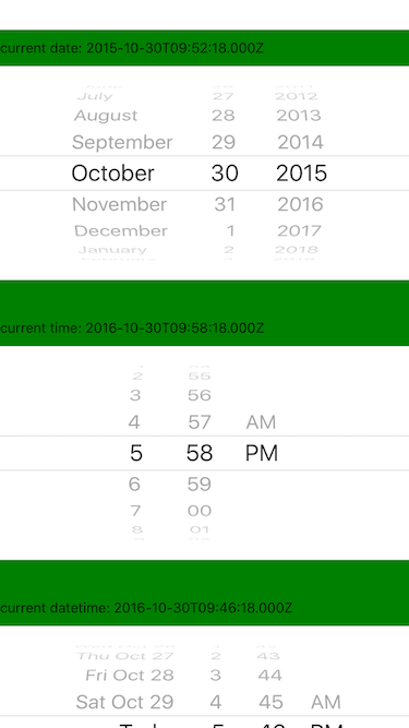
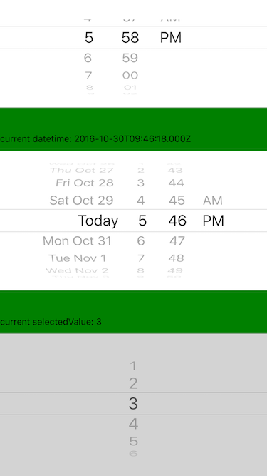
A iOS style picker and datepicker components for ReactNative.
- Original repository by @lesliesam: react-native-wheel-picker.
- Fork by @wusuopu who added the real cross platform behavior and datepicker react-native-wheel-picker.
- Fork by @pinguinjkeke, who provided maintenance and fixes react-native-wheel-datepicker
This is the fourth fork of repository, since it seems that @pinguinjkeke is no longer supporting react-native-wheel-datepicker.
Goals of this fork:
- Maintenance / updates for RN & platform changes
- Implement some missing features on Android (12-hour AM/PM mode, minute intervals)
- Typescript definitions
- Add tests
- Semver adherance
Introduction
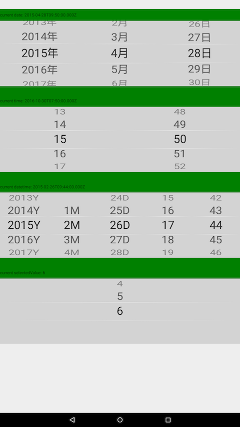
Cross platform Picker component for React-native.
Since picker is originally supported by iOS while Android only supports a ugly Spinner component. If you want to have the same user behaviour, you can use this.
The android component is based on wheel-picker which runs super fast and smoothly. It also supports curved effect which make it exactly the same looking and feel as the ios picker.
Installation
npm i @davidgovea/react-native-wheel-datepicker --save
Configration (for RN below 0.60):
react-native link @davidgovea/react-native-wheel-datepicker
<Picker> Component
import { Picker } from '@davidgovea/react-native-wheel-datepicker';

<Picker
  style={{ flex: 1 }}
  selectedValue={3}
  pickerData={[1, 2, 3, 4, 5, 6]}
  onValueChange={value => { console.log(value); }}
/>
Picker props
| Property | Type | Default | Description |
|---|---|---|---|
| pickerData | any[] | - | Required: an array of data to display in picker |
| onValueChange | (value: any) => void | - | Required: selected value changed callback |
| selectedValue | any? | First item of pickerData
|
Set/control the selected value |
| textColor | string | '#333' | (Android only) Color of spinner text |
| textSize | number | 26 | (Android only) Spinner text size |
| itemSpace | number | 20 | (Android only) Spacing between spinner items |
| itemStyle | style | null | (iOS only) passed into PickerIOS for item styling |
| style | style | null | Style applied to the picker element |
<DatePicker> Component
import { DatePicker } from '@davidgovea/react-native-wheel-datepicker';

<DatePicker
  mode="datetime"
  use12Hours
  minuteInterval={15}
  onDateChange={(date) => { console.log(date); }}
/>
DatePicker props
| Property | Type | Default | Description |
|---|---|---|---|
| onDateChange | (value: Date) => void | - | Required: selected date changed callback |
| mode | enum('date', 'time', 'datetime') | 'date' | Show date, time, or both in picker |
| date | Date |
new Date() (now) |
Provide/control the selected date value |
| maximumDate | Date | 10 years in future | Restricts the range of possible date/time values. |
| minimumDate | Date | 10 years in past | Restricts the range of possible date/time values. |
| minuteInterval | enum(1, 2, 3, 4, 5, 6, 10, 12, 15, 20, 30) | 1 | The interval at which minutes can be selected. |
| use12Hours | boolean | false | (Android only) Use 12-hour AM/PM for hour selection. On iOS, DatePickerIOS automatically uses i18n information to enable 12-hour mode. |
| order | custom string | 'D-M-Y' | (Android only) Ordering of date fields. Use "D" for day, "M" for month, "Y" for year, separated by dashes ("-") |
| labelUnit | { year: string, month: string, date: string } | { year: '', month: '', date: '' } | (Android only) Suffix labels for year, month, date values |
| textColor | string | '#333' | (Android only) Color of spinner text |
| textSize | number | 26 | (Android only) Spinner text size |
| itemSpace | number | 20 | (Android only) Spacing between spinner items |
| style | style | null | Style applied to the datepicker element |
[DEPRECATED] Integration with CustomDatePickerIOS
CustomDatePickerIOS can apparently cause Appstore approval issues. This library will be removing iOS functionality in a future release. Users are advised to use the builtin Pickers on iOS.
By default, package provides default DatePickerIOS on the iOS side to simplify usage on both platforms.
You can install react-native-custom-datepicker-ios package if you need textColor functionality on IOS platform.
Just install:
npm i react-native-custom-datepicker-ios
// or
yarn add react-native-custom-datepicker-ios
link dependencies:
react-native link react-native-custom-datepicker-ios
And register CustomDatePickerIOS inside react-native-wheel-datepicker package.
import { registerCustomDatePickerIOS } from '@davidgovea/react-native-wheel-datepicker';
import CustomDatePickerIOS from 'react-native-custom-datepicker-ios';

registerCustomDatePickerIOS(CustomDatePickerIOS);
Then you can use textColored components for both platforms inside render function!
import { DatePicker } from '@davidgovea/react-native-wheel-datepicker';

// ...
render() {
  return (
    <DatePicker
      mode="date"
      textColor="green"
    />
  )
}


