

Content Loader aka Content Placeholder for React Native
Customizable react native content loader for React-Native apps.
No need for external dependencies, it only use View component from react-native. For styling, you can use "barebone" stylesheet from react-native or you can use third party libraries like Nativewind (TailwindCSS for react-native)
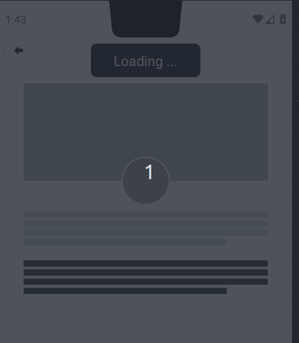
Preview
Support
Buy me a coffe at:
Installation
Step 1.
npm install @casteasoft/react-native-content-loader --save
or
yarn add @casteasoft/react-native-content-loader
Step 2.
And now you are ready to use it in your code. See example below.
Basic example
const ProfileImage = withViewLoader(View)

<ProfileImage style={{width: 120, height: 120}} isLoading={isLoading}>
  <Image resizeMode="cover" source={{uri: "http://localhost:3000/avatars/cipto.jpg"}} style={{width:"100%", height:"100%"}} />
</ProfileImage>

// or using explicit conditional statement
{
  isLoading ? <ProfileImage style={{width: 120, height: 120}} isLoading={isLoading} /> : <View style={{width: 120, height: 120}} isLoading={isLoading}><Image resizeMode="cover" source={{uri: "http://localhost:3000/avatars/cipto.jpg"}} style={{width:"100%", height:"100%"}} />
</View>
}
Live advanced example
Fiddle it around on codesanbox . You prefer expo snack? I've got you, here is yummy expo snack
Advanced example using Nativewind
import { View, Text, TouchableOpacity, Image } from "react-native";
import { withViewLoader } from "@casteasoft/react-native-content-loader";
import { styled } from "nativewind";


 /* =============================
  *  Content Loader Examples @casteasoft/react-native-content-loader
  #  , styling using Nativewind
  * ============================ */

export const ContentLoader = () => {
 return <View >
      {/* Button for toggling isLoading state */}
      <ToggleLoadingBtn
        onPress={() => {
          setIsLoading(!isLoading);
        }}
      >
        <ToggleLoadingText>
          {isLoading ? "Loading ..." : "Completed"}
        </ToggleLoadingText>
      </ToggleLoadingBtn>

      {/* Profile Details */}
      <ProfileContainer>
        <ProfileHeaderContainer>
          <ProfileHeaderImageContainer isLoading={isLoading}>
            <ProfileHeaderImage
              resizeMode="cover"
              source={{ uri: "http:/localhost:3000/sceneries/tandur_padi.jpg" }}
            />
          </ProfileHeaderImageContainer>
          <ProfileImageContainer isLoading={isLoading}>
            <ProfileImage
              resizeMode="cover"
              source={{ uri: "http:/localhost:3000/avatars/elena.jpg" }}
            />
          </ProfileImageContainer>

          <ProfileImageBackground />
        </ProfileHeaderContainer>

        <BioParagraph
          {...{ isLoading }}
          className="mx-auto mt-10 w-80"
          numberOfLines={4}
          loaderColorStyle={{ backgroundColor: "#1e3a8a" }}
        >
          <Text>
            Lorem ipsum dolor sit amet consectetur adipisicing elit. Illum totam
            corrupti necessitatibus quasi dolores eos laboriosam cum!
            Consequatur, laudantium sit facere vitae et nisi dolorum
            accusantium, iure laborum, asperiores veniam.
          </Text>
        </BioParagraph>

        {/*  Styling content loader with style prop only  */}
        {isLoading ? (
          <BioParagraph
            {...{ isLoading }}
            numberOfLines={4}
            style={{
              marginLeft: "auto",
              marginRight: "auto",
              marginTop: 16,
              width: 320,
            }}
          />
        ) : (
          <View className="mx-auto mt-4 w-80">
            <Text>
              Lorem ipsum dolor sit amet consectetur adipisicing elit. Illum
              totam corrupti necessitatibus quasi dolores eos laboriosam cum!
              Consequatur, laudantium sit facere vitae et nisi dolorum
              accusantium, iure laborum, asperiores veniam.
            </Text>
          </View>
        )}
      </ProfileContainer>
      {/* End of Profile Details */}
</View>

/** =============================
 *  Styled Components using Nativewind
 *  =============================
 */
const ViewWithLoader = withViewLoader(View);

const ToggleLoadingBtn = styled(
  TouchableOpacity,
  `items-center self-center justify-center px-4 py-2 mx-4 my-2 bg-gray-900 rounded-lg w-36`
);
const ToggleLoadingText = styled(Text, `text-lg text-white text-font-semibold`);

const ProfileContainer = styled(View, `flex flex-col w-full`);

const ProfileHeaderContainer = styled(
  View,
  `relative flex flex-col items-center mx-auto w-80`
);

const ProfileHeaderImageContainer = styled(ViewWithLoader, `w-full h-32`);

const ProfileHeaderImage = styled(Image, `w-full h-full`);

const ProfileImageContainer = styled(
  ViewWithLoader,
  `absolute z-20 w-16 h-16 border-2 border-gray-100 rounded-full top-24`
);

const ProfileImage = styled(Image, `w-full h-full rounded-full`);

const ProfileImageBackground = styled(
  View,
  `absolute w-16 h-16 border-2 border-gray-100 rounded-full bg-gray-50 top-24`
);
const BioParagraph = ViewWithLoader;
Available Properties
If you use a third party library like Nativewind, the tailwind class will be transformed into an array of style object, therefore there is no className property, for example:
mx-auto mt-4 w-80 will be transformed into [{marginLeft: "auto", marginRight: "auto"}, {marginTop: 16}, {width: 320}]
| Property name | Description |
|---|---|
| duration | : number (default: 3000) |
| bottomtValue | : minimum value for opacity (default: 0.1) |
| topValue | : maxmum value for opacity (default: 1) |
| children | : children element to be displayed |
| isLoading | : boolean |
| numberOfLines | : number (the number of paragraph lines) |
| style | : StyleProp<ViewStyle>
|
| loaderColorStyle | : StyleProp<ViewStyle>, only backgroundColor |
(default: { backgroundColor: "#111827" }) |
Changelog
Please see the releases tab for the changelog information.