
notistack


Notistack is an extention to Material-UI Snackbar. notistack makes it extremely easy to display snackbars (so you don't have to deal with open/close state of them), and also enables you to stack snackbars on top of one another. It's highly customizable and you can customize snackbars the same way you do for Mui-Snackbars.
Play with online demo here
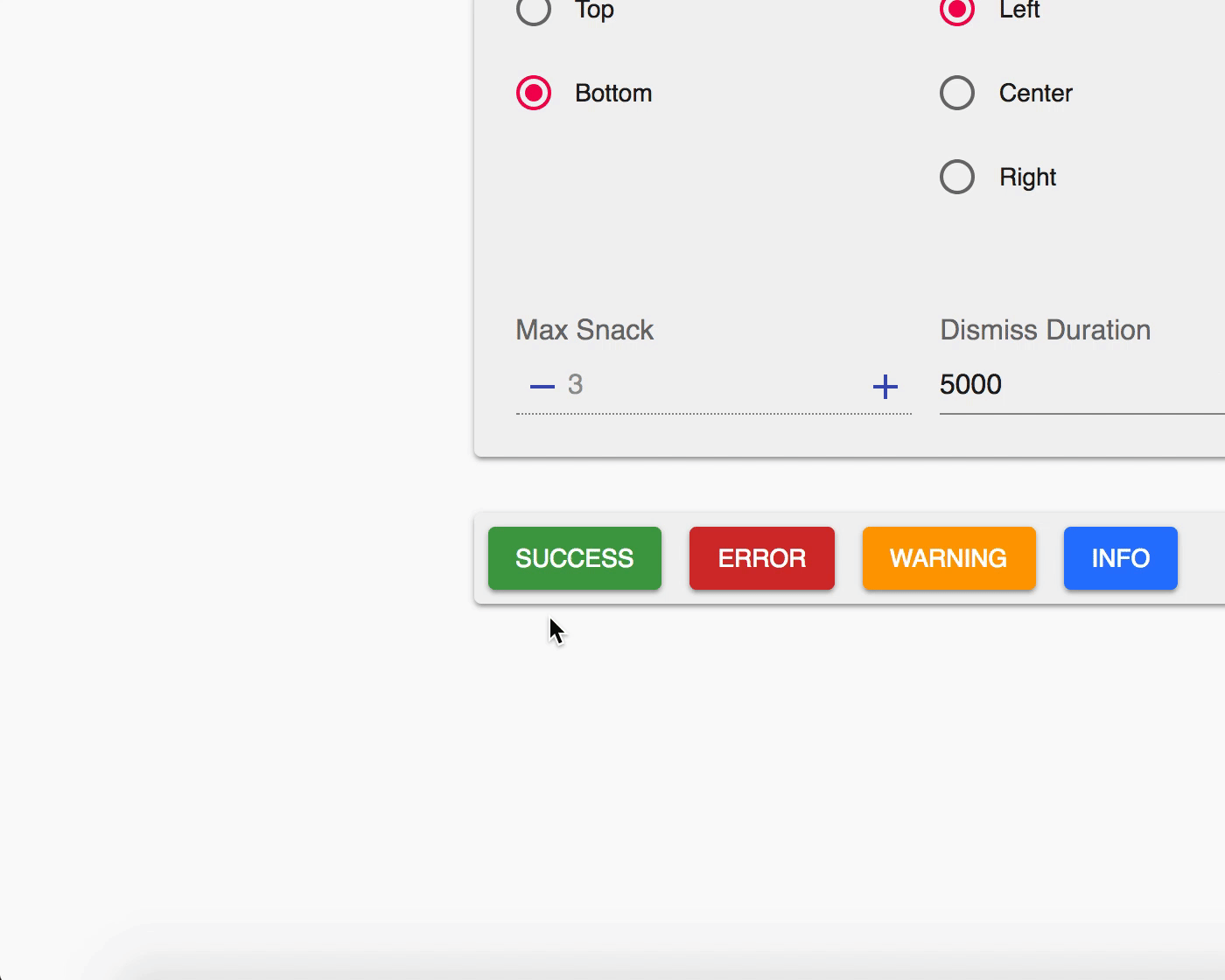
| Stacking behaviour | Dismiss oldest when reached maxSnack (3 here) |
|---|---|
 |
 |
Table of Contents
Getting Started
Use your prefered package manager:
npm install notistack
yarn add notistack
How to use
1: Wrap your app inside a SnackbarProvider component: (see docs for a full list of available props)
import { SnackbarProvider } from 'notistack';

<SnackbarProvider maxSnack={3}>
    <App />
</SnackbarProvider>
2: Export any component that needs to send notification using withSnackbar. By doing this, you'll have access to methods enqueueSnackbar and closeSnackbar, where the former can be used to send snackbars.
import { withSnackbar } from 'notistack';

class MyComponent extends Component {
  handleNetworkRequest = () => {
     fetchSomeData()
        .then(() => this.props.enqueueSnackbar('Successfully fetched the data.'))
        .catch(() => this.props.enqueueSnackbar('Failed fetching data.'));
  };

  render(){
     //...
  };

};

export default withSnackbar(MyComponent);
Online demo
You can see the online demo and experiment all the possible configurations here.
Or see the code for a minimal working example: codesandbox
Documentation
See full docs here
SnackbarProvider:
All material-ui Snackbar props will get passed down to a Snackbar component. See Material-ui docs for more info.
// Maximum number of snackbars that can be stacked on top of eachother.
maxSnack            type: number          required: true        default: 3

// The little icon that is displayed in a snackbar
iconVariant         type: any             required: false       default: Material design icons

// hide or display icon variant of a snackbar
hideIconVariant     type: boolean         required: false       default: false

// event fired when user clicks on action button (if any)
onClickAction       type: func            required: false       defualt: dismisses the snackbar

// Example of a Mui-Snackbar prop
transitionDuration={{ exit: 380, enter: 400 }}
Using material-ui classes prop, you can override styles applied to a snackbar based on its variant. For more info see overriding with classes. This accepts the following keys:
classes.variantSuccess:       Styles applied to the snackbar if variant is set to 'success'.
classes.variantError:                                                   is set to 'error'.
classes.variantWarning:                                                 is set to 'warning'.
classes.variantInfo:                                                    is set to 'info'.
withSnackbar:
When you export your component using withSnackbar, you'll have access to enqueueSnackbar and closeSnackbar methods in your props.
enqueueSnackbar
Adds a snackbar to the queue to be displayed to the user. It takes two arguments message and an object of options and returns a key that is used to reference that snackbar later on. (e.g. to dismiss it programmatically)
const key = this.props.enqueueSnackbar(message, options)

// text of the snackbar
message         type:string         required: true

// object containing options with the following shape
options:        type:object         required: false

// type of the snackbar
options.variant type:string         oneOf(['default', 'error', 'success', 'warning', 'info'])

// You can pass any material-ui Snackbar prop here, and they will be applied to this individual snackbar.
// for example, this particular snackbar will get dismissed after 1 second.
options.autoHideDuration: 1000Note: onPresentSnackbar has been now deprecated. Use enqueueSnackbar instead:
// ❌ before:
this.props.onPresentSnackbar('variant', 'message')

// ✅ after:
this.props.enqueueSnackbar('message', { variant: 'variant' })
closeSnackbar
Dismiss snackbar with the given key.
this.props.closeSnackbar(key)

// id returned by enqueueSnackbar - in order to reference a snackbar
key             type: string|number     required: true
Add actions to snackbar:
You can add actions to snackbars in the same manner specified in material-ui docs:
<SnackbarProvider
    maxSnack={3}
    action={[
        <Button color="secondary" size="small">My Action</Button>
    ]}
    onClickAction={() => alert('Clicked on my action button.')}
>
    <App />
</SnackbarProvider>
However, notice that by passing action to SnackbarProvider, you’ll be adding action to all of the snackbars. To specify action for a single snackbar, use options argument of enqueueSnackbar method instead:
this.props.enqueueSnackbar('Item moved to recently deleted folder.', {
    variant: 'default',
    action: <Button color="secondary" size="small">Undo</Button>,
    onClickAction={() => alert('Clicked on my action button.')}
})
Use onClickAction prop to handle onClick event on snackbar action. The default behaviour of onClickAction is to dismiss the snackbar. Also, note that multiple actions for a snackbar is not supported by notistack.
Redux example:
You can use notistack to send snackbars from reducers. This has lots of applications but particularly useful when a network request fails. For more information check out notistack's minimal redux example.
Contribution
Open an issue and your problem will be solved.
Notes
Material Design guidelines suggests that only one snackbar should be displayed at a time. But I liked to stack them. maxSnack to 1 and just take advantage of enqueueSnackbar function.
Author - Contact
Hossein Dehnokhalaji