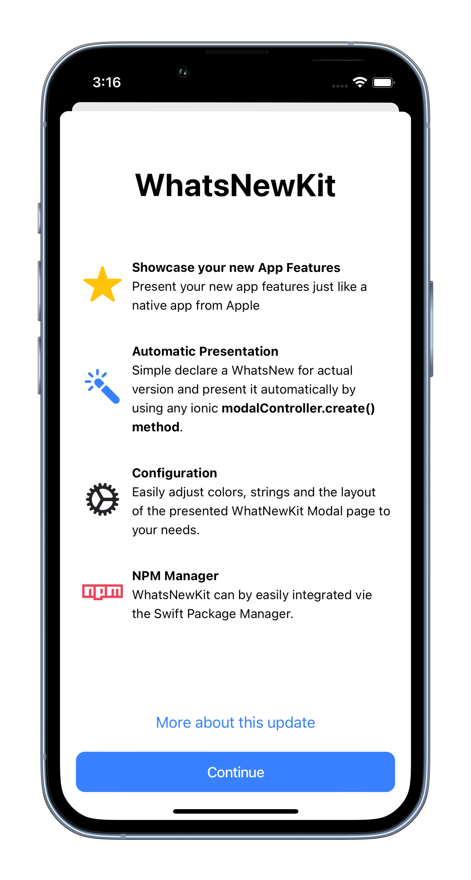
WhatsNewKit for Ionic (Angular)
A NPM Package to easily showcase your new app features in your Ionic Angular App.
It's designed from the ground up to be fully customized to your needs.
Original Swift Package SvenTiigi/WhatsNewKit
export class HomePage implements OnInit  {

  constructor(
    protected updateWNKService: UpdateWNKService,
  ) {
  }

  ngOnInit() {
    this.updateWNKService.whatsNew();
  }
}
Features
- [x] Easily present your new app features
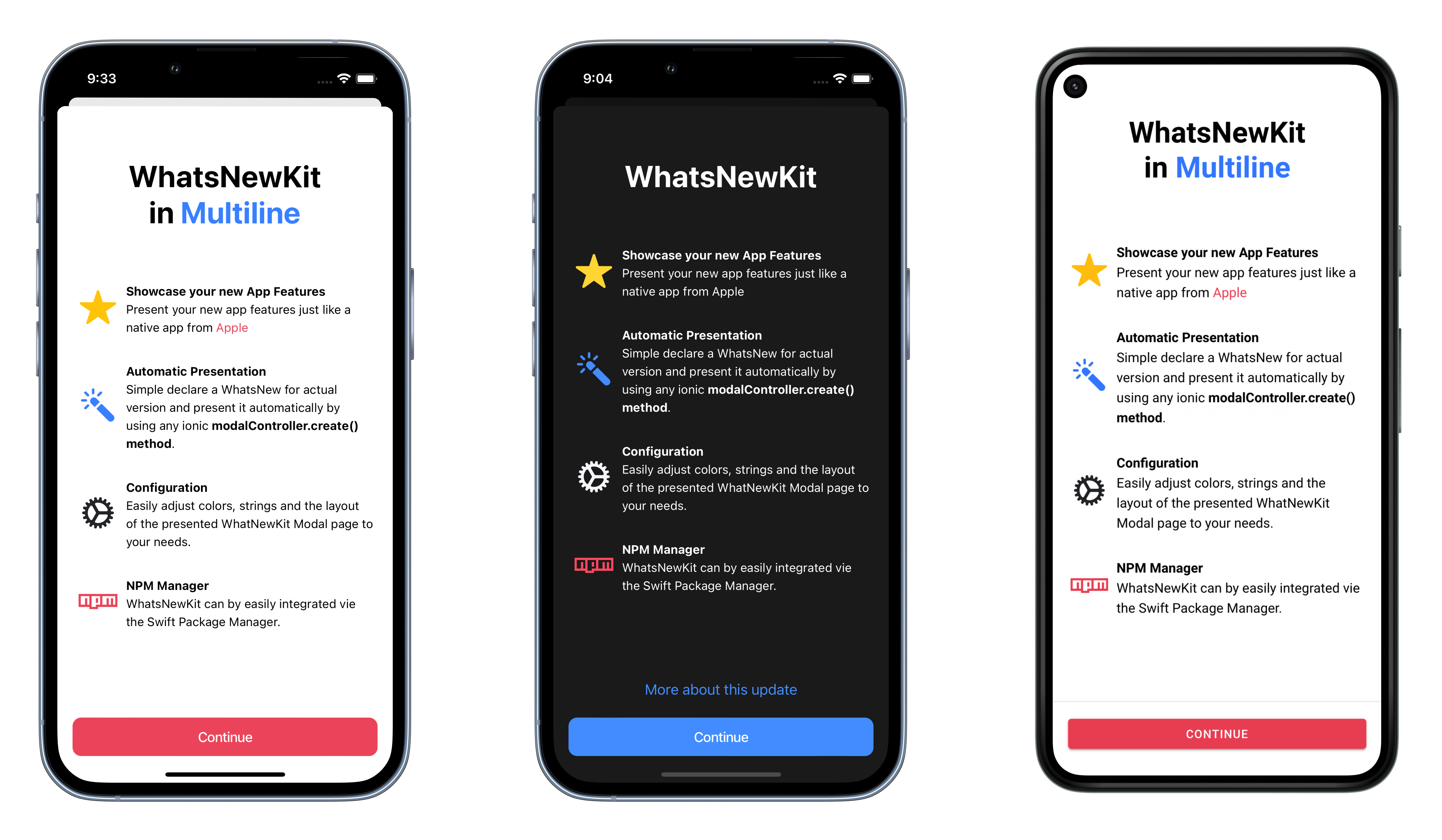
🤩 - [x] Automatic & Manual presentation mode
✅ - [x] Dark mode ready
☑️ - [x] Use Ionic Theming Colors
🎨 - [x] Support for Ionic - Angular and Capacitor
🧑🎨 - [x] Support any platform: iOS, macOS, iPadOS, Android, Web & Electron
📱 🖥 - [x] Adjustable content
🔧
Installation
- Install package from NPM using
npm i @awwwesome-cz/whats-new-kit. - Create Custom Service for automatic presentation.
- Call
this.updateWNKService.whatsNew()on your page.
Example
Usage
Manual Presentation
- Define features (WNK recommend 4-5 max for small screen not good for UX, user need to scroll).
- Adding
ModalControllerservice. - Show modal with
WhatsNewKitComponent.
In modalController.create() you need to add componentProps and set all what you want to show on WNK page.
export class ExamplePage {
  protected _features: WhatsNewKitFeature[] = [
    {
      icon: {
        name: 'star',
        color: 'warning'
      },
      title: 'Showcase your new App Features',
      text: 'Present your new app features just like a native app from <span class="aw3sm-wnk-color ion-color-danger">Apple</span>',
    },
    {
      icon: {
        name: 'color-wand',
        color: 'primary'
      },
      title: 'Automatic Presentation',
      text: 'Simple declare a WhatsNew for actual version and present it automatically by ' +
        'using any ionic <strong>modalController.create() method</strong>.',
    },
    {
      icon: {
        name: 'cog',
        color: 'dark'
      },
      title: 'Configuration',
      text: 'Easily adjust colors, strings and the layout of the presented WhatNewKit Modal page to your needs.',
    },
    {
      icon: {
        name: 'logo-npm',
        color: 'danger'
      },
      title: 'NPM Manager',
      text: 'WhatsNewKit can by easily integrated vie the Swift Package Manager.',
    }
  ];

  constructor(
    protected modalController: ModalController,
  ) {
  }

  /**
   * Show WhatsNewKit as modal sheet
   */
  async showUpdateInfoSheet() {
    const modal = await this.modalController.create({
      component: WhatsNewKitComponent,
      componentProps: {
        buttons: {
          continue: {
            title: 'Continue',
            color: 'danger'
            // additionally you can add custom handler, default capacitor.storage & canShow() check won't override!
            // handler: () => {
            //   alert('Get more');
            // }
          },
          /*more: {
            title: 'More about this update',
            handler: () => {
              alert('Get more');
            }
          }*/
        },
        title: 'WhatsNewKit<br>in <span class="aw3sm-wnk-color ion-color-primary">Multiline</span>',
        features: this._features,
      },
      backdropDismiss: false, // other Ionic modal settings
      // Used for iOS card presenting style (only on iOS), see doc: https://ionicframework.com/docs/api/modal#card-modal
      presentingElement: document.querySelector('.ion-page ion-router-outlet')
    });
    return await modal.present();
  }
}
Automatic Presentation
Capacitor plugins and your app may not have it.
- Do same things like in Manual Presentation
- Setup all data.
- Run
whatsNew()method in any page.
More information about canShow().
There is a DEMO of WNK Service.
import {WhatsNewKitComponent, WhatsNewKitFeature} from 'whats-new-kit';
import {ModalController} from '@ionic/angular';
import {App} from '@capacitor/app';
import {Capacitor} from '@capacitor/core';
import {Injectable} from '@angular/core';

@Injectable({
  providedIn: 'root'
})
export class UpdateWNKService {
  protected _features: WhatsNewKitFeature[] = [
    {
      icon: {
        name: 'star',
        color: 'warning'
      },
      title: 'Showcase your new App Features',
      text: 'Present your new app features just like a native app from <span class="aw3sm-wnk-color ion-color-danger">Apple</span>',
    },
    {
      icon: {
        name: 'color-wand',
        color: 'primary'
      },
      title: 'Automatic Presentation',
      text: 'Simple declare a WhatsNew for actual version and present it automatically by ' +
        'using any ionic <strong>modalController.create() method</strong>.',
    },
    {
      icon: {
        name: 'cog',
        color: 'dark'
      },
      title: 'Configuration',
      text: 'Easily adjust colors, strings and the layout of the presented WhatNewKit Modal page to your needs.',
    },
    {
      icon: {
        name: 'logo-npm',
        color: 'danger'
      },
      title: 'NPM Manager',
      text: 'WhatsNewKit can by easily integrated vie the Swift Package Manager.',
    }
  ];

  constructor(
    protected modalController: ModalController,
  ) {
  }

  async whatsNew() {
    // get version of app
    let version;
    if (Capacitor.getPlatform() !== 'web') {
      version = (await App.getInfo()).version;
    } else {
      version = '1.0'; // web app version must be added by developer
    }

    if (await WhatsNewKitComponent.canShow({
      appVersion: version,
      skipPatchVersion: true
    })) {
      // eslint-disable-next-line no-underscore-dangle
      await this._initUpdateInfoSheet();
    }
  }

  /**
   * Show WhatsNewKit as modal sheet
   *
   * @private
   */
  private async _initUpdateInfoSheet() {
    const modal = await this.modalController.create({
      component: WhatsNewKitComponent,
      componentProps: {
        buttons: {
          continue: {
            title: 'Continue',
            color: 'danger'
            // additionally you can add custom handler, default capacitor.storage & canShow() check won't override!
            // handler: () => {
            //   alert('Get more');
            // }
          },
          /*more: {
            title: 'More about this update',
            handler: () => {
              alert('Get more');
            }
          }*/
        },
        title: 'WhatsNewKit<br>in <span class="aw3sm-wnk-color ion-color-primary">Multiline</span>',
        // eslint-disable-next-line no-underscore-dangle
        features: this._features,
      },
      backdropDismiss: false,
      // Used for iOS card presenting style (only on iOS), see doc: https://ionicframework.com/docs/api/modal#card-modal
      presentingElement: document.querySelector('.ion-page ion-router-outlet')
    });
    return await modal.present();
  }
}
Config of canShow
canShow() is a static method for automatic check version of app last opened (installed) and your actual version. You
need to pass actual version of app and method return async boolean. true = app version is bigger (first install)
1.0 < 1.1 (second install/update). false = you have same version as before.
if (await WhatsNewKitComponent.canShow({
  appVersion: version,
  skipPatchVersion: true
})) {
  // eslint-disable-next-line no-underscore-dangle
  await this._initUpdateInfoSheet();
}
Minor & Patch versions
WNK use Semantic Versioning 2.0.0. - MAJOR.MINOR.PATCH (X.Y.Z).
- MAJOR version when you make incompatible API changes,
- MINOR version when you add functionality in a backwards compatible manner, and
- PATCH version when you make backwards compatible bug fixes.
You can set if you want check every PATCH or MINOR version of your app. We don't check PATCH version and
use skipPatchVersion: true for skip it. PATCH number in our apps use only for fix, not for new feature. Your app can
also skip MINOR if you add skipMinorVersion: true.
Styling
You can customize theming for you perfect app. WNK use default Ionic Theming system.
Styling text
For custom color text you need to use wnk color class and original ionic color class. For your text you need to
add aw3sm-wnk-color to activate reading ionic color from class. Then you need to add color what you want, for
example ion-color-primary, ion-color-secondary. You can also use custom
colors Ionic Theming Adding Colors.
This colored text can be used anywhere, where you place string.
Your second class need --ion-color-base. This will apply for color in your HTML tag color: var(--ion-color-base).
Ionic Theming classes have it prepared for this situation.
{
  // other componentProps
  title: 'WhatsNewKit<br>in <span class="aw3sm-wnk-color ion-color-primary">Multiline</span>',
  // other componentProps
}
Styling Features
Icon can by set from original Ionicons, also you can use custom ion-icon or see official Ionicons Documentation.
Color of icon use default theming Ionic system, and you can set color as <ion-icon color="warning">. The warning
is a color what you need to set in feature icon object structure.
Title & text are string (HTML string). For this WNK use angular innerHTML. There some limitation about styling,
and you need only HTML tags with class. For color WNK have custom class defined for Ionic Theming colors
named aw3sm-wnk-color, second is your Ionic color class. More info you can se in Styling text.
const _features: WhatsNewKitFeature[] = [
  {
    icon: {
      name: 'star',
      color: 'warning'
    },
    title: 'Showcase your new App Features',
    text: 'Present your new app features just like a native app from <span class="aw3sm-wnk-color ion-color-danger">Apple</span>',
  }
]
Styling Buttons
Buttons have WNK Ionic style and use Ionic Theming like Icons in Stiling Features.
const buttons = {
  continue: {
    title: 'Continue',
    color: 'danger',
    // Additionally you can add custom handler, default capacitor.storage & canShow() check won't override!
    /*handler: () => {
      alert('Get more');
    }*/
  },
  more: {
    title: 'More about this update',
    // color: 'danger',
    // You need to add custom handler, for define your logic! Without handler button does not execute any action.
    handler: () => {
      alert('Get more');
    }
  }
};
Licence
WhatsNewKit for Ionic (Angular)
Copyright (c) 2022 Ing. Jakub Josef Forman forman@awwwesome.cz
Permission is hereby granted, free of charge, to any person obtaining a copy of this software and associated documentation files (the "Software"), to deal in the Software without restriction, including without limitation the rights to use, copy, modify, merge, publish, distribute, sublicense, and/or sell copies of the Software, and to permit persons to whom the Software is furnished to do so, subject to the following conditions:
The above copyright notice and this permission notice shall be included in all copies or substantial portions of the Software.
THE SOFTWARE IS PROVIDED "AS IS", WITHOUT WARRANTY OF ANY KIND, EXPRESS OR IMPLIED, INCLUDING BUT NOT LIMITED TO THE WARRANTIES OF MERCHANTABILITY, FITNESS FOR A PARTICULAR PURPOSE AND NONINFRINGEMENT. IN NO EVENT SHALL THE AUTHORS OR COPYRIGHT HOLDERS BE LIABLE FOR ANY CLAIM, DAMAGES OR OTHER LIABILITY, WHETHER IN AN ACTION OF CONTRACT, TORT OR OTHERWISE, ARISING FROM, OUT OF OR IN CONNECTION WITH THE SOFTWARE OR THE USE OR OTHER DEALINGS IN THE SOFTWARE.


