
@arelstone/react-native-swipe-button
This component can be used to have an animated tabbar in your react-native app.
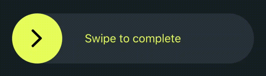
A lot of app use the swipe to complete. This is an easy to use and highly customizable page that heklp you so you don't have to write the code over and over again
Install
npm i @arelstone/react-native-swipe-button
// or
yarn add @arelstone/react-native-swipe-button
Props
| Prop | Type | Description |
|---|---|---|
| title | string Required | The text that will be displayed inside the button |
| onComplete | () => void Required | Callback function that will be invoked when the button has reached the final state |
| height | number | The height of the container. Default 70 |
| width | number | The width of the container. Default 90% of the screen width |
| borderRadius | number | The border radius of the container and button (default: height / 2) |
| completeThresholdPercentage | number | Determinates when onComplete should be invoked (defualt: 70) |
| onSwipeStart | () => void | Callback that will be invoked when the user starts swiping |
| onSwipeEnd | () => void | Callback that will be invoked when the user ends swiping |
| containerStyle | StyleProp | Styling for the container |
| underlayStyle | StyleProp | Styling for the underlay container |
| titleContainerProps | ViewProps | Additonal Props for the title container |
| titleContainerStyle | StyleProp | Styling for the title container |
| titleProps | TextProps | Additonal Props for the title text |
| titleStyle | StyleProp | Styling for the title text |
| circleBackgroundColor | string | Background color for the circle |
| goBackToStart | bololean | If set to TRUE, after swipe is completed, the circle goes back to the start position |