Deprecated
This component has been moved to anypoint-web-components/awc.
This component is based on Material Design menu and adjusted for Anypoint platform components.
Anypoint web components are set of components that allows to build Anypoint enabled UI in open source projects.
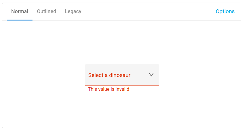
Exposed dropdown menus display the currently selected menu item above the menu. They can be used only when a single menu item can be chosen at a time.
Styling options
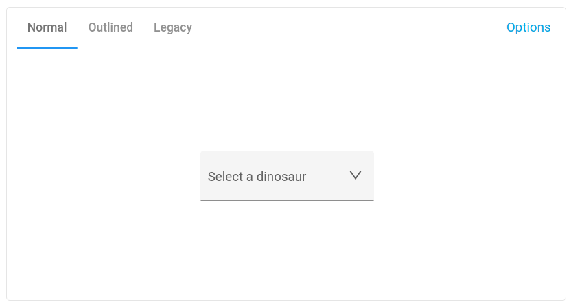
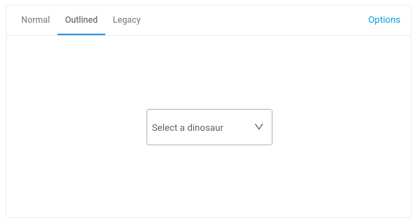
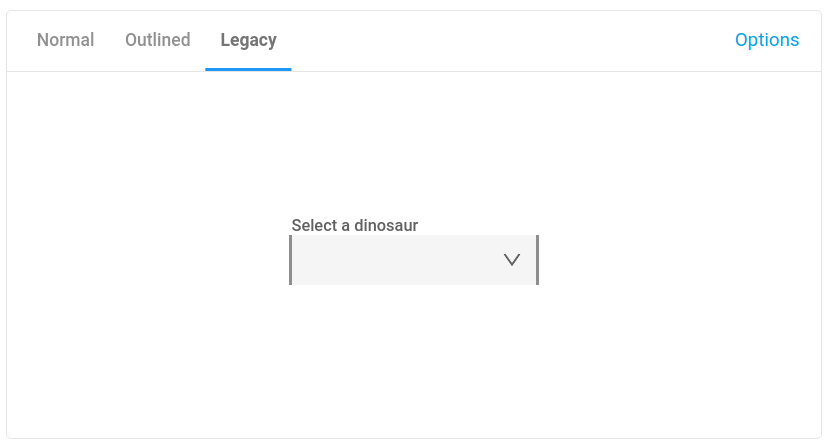
The element has three built-in themes:
- Material Design - Filled
- Material Design - Outlined
- Anypoint Design - Compatibility
By default the input renders filled dropdown list.
Outlined style is rendered when outlined property is set.
Anypoint ready styles are rendered when compatibility property is set.
OSS application should not use Anypoint based styling as it's protected by MuleSoft copyrights. This property is reserved for OSS applications embedded in the Anypoint platform.
Usage
Installation
npm install --save @anypoint-web-components/anypoint-dropdownIn an HTML file
<html>
  <head>
    <script type="module">
      import "@anypoint-web-components/anypoint-dropdown/anypoint-dropdown.js";
      import "@anypoint-web-components/anypoint-listbox/anypoint-listbox.js";
      import "@anypoint-web-components/anypoint-item/anypoint-item.js";
    </script>
  </head>
  <body>
    <anypoint-dropdown-menu
      aria-label="Select dinosaur from the list of available options"
    >
      <label slot="label">Selected dinosaur</label>
      <anypoint-listbox slot="dropdown-content" tabindex="-1">
        <anypoint-item>item 1</anypoint-item>
        <anypoint-item>item 2</anypoint-item>
        <anypoint-item>item 3</anypoint-item>
      </anypoint-listbox>
    </anypoint-dropdown-menu>
  </body>
</html>
Replacement for the anypoint-listbox element
It is possible to use different element than anypoint-listbox. The replacement should use AnypointMenuMixin which provides API for the dropdown element to work.
Value selection
When the user selects one of the options in the dropdown menu the list is closed and the rendered label is one of the following (in order):
-
labelproperty of the selected item -
labelordata-labelattribute io the selected item -
innerTextof the selected item
The same value is set as value property.
The selection can be controlled by setting selected attribute/property on the anypoint-listbox or the element implementing AnypointMenuMixin.
<anypoint-dropdown-menu
  aria-label="Select dinosaur from the list of available options"
>
  <label slot="label">Selected dinosaur</label>
  <anypoint-listbox slot="dropdown-content" tabindex="-1" selected="0">
    <anypoint-item label="My item 1">item 1</anypoint-item>
    <anypoint-item label="My item 2">item 2</anypoint-item>
    <anypoint-item>item 3</anypoint-item>
  </anypoint-listbox>
</anypoint-dropdown-menu>
By default the selected value is set to My item 1. When selecting option 3 then the label value becomes item 3.
Assistive text
Assistive text allows the user to better understand what kind of input is required. It can be an info message or invalid message when invalid input has been detected.
Info message
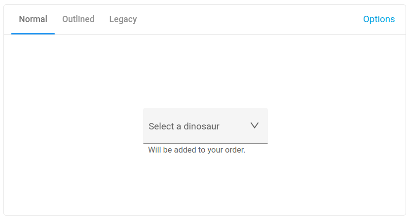
Info message provides the user with additional description for the field. It should be used when the label can be confusing or to ensure the user about the reason of collecting the input.
<anypoint-dropdown-menu infomessage="Will be added to your order.">
  <label slot="label">Select a dinosaur</label>
  <anypoint-listbox slot="dropdown-content" tabindex="-1">
    <anypoint-item>item 1</anypoint-item>
    <anypoint-item>item 2</anypoint-item>
    <anypoint-item>item 3</anypoint-item>
  </anypoint-listbox>
</anypoint-dropdown-menu>
Do not try to put too detailed information. The user should be able to scan the message in a fraction of a second. Treat it as an additional text for the label.
Invalid message
Error message should help the user recover from the error state. Use clear message with simple instructions of how to fix the problem, for example Only letters are allowed.
<anypoint-dropdown-menu
  invalidmessage="This value is required"
  invalid
  required
>
  <label slot="label">Select a dinosaur</label>
  <anypoint-listbox slot="dropdown-content" tabindex="-1">
    <anypoint-item>item 1</anypoint-item>
    <anypoint-item>item 2</anypoint-item>
    <anypoint-item>item 3</anypoint-item>
  </anypoint-listbox>
</anypoint-dropdown-menu>
Form-associated custom elements
The form-associated custom elements allows to associate a custom element with a <form> element. Original custom elements spec does not allow this.
The form-associated custom elements may not be supported in some browsers so custom form elements may be required to be used (for example iron-form).
The element supports this API in browser that has this API implemented. This means that the element behaves like a <select> element when inserted into the form element. See demo page for an example.
Validation
The element support required and autoValidate properties. When the element is required then it renders invalid state when validate() or checkValidity() function is called.
The validate() function is provided by ValidatableMixin for custom elements. checkValidity() function calls validate() function, and, if available, internal checkValidity() function provided by form-associated custom elements API.
The autoValidate option allows to automatically call validate function when value change. It can be used with custom validators implementing ValidatorMixin.
<anypoint-dropdown-menu required autovalidate>
  <label slot="label">Selected dinosaur</label>
  <anypoint-listbox slot="dropdown-content">
    <anypoint-item>item 1</anypoint-item>
    <anypoint-item>item 2</anypoint-item>
    <anypoint-item>item 3</anypoint-item>
  </anypoint-listbox>
</anypoint-dropdown-menu>
Accessibility
The element works perfectly with anypoint-listbox which together creates an accessible list of options. The listbox can be replaced by any other element that support similar functionality but make sure it has an appropriate aria support.
Development
git clone https://github.com/anypoint-web-components/anypoint-dropdown-menu
cd anypoint-dropdown-menu
npm install
Running the demo locally
npm startRunning the tests
npm test
