
Amplifi UI
Tailwind based React Native components
This library is still on initial phase of development. Feel free to use it, but be aware that structural changes are still possible. If you want to use it, please, lock the imported version on your package.json file.
Key concepts of this library:
- Based on Tailwind CSS (through twrnc);
- Components can (and should) be extended and styled using twrnc styles, in a flexible way;
- Based on the KISS principle (Keep It Simple, Stupid);
- Makes props for accessibility mandatory;
- Simplifies hard tasks like, adding animations, easier;
- Tailwind CSS is doing great on the Web apps, we want to make the process of using Tailwind on the mobile as easy as on the web;
- Focus on reusability and flexibility;
- Heavily depends on SVGs;
If your project uses Amplifi UI, please, let us know! We would love
Notes
- This library was designed to work with Tailwind styles, through twrnc. For a complete documentation on how to use tailwinds using react native, please, check twrnc's documentation. Thank you, Jared!
- It's mandatory to have this packages installed on your project:
Table of Contents
- BackgroundImage
- Button
- Card
- Charts
- CollapsibleModal
- Forms
- Typography
- HR
- Image
- LoadingRound
- ProgressSteps
- Spinner
- SwipeCarousel
- ToastMessage
Components
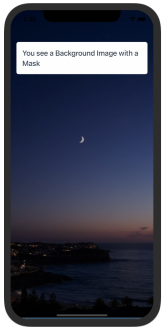
BackgroundImage
Description:
This component creates a View with an image as background. Accepts jpeg and png files.
Samples
Try using Expo: https://snack.expo.dev/@paulorieck/amplifi-ui---mobile---backgroundimage?platform=ios
import * as React from 'react';
import { Text, View, StyleSheet } from 'react-native';
import { Card, Button, H2, BackgroundImage } from '@amplifiui/mobile';

import Background from './assets/pexels-tieu-linh-11635802.jpg';

import tw from './services/tw';

export default function App() {
  return (
    <BackgroundImage
      tw={tw}
      mask="bg-black/40"
      image={Background}
    >
      <View>
        <Card tw={tw} style={tw`mt-10 mx-4`}>
          <H2 tw={tw}>You see a Background Image with a Mask</H2>
        </Card>
      </View>
    </BackgroundImage>
  );
}
Props:
| Variable | Value Type | Default | Mandatory | Notes |
|---|---|---|---|---|
| tw | Tailwind Function | _ | _ | |
| image | Image | _ | _ | |
| style | Tailwind Style | _ | _ | |
| children | JSX.Element/JSX.Element[] | _ | _ | |
| bottomColor | string | _ | This color is applied on the safe area on iOS devices | |
| mask | string | _ | This is a color with an alpha channel. It adds a mask over the background image |
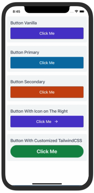
Button
Description:
This is a clickable component and can execute functions passed as an argument (onPress). Accepts icons and texts as parameters.
Samples
Try using Expo: https://snack.expo.dev/@paulorieck/amplifi-ui---mobile---button?platform=ios
import * as React from 'react';
import { Text, SafeAreaView, StyleSheet, ScrollView } from 'react-native';
import { Card, Button, H2 } from '@amplifiui/mobile';

import RightIcon from './icons/arrow-right-white';

import tw from './services/tw';

export default function App() {
  return (
    <SafeAreaView>
      <ScrollView style={tw`p-2 mt-10`}>
        <Card tw={tw} style={tw`bg-gray-100 mb-4`}>
          <H2 tw={tw} style={tw`pb-2`}>Button Vanilla</H2>
          <Button tw={tw} onPress={() => console.log('You clicked on me!')}>Click Me</Button>
        </Card>
        <Card tw={tw} style={tw`bg-gray-100 mb-4`}>
          <H2 tw={tw} style={tw`pb-2`}>Button Primary</H2>
          <Button tw={tw} type="primary" onPress={() => console.log('You clicked on me!')}>Click Me</Button>
        </Card>
        <Card tw={tw} style={tw`bg-gray-100 mb-4`}>
          <H2 tw={tw} style={tw`pb-2`}>Button Secondary</H2>
          <Button tw={tw} type="secondary" onPress={() => console.log('You clicked on me!')}>Click Me</Button>
        </Card>
        <Card tw={tw} style={tw`bg-gray-100 mb-4`}>
          <H2 tw={tw} style={tw`pb-2`}>Button With Icon on The Right</H2>
          <Button tw={tw} onPress={() => console.log('You clicked on me!')} iconRight={RightIcon}>Click Me</Button>
        </Card>
        <Card tw={tw} style={tw`bg-gray-100 mb-4`}>
          <H2 tw={tw} style={tw`pb-2`}>Button With Customized TailwindCSS</H2>
          <Button
            tw={tw}
            onPress={() => console.log('You clicked on me!')}
            style={tw`bg-green-700 rounded-full`}
            textStyle={tw`text-gray-100 font-bold text-2xl`}
          >
            Click Me
          </Button>
        </Card>
        <Card tw={tw} style={tw`bg-gray-100 mb-4`}>
          <H2 tw={tw} style={tw`pb-2`}>Button with Loading Indicator</H2>
          <Button
            tw={tw}
            onPress={() => console.log('You clicked on me!')}
            style={tw`bg-orange-700`}
            textStyle={tw`text-gray-100`}
            isLoading={true}
          >
            Click Me
          </Button>
        </Card>
      </ScrollView>
    </SafeAreaView>
  );
}
Props:
| Variable | Value Type | Default | Mandatory | Notes |
|---|---|---|---|---|
| tw | Tailwind Function | _ | _ | |
| style | Tailwind Style | _ | This style is applied to the container View | |
| textStyle | Tailwind Style | _ | This style is applied directly to the Text component | |
| children | String | _ | The children props are limited to strings. | |
| type | 'primary' OR 'secondary' | _ | If defined applies the default primary or secondary colors as button color | |
| onPress | () => void | _ | Defines the function that will be executed when button pressed. | |
| iconLeft | SVG string | _ | If defined will add an icon to the left of the text. | |
| iconRight | SVG string | _ | If defined will add an icon to the right of the text. | |
| loadingIcon | SVG string | _ | Has a default icon, if defined replaces this default icon | |
| loadingStyle | Tailwind Style | _ | _ | |
| isLoading | boolean | false | _ |
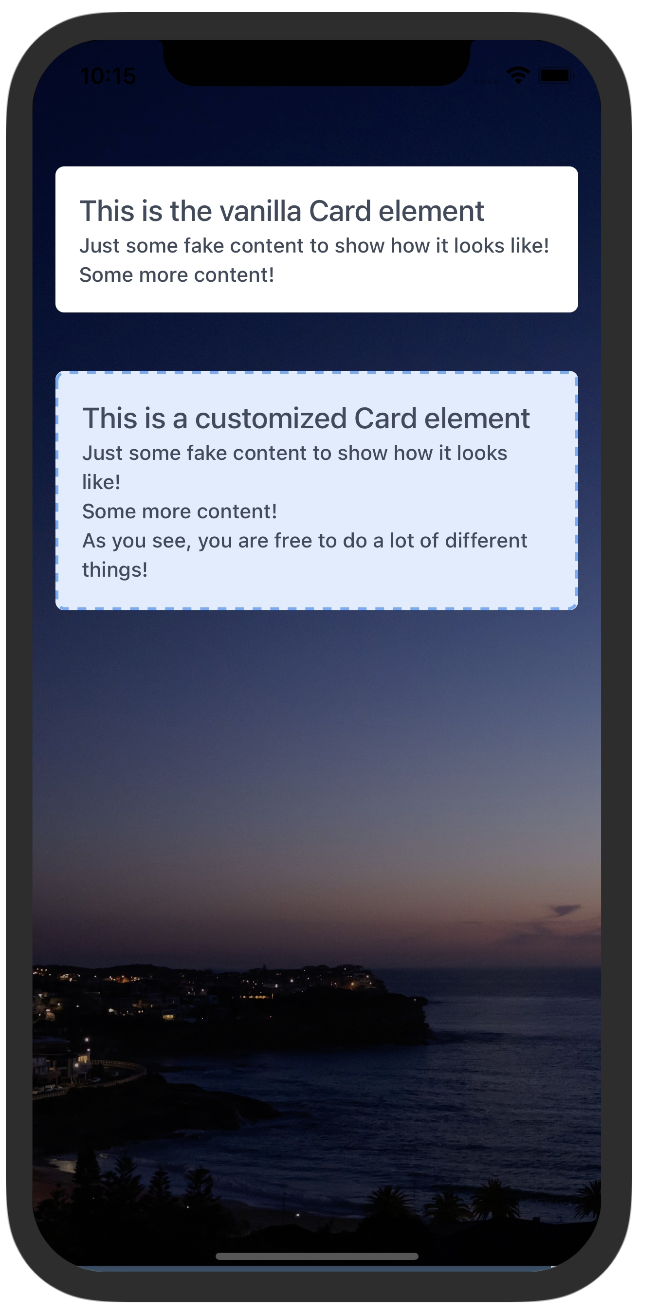
Card
Description:
This is a div that has a shadow around it and rounded corners.
Samples
Try using Expo: https://snack.expo.dev/@paulorieck/amplifi-ui---mobile---card?platform=ios
import * as React from 'react';
import { Text, View, StyleSheet } from 'react-native';
import { Card, Button, H2, BackgroundImage, Paragraph } from '@amplifiui/mobile';

import Background from './assets/pexels-tieu-linh-11635802.jpg';

import tw from './services/tw';

export default function App() {
  return (
    <BackgroundImage
      tw={tw}
      mask="bg-black/40"
      image={Background}
    >
      <View>
        <Card tw={tw} style={tw`mt-10 mx-4`}>
          <H2 tw={tw}>This is the vanilla Card element</H2>
          <Paragraph tw={tw}>Just some fake content to show how it looks like!</Paragraph>
          <Paragraph tw={tw}>Some more content!</Paragraph>
        </Card>
        <Card tw={tw} style={tw`mt-10 mx-4 border-2 border-dashed border-blue-400 bg-blue-100`}>
          <H2 tw={tw}>This is a customized Card element</H2>
          <Paragraph tw={tw}>Just some fake content to show how it looks like!</Paragraph>
          <Paragraph tw={tw}>Some more content!</Paragraph>
          <Paragraph tw={tw}>As you see, you are free to do a lot of different things!</Paragraph>
        </Card>
      </View>
    </BackgroundImage>
  );
}
Props:
| Variable | Value Type | Default | Mandatory | Notes |
|---|---|---|---|---|
| tw | Tailwind Function | _ | _ | |
| style | Tailwind Style | _ | This style is applied to the container View | |
| children | String | _ | The children props are limited to strings. |
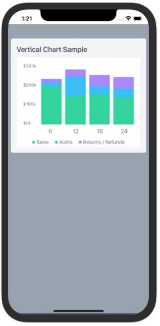
Charts
VerticalBars
Description:
This component renders vertical bars charts
Samples
Try using Expo: https://snack.expo.dev/@paulorieck/amplifi-ui---mobile---charts---vertical-bars?platform=ios
import * as React from 'react';
import { Text, View, StyleSheet, Dimensions } from 'react-native';
import { Card, Button, H2, VerticalBars } from '@amplifiui/mobile';

import tw from './services/tw';

const chartData = {
  values: {
    '6': {
      Sales: {amount: 200000, transactions: 20},
      Auths: {amount: 20000, transactions: 20},
      'Returns / Refunds': {amount: 20000, transactions: 20},
    }, // 290k
    '12': {
      Sales: {amount: 150000, transactions: 30},
      Auths: {amount: 100000, transactions: 30},
      'Returns / Refunds': {amount: 40000, transactions: 30},
    }, // 290k
    '18': {
      Sales: {amount: 160000, transactions: 40},
      Auths: {amount: 40000, transactions: 40},
      'Returns / Refunds': {amount: 60000, transactions: 40},
    }, // 260k
    '24': {
      Sales: {amount: 140000, transactions: 50},
      Auths: {amount: 50000, transactions: 50},
      'Returns / Refunds': {amount: 60000, transactions: 50},
    }, // 250k
  },
};

const windowWidth = Dimensions.get('window').width;

export default function App() {
  return (
    <View style={tw`flex-1 p-2 mt-10 bg-gray-400`}>
      <Card tw={tw} style={tw`bg-gray-100 mb-4 mt-8`}>
        <H2 tw={tw} style={tw`pb-2`}>Vertical Chart Sample</H2>
        <View style={tw`h-62`}>
          <VerticalBars
            tw={tw}
            style={tw`bg-white flex-1`}
            data={chartData}
            width={windowWidth - 84}
            height={210}
            scaleSize={400000}
            fontColor="#6B7280"
          />
        </View>
      </Card>
    </View>
  );
}
Props
| Variable | Value Type | Default | Mandatory | Notes |
|---|---|---|---|---|
| tw | Tailwind Function | _ | _ | |
| style | Tailwind Style | _ | This style is applied to the container View | |
| labelingStyle | Tailwind Style | _ | This style is applied to the charts labels | |
| data | See details bellow | _ | _ | |
| colorsArray | string[] | ['#34D399', '#38BDF8', '#A78BFA'] | _ | |
| width | number | _ | _ | |
| height | number | _ | _ | |
| scaleSize | number | _ | This is the maximum number to be displayed on the chart scale | |
| showLabels | boolean | true | Display labels on the chart, or not | |
| fontColor | Hexadecimal color code | #6B7280 | Changes the color for all texts on the chart | |
| notSelectedColor | Hexadecimal color code | #D1D5DB | The color of the non selected columns | |
| balloonData | Under construction | |||
| setBalloonData | Under construction |
CollapsibleModal
Description:
This component presents a collapsible modal to the user. The user, by dragging the "header" of the modal can close it.
Samples
Try using Expo: https://snack.expo.dev/@paulorieck/amplifi-ui---mobile---collapsible-modal?platform=ios
import * as React from 'react';
import { View, Text, StyleSheet, ScrollView, SafeAreaView } from 'react-native';
import { Card, Button, H2, CollapsibleModal } from '@amplifiui/mobile';
import { SafeAreaProvider } from 'react-native-safe-area-context';
import tw from './services/tw';
export default function App() {
const [isModalVisible, setModalVisible] = React.useState(true);
return (
<SafeAreaProvider>
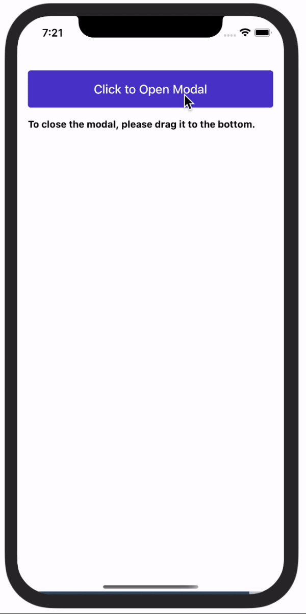
<Button
tw={tw}
style={tw`mt-20 mx-4`}
onPress={() => setModalVisible(true)}>
Click to Open Modal
</Button>
<Text style={tw`mt-4 mx-4 font-bold`}>
To close the modal, please drag it to the bottom.
</Text>
<CollapsibleModal
tw={tw}
maxHeight={290}
show={isModalVisible}
setShow={() => setModalVisible(!isModalVisible)}>
<Text style={tw`mt-4 mx-4 font-bold text-center`}>
This is the modal content
</Text>
<Text style={tw`mt-4 mx-4 font-bold text-center`}>
To close the modal, please drag it to the bottom.
</Text>
<Text style={tw`mt-4 mx-4 font-bold text-center`}>
OR
</Text>
<Button
tw={tw}
style={tw`mt-4 mx-4`}
onPress={() => setModalVisible(false)}>
Click to Close Modal
</Button>
</CollapsibleModal>
</SafeAreaProvider>
);
}
Props
| Variable | Value Type | Default | Mandatory | Notes |
|---|---|---|---|---|
| tw | Tailwind Function | _ | _ | |
| children | JSX.Element | JSX.Element[] | _ | The children props are limited to strings. | |
| maxHeight | maxHeight | _ | This is mandatory and determines the height of the modal. | |
| show | boolean | _ | If true shows the modal. | |
| setShow | () => void | _ | This is the callback to update the modal state (opened/closed) |
Forms
InputNumber
Description:
This component is a subset of the InputText created specifically to receive numbers.
Samples
Try using Expo: https://snack.expo.dev/@paulorieck/amplifi-ui---forms--input-number?platform=ios
import * as React from 'react';
import { View, Text, SafeAreaView } from 'react-native';
import { Card, Button, CollapsibleModal, InputNumber, H3 } from '@amplifiui/mobile';
import { SafeAreaProvider } from 'react-native-safe-area-context';
import tw from './services/tw';
import MoneyIcon from './icons/money';
export default function App() {
return (
<SafeAreaView style={tw`mt-8 bg-gray-200 flex-1`}>
<View style={tw`m-4`}>
<Card tw={tw} style={tw`mt-4 shadow`}>
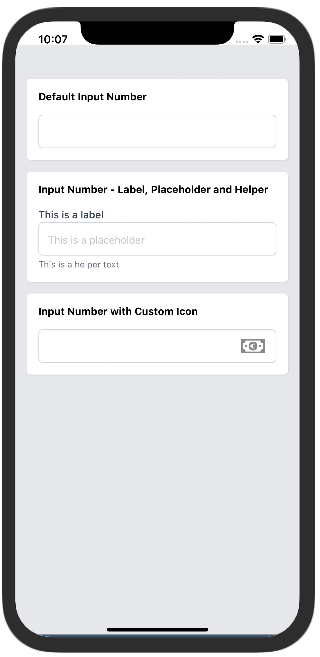
<Text style={tw`mb-4 font-bold`}>
Default Input Number
</Text>
<InputNumber tw={tw} onChangeText={() => null} value={0} />
</Card>
<Card tw={tw} style={tw`mt-4 font-bold shadow`}>
<Text style={tw`mb-4 font-bold`}>
Input Number - Label, Placeholder and Helper
</Text>
<InputNumber
tw={tw}
onChangeText={() => null}
value={0}
label="This is a label"
placeholder="This is a placeholder"
helper="This is a helper text"
/>
</Card>
<Card tw={tw} style={tw`mt-4 shadow`}>
<Text style={tw`mb-4 font-bold`}>
Input Number with Custom Icon
</Text>
<InputNumber
tw={tw}
onChangeText={() => null}
value={0}
icon={MoneyIcon}
iconStyle={tw`mx-4`}
/>
</Card>
</View>
</SafeAreaView>
);
}
Props
| Variable | Value Type | Default | Mandatory | Notes |
|---|---|---|---|---|
| tw | Tailwind Function | _ | _ | |
| label | string | _ | Text that goes over the input field. | |
| placeholder | string | _ | Text that goes inside the input field if value is empty. | |
| helper | string | _ | Text that goes under the input field. | |
| style | Tailwind Style | _ | This style is applied to the container View | |
| labelStyle | Tailwind Style | _ | This style is applied specifically to the label. | |
| inputStyle | Tailwind Style | _ | This style is applied specifically to the input. | |
| helperStyle | Tailwind Style | _ | This style is applied specifically to the helper text. | |
| icon | Valid SVG string | _ | This is an optional icon that can be displayed by the end of the input. | |
| iconStyle | Tailwind Style | _ | This style is applied specifically to the icon. | |
| onChangeText | (value: string) => void | _ | Callback when the text changes. | |
| value | string | _ | Value for the input field. | |
| inputType | 'primary' | 'secondary' | _ | If selected, the project primary or secondary colors will be applied. | |
| helperType | 'primary' | 'secondary' | _ | Shows the helper text with primary or secondary colors. | |
| error | string | _ | Replaces the helper text (same position). Used to return errors from the API | |
| errorStyle | Tailwind Style | _ | This style is applied specifically to the error text. | |
| keyboardType | RN KeyboardTypeOptions | _ | Defines the type of keyboards that will be presented to the user. | |
| onBlur | NativeSyntheticEvent | _ | Detects when the user leaves the input field. Used in combination with Formik. |
InputPassword
Description:
This component is a subset of the InputText created specifically to process passwords.
Samples
Try using Expo: https://snack.expo.dev/@paulorieck/amplifi-ui---forms--input-password?platform=ios
import * as React from 'react';
import { View, Text, SafeAreaView } from 'react-native';
import { Card, Button, InputPassword } from '@amplifiui/mobile';
import { SafeAreaProvider } from 'react-native-safe-area-context';
import tw from './services/tw';
import Visible from './icons/eye-on';
import Invisible from './icons/eye-off';
export default function App() {
const [password1, setPassword1] = React.useState('');
const [password2, setPassword2] = React.useState('');
return (
<SafeAreaView style={tw`mt-8 bg-gray-200 flex-1`}>
<View style={tw`m-4`}>
<Card tw={tw} style={tw`mt-4 shadow`}>
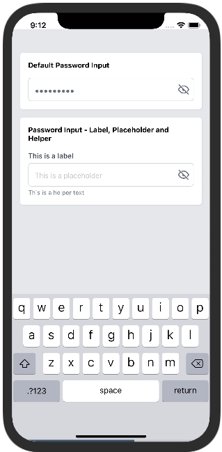
<Text style={tw`mb-4 font-bold`}>
Default Password Input
</Text>
<InputPassword
tw={tw}
onChangeText={(e) => console.log(e)}
value={password1}
visibleIcon={Visible}
invisibleIcon={Invisible}
/>
</Card>
<Card tw={tw} style={tw`mt-4 font-bold shadow`}>
<Text style={tw`mb-4 font-bold`}>
Password Input - Label, Placeholder and Helper
</Text>
<InputPassword
tw={tw}
onChangeText={setPassword2}
value={password2}
label="This is a label"
placeholder="This is a placeholder"
helper="This is a helper text"
visibleIcon={Visible}
invisibleIcon={Invisible}
/>
</Card>
</View>
</SafeAreaView>
);
}
Props
| Variable | Value Type | Default | Mandatory | Notes |
|---|---|---|---|---|
| tw | Tailwind Function | _ | _ | |
| label | string | _ | Text that goes over the input field. | |
| placeholder | string | _ | Text that goes inside the input field if value is empty. | |
| helper | string | _ | Text that goes under the input field. | |
| style | Tailwind Style | _ | This style is applied to the container View | |
| labelStyle | Tailwind Style | _ | This style is applied specifically to the label. | |
| inputStyle | Tailwind Style | _ | This style is applied specifically to the input. | |
| textInputStyle | Tailwind Style | _ | This style is applied specifically to the input text. | |
| helperStyle | Tailwind Style | _ | This style is applied specifically to the helper text. | |
| invisibleIcon | Valid SVG string | _ | This icon is displayed when the password is invisible. | |
| visibleIcon | Valid SVG string | _ | This icon is displayed when the password is visible. | |
| iconStyle | Tailwind Style | _ | This style is applied specifically to the icons. | |
| onChangeText | (value: string) => void | _ | Callback when the text changes. | |
| value | string | _ | Value for the input field. | |
| inputType | 'primary' | 'secondary' | _ | If selected, the project primary or secondary colors will be applied. | |
| helperType | 'primary' | 'secondary' | _ | Shows the helper text with primary or secondary colors. | |
| error | string | _ | Replaces the helper text (same position). Used to return errors from the API | |
| errorStyle | Tailwind Style | _ | This style is applied specifically to the error text. | |
| onBlur | NativeSyntheticEvent | _ | Detects when the user leaves the input field. Used in combination with Formik. |
InputText
Description:
This component was designed specifically to receive strings.
Samples
Try using Expo: https://snack.expo.dev/@paulorieck/amplifi-ui---forms--input-text?platform=ios
import * as React from 'react';
import { View, Text, SafeAreaView } from 'react-native';
import { Card, Button, CollapsibleModal, InputText, H3 } from '@amplifiui/mobile';
import { SafeAreaProvider } from 'react-native-safe-area-context';

import tw from './services/tw';

import MoneyIcon from './icons/money';

export default function App() {
  const [text1, setText1] = React.useState('');
  const [text2, setText2] = React.useState('');
  const [text3, setText3] = React.useState('');

  return (
    <SafeAreaView style={tw`bg-gray-200 flex-1`}>
      <View style={tw`m-4`}>
        <Card tw={tw} style={tw`mt-4 shadow`}>
          <Text style={tw`mb-4 font-bold`}>
            Default Input Text
          </Text>
          <InputText
            tw={tw}
            onChangeText={setText1}
            value={text1}
          />
        </Card>
        <Card tw={tw} style={tw`mt-4 font-bold shadow`}>
          <Text style={tw`mb-4 font-bold`}>
            Input Text - Label, Placeholder and Helper
          </Text>
          <InputText
            tw={tw}
            onChangeText={setText2}
            value={text2}
            label="This is a label"
            placeholder="This is a placeholder"
            helper="This is a helper text"
          />
        </Card>
        <Card tw={tw} style={tw`mt-4 shadow`}>
          <Text style={tw`mb-4 font-bold`}>
            Input Text with Custom Icon
          </Text>
          <InputText
            tw={tw}
            onChangeText={setText3}
            value={text3}
            icon={MoneyIcon}
            iconStyle={tw`mx-4`}
          />
        </Card>
      </View>
    </SafeAreaView>
  );
}
Props
| Variable | Value Type | Default | Mandatory | Notes |
|---|---|---|---|---|
| tw | Tailwind Function | _ | _ | |
| label | string | _ | Text that goes over the input field. | |
| placeholder | string | _ | Text that goes inside the input field if value is empty. | |
| helper | string | _ | Text that goes under the input field. | |
| style | Tailwind Style | _ | This style is applied to the container View | |
| labelStyle | Tailwind Style | _ | This style is applied specifically to the label. | |
| inputStyle | Tailwind Style | _ | This style is applied specifically to the input. | |
| helperStyle | Tailwind Style | _ | This style is applied specifically to the helper text. | |
| icon | Valid SVG string | _ | This is an optional icon that can be displayed by the end of the input. | |
| iconStyle | Tailwind Style | _ | This style is applied specifically to the icon. | |
| onChangeText | (value: string) => void | _ | Callback when the text changes. | |
| value | string | _ | Value for the input field. | |
| inputType | 'primary' | 'secondary' | _ | If selected, the project primary or secondary colors will be applied. | |
| helperType | 'primary' | 'secondary' | _ | Shows the helper text with primary or secondary colors. | |
| error | string | _ | Replaces the helper text (same position). Used to return errors from the API | |
| errorStyle | Tailwind Style | _ | This style is applied specifically to the error text. | |
| keyboardType | RN KeyboardTypeOptions | _ | Defines the type of keyboards that will be presented to the user. | |
| onBlur | NativeSyntheticEvent | _ | Detects when the user leaves the input field. Used in combination with Formik. |
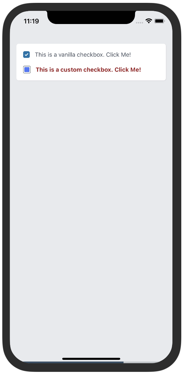
Checkbox
Description:
This component renders a checkbox element to be used on forms.
Samples
Try using Expo: https://snack.expo.dev/@paulorieck/amplifi-ui---mobile---forms---checkbox?platform=ios
import * as React from 'react';
import { View, Text, SafeAreaView } from 'react-native';
import { Card, Button, InputPassword, Checkbox } from '@amplifiui/mobile';
import { SafeAreaProvider } from 'react-native-safe-area-context';

import tw from './services/tw';

import CustomCheck from './icons/custom-check';

export default function App() {
  const [check1Selected, setCheck1Selected] = React.useState(true);
  const [check2Selected, setCheck2Selected] = React.useState(true);

  return (
    <SafeAreaView style={tw`bg-gray-200 flex-1`}>
      <View style={tw`m-4`}>
        <Card tw={tw} style={tw`mt-4 shadow`}>
          <Checkbox
            tw={tw}
            label="This is a vanilla checkbox. Click Me!"
            value={check1Selected}
            onPress={() => setCheck1Selected(!check1Selected)}
          />
          <Checkbox
            tw={tw}
            style={tw`mt-4`}
            label="This is a custom checkbox. Click Me!"
            labelStyle={tw`text-red-800 font-bold`}
            checkboxStyle={tw`h-[18px] w-[18px] rounded-[3px] border-[#505D68] border bg-white`}
            checkedCheckboxStyle={tw`bg-white`}
            iconWidth={12}
            iconHeight={12}
            value={check2Selected}
            onPress={() => setCheck2Selected(!check2Selected)}
            icon={CustomCheck}
          />
        </Card>
      </View>
    </SafeAreaView>
  );
}
Props
| Variable | Value Type | Default | Mandatory | Notes |
|---|---|---|---|---|
| tw | Tailwind Function | _ | _ | |
| style | Tailwind Style | _ | This style is applied to the container View | |
| label | string | _ | Text that is shown beside the checkbox (right side). | |
| labelStyle | Tailwind Style | _ | Defines the style for the label. | |
| checkboxStyle | Tailwind Style | _ | Defines the style for the checkbox. | |
| checkedCheckboxStyle | Tailwind Style | _ | Defines the style for the checked checkbox. | |
| value | boolean | _ | Defines if the checkbox is checked or not. | |
| onPress | () => void | _ | Callback when the Checkbox is clicked. | |
| icon | SVG String | _ | To set a custom icon, is displayed when checked. | |
| iconWidth | number | _ | To define a custom width to the icon. | |
| iconHeight | number | _ | To define a custom height to the icon. |
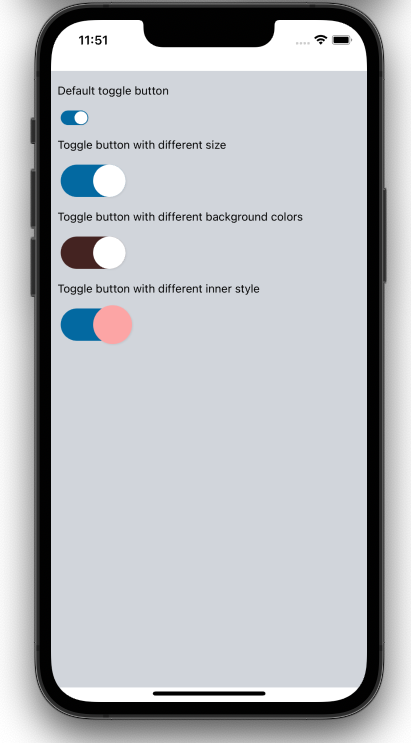
ToggleButton
Description:
This component renders a toggle switch element to be used on forms.
Samples
Try using Expo: https://snack.expo.dev/@jguilhermesl/amplifi-ui---mobile---togglebutton?platform=ios
import * as React from 'react';
import { SafeAreaView, ScrollView } from 'react-native';
import { ToggleButton } from '@amplifiui/mobile';

import tw from './services/tw';

export default function App() {
  const [state, setState] = React.useState(false);

  return (
    <SafeAreaView>
      <ScrollView style={tw`p-2 mt-4 h-full flex flex-col bg-gray-300 py-4`}>
        <ToggleButton
          label="Default toggle button"
          style={tw`mt-4`}
          tw={tw}
          value={state}
          onToggle={() => setState(!state)}
        />
        <ToggleButton
          widthView={80}
          label="Toggle button with different size"
          labelStyle={tw`mt-4`}
          style={tw`mt-4 w-20 h-10`}
          innerStyle={tw`w-10 h-10`}
          tw={tw}
          value={state}
          onToggle={() => setState(!state)}
        />
        <ToggleButton
          widthView={80}
          onColor="#442321"
          offColor="#212121"
          label="Toggle button with different background colors"
          labelStyle={tw`mt-4`}
          style={tw`mt-4 w-20 h-10`}
          innerStyle={tw`w-10 h-10`}
          tw={tw}
          value={state}
          onToggle={() => setState(!state)}
        />
        <ToggleButton
          widthView={80}
          label="Toggle button with different inner style"
          labelStyle={tw`mt-4`}
          style={tw`mt-4 w-20 h-10`}
          innerStyle={tw`w-12 h-12 bg-red-300`}
          tw={tw}
          value={state}
          onToggle={() => setState(!state)}
        />
      </ScrollView>
    </SafeAreaView>
  );
}
Props
| Variable | Value Type | Default | Mandatory | Notes |
|---|---|---|---|---|
| tw | Tailwind Function | _ | _ | |
| onColor | string | #0369A1 | Background color when toggle is on. | |
| offColor | string | #ecf0f1 | Background color when toggle is off. | |
| label | string | _ | Text that is shown beside the toggle button. | |
| style | Tailwind Style |
tw`w-8.5 h-4.5 ml-1 rounded-25 justify-center` |
This style is applied to the container View | |
| value | boolean | _ | Toggle button value, this property defines if the button is active or not. | |
| labelStyle | string | _ | This style is applied to the label. | |
| innerStyle | string |
tw`w-4 h-4 bg-white rounded-25 shadow-black shadow` |
This style is applied to the inner View. | |
| onToggle | string | _ | Function that must be called when the toggle is clicked. | |
| widthView | string | _ | This prop is mandatory when the width of the View container is changed. | Width in px of the container view |
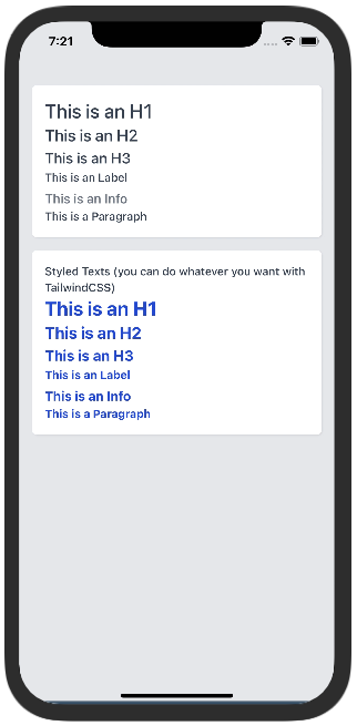
Typography
Description:
A group of components to render text on the screen.
Samples
Try using Expo: https://snack.expo.dev/@paulorieck/amplifi-ui---text-typography?platform=ios
import * as React from 'react';
import { View, SafeAreaView } from 'react-native';
import { Card, H1, H2, H3, Label, Info, Paragraph } from '@amplifiui/mobile';
import { SafeAreaProvider } from 'react-native-safe-area-context';

import tw from './services/tw';

export default function App() {
  return (
    <SafeAreaView style={tw`bg-gray-200 flex-1`}>
      <View style={tw`m-4`}>
        <Card tw={tw} style={tw`mt-4 shadow`}>
          <H1 tw={tw}>This is an H1</H1>
          <H2 tw={tw}>This is an H2</H2>
          <H3 tw={tw}>This is an H3</H3>
          <Label tw={tw}>This is an Label</Label>
          <Info tw={tw}>This is an Info</Info>
          <Paragraph tw={tw}>This is a Paragraph</Paragraph>
        </Card>
        <Card tw={tw} style={tw`mt-4 shadow`}>
          <Paragraph tw={tw}>Styled Texts (you can do whatever you want with TailwindCSS)</Paragraph>
          <H1 tw={tw} style={tw`font-bold text-blue-700`}>This is an H1</H1>
          <H2 tw={tw} style={tw`font-bold text-blue-700`}>This is an H2</H2>
          <H3 tw={tw} style={tw`font-bold text-blue-700`}>This is an H3</H3>
          <Label tw={tw} style={tw`font-bold text-blue-700`}>This is an Label</Label>
          <Info tw={tw} style={tw`font-bold text-blue-700`}>This is an Info</Info>
          <Paragraph tw={tw} style={tw`font-bold text-blue-700`}>This is a Paragraph</Paragraph>
        </Card>
      </View>
    </SafeAreaView>
  );
}
Props
For ALL of the text components:
| Variable | Value Type | Default | Mandatory | Notes |
|---|---|---|---|---|
| tw | Tailwind Function | _ | _ | |
| style | Tailwind Style | _ | This style is applied to the container View | |
| children | string | _ | Text that goes over the input field. |
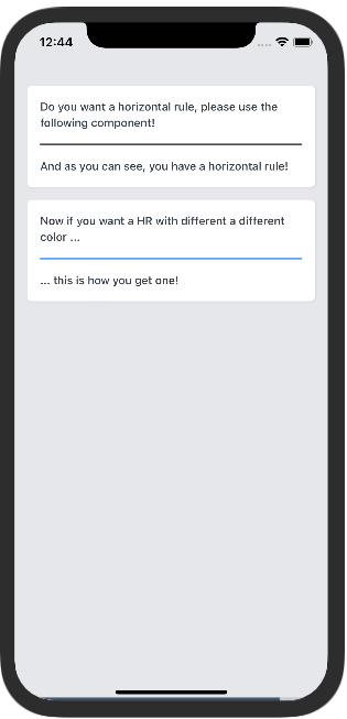
HR
Description:
This component implements a Horizontal Rule.
Samples
Try using Expo: https://snack.expo.dev/@paulorieck/amplifi-ui---mobile---hr?platform=ios
import * as React from 'react';
import { View, SafeAreaView } from 'react-native';
import { Card, HR, Paragraph } from '@amplifiui/mobile';
import { SafeAreaProvider } from 'react-native-safe-area-context';

import tw from './services/tw';

export default function App() {
  return (
    <SafeAreaView style={tw`bg-gray-200 flex-1`}>
      <View style={tw`m-4`}>
        <Card tw={tw} style={tw`mt-4 shadow`}>
          <Paragraph tw={tw}>
            Do you want a horizontal rule, please use the following component!
          </Paragraph>
          <HR tw={tw} style={tw`my-4`} />
          <Paragraph tw={tw}>
            And as you can see, you have a horizontal rule!
          </Paragraph>
        </Card>
        <Card tw={tw} style={tw`mt-4 shadow`}>
          <Paragraph tw={tw}>
            Now if you want a HR with different a different color ...
          </Paragraph>
          <HR tw={tw} style={tw`my-4`} color="blue-400" />
          <Paragraph tw={tw}>
            ... this is how you get one!
          </Paragraph>
        </Card>
      </View>
    </SafeAreaView>
  );
}
Props
| Variable | Value Type | Default | Mandatory | Notes |
|---|---|---|---|---|
| tw | Tailwind Function | _ | _ | |
| color | Tailwind Color | black | Tailwind Color, i.e. blue-400 | |
| style | Tailwind Style | _ | This style is applied to the container View |
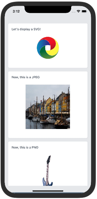
Image
Description:
This component makes it possible to render SVGs, JPEGs and PNGs on mobile.
Samples
Try using Expo: https://snack.expo.dev/@paulorieck/amplifi-ui---mobile---image?platform=ios
import * as React from 'react';
import { View, SafeAreaView, ScrollView } from 'react-native';
import { Card, Paragraph, Image } from '@amplifiui/mobile';
import { SafeAreaProvider } from 'react-native-safe-area-context';

import tw from './services/tw';

import SVGSample from './assets/svg';
import JPEGSample from './assets/pexels-william-larsen-11515591.jpg';
import PNGSample from './assets/2cd43b_eafff063f69f4ea8b65b3ae32ca62cb8_mv2.png';

export default function App() {
  return (
    <SafeAreaView style={tw`bg-gray-200 flex-1`}>
      <ScrollView>
        <View style={tw`m-4`}>
          <Card tw={tw} style={tw`mt-4 shadow`}>
            <Paragraph tw={tw}>
              Let's display a SVG!
            </Paragraph>
            <View style={tw`flex-row justify-center my-6`}>
              <Image
                tw={tw}
                svg={SVGSample}
                width={100}
                height={100}
                style={tw`h-25`}
              />
            </View>
          </Card>
          <Card tw={tw} style={tw`mt-4 shadow`}>
            <Paragraph tw={tw}>
              Now, this is a JPEG
            </Paragraph>
            <View style={tw`flex-row justify-center my-6`}>
              <Image
                tw={tw}
                src={JPEGSample}
                width={200}
                height={200}
              />
            </View>
          </Card>
          <Card tw={tw} style={tw`mt-4 shadow`}>
            <Paragraph tw={tw}>
              Now, this is a PNG
            </Paragraph>
            <View style={tw`flex-row justify-center my-6`}>
              <Image
                tw={tw}
                src={PNGSample}
                width={70}
                height={200}
              />
            </View>
          </Card>
        </View>
      </ScrollView>
    </SafeAreaView>
  );
}
Props
| Variable | Value Type | Default | Mandatory | Notes |
|---|---|---|---|---|
| tw | Tailwind Function | _ | _ | |
| style | Tailwind Style | _ | This style is applied to the container View | |
| svg | SVG String | _ | When it's a SVG image, this prop needs to be informed. | |
| src | ImageSourcePropType | _ | When it's a JPEG or PNG image, this prop needs to be informed. | |
| width | number | _ | The width of the image | |
| height | number | _ | The height of the image |
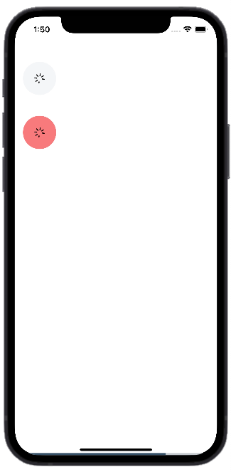
LoadingRound
Description:
This component can be used to show the loading state.
Samples
Try using Expo: https://aa
import { SvgXml } from "react-native-svg"
import { View, SafeAreaView } from 'react-native';
import { LoadingRound } from '@amplifiui/mobile';
import tw from './services/tw';

import Icon from "./icon/index"

export default function App() {
  return (
    <SafeAreaView>
      <View style={tw`mt-10 mx-4`}>
        <LoadingRound tw={tw} children={<SvgXml xml={Icon} width={20} height={20} />} />
        <LoadingRound tw={tw} style={tw`bg-red-300 mt-10`} children={<SvgXml xml={Icon} width={20} height={20} />} />
      </View>
    </SafeAreaView>
  );
}
Props
| Variable | Value Type | Default | Mandatory | Notes |
|---|---|---|---|---|
| tw | Tailwind Function | _ | _ | |
| style | Tailwind Style | _ | This style is applied to the container View. | |
| children | JSX.Element | JSX.Element[] | _ | Component that will be rendered and will remain rotating. | |
| time | number | 3000 | Duration of one spinner turn. |
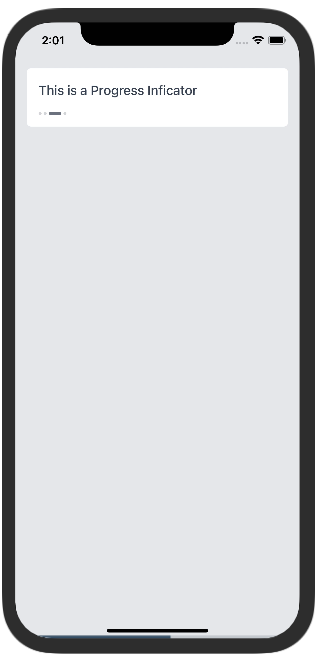
ProgressSteps
Description:
This component shows progress.
Samples
Try using Expo: https://snack.expo.dev/@paulorieck/amplifi-ui---mobile---progress-indicator?platform=ios
import * as React from 'react';
import { View, SafeAreaView } from 'react-native';
import { Card, Paragraph, Image, ProgressSteps, H3, Button } from '@amplifiui/mobile';
import { SafeAreaProvider } from 'react-native-safe-area-context';

import tw from './services/tw';

export default function App() {
  const [card1Indicator, setCard1Indicator] = React.useState(1);
  const [card2Indicator, setCard2Indicator] = React.useState(1);

  return (
    <SafeAreaView style={tw`bg-gray-200 flex-1`}>
      <View style={tw`m-4`}>
        <Card tw={tw} style={tw`mb-4`}>
          <H3 tw={tw} style={tw`mb-4`}>
            This is a Vanilla Progress Indicator
          </H3>
          <ProgressSteps tw={tw} steps={4} current={card1Indicator} />
          <View style={tw`flex-row justify-around m-4`}>
            <Button
              tw={tw}
              style={tw`flex-1 mr-2`}
              onPress={() => setCard1Indicator(card1Indicator-1 < 0 ? 3 : card1Indicator-1)}>
              Prev
            </Button>
            <Button
              tw={tw}
              style={tw`flex-1 ml-2`}
              onPress={() => setCard1Indicator(card1Indicator+1 > 3 ? 0 : card1Indicator+1)}>
              Next
            </Button>
          </View>
        </Card>
        <Card tw={tw} style={tw`mb-4`}>
          <H3 tw={tw} style={tw`mb-4`}>
            This is a custom Progress Indicator
          </H3>
          <ProgressSteps
            tw={tw}
            steps={4}
            current={2}
            space={4}
            width={32}
            unselectedWidth={12}
            selectedColor="#408E5A"
            unselectedColor="#D6D6D6"
          />
          <View style={tw`flex-row justify-around m-4`}>
            <Button
              tw={tw}
              style={tw`flex-1 mr-2`}
              onPress={() => setCard2Indicator(card2Indicator-1 < 0 ? 3 : card2Indicator-1)}>
              Prev
            </Button>
            <Button
              tw={tw}
              style={tw`flex-1 ml-2`}
              onPress={() => setCard1Indicator(card2Indicator+1 > 3 ? 0 : card2Indicator+1)}>
              Next
            </Button>
          </View>
        </Card>
      </View>
    </SafeAreaView>
  );
}
Props
| Variable | Value Type | Default | Mandatory | Notes |
|---|---|---|---|---|
| tw | Tailwind Function | _ | _ | |
| style | Tailwind Style | _ | This style is applied to the container View | |
| steps | number | _ | The number of steps on the progress indicator | |
| current | number | _ | The current step of the indicator. | |
| space | number | 3 | Defines the space between indicators. | |
| width | number | 17 | Defines the width for the selected indicator. | |
| diameter | number | 4 | Defines the diameter of the unselected indicator. | |
| selectedColor | string | #6B7280 | Defines the color for the selected indicator. | |
| unselectedColor | string | #6B7280 | Defines the color for the unselected indicators. | |
| opacity | number | 0.3 | Defines the opacity for the unselected indicators. | |
| radius | number | 2 | Defines the round radius of the indicators. | |
| unselectedWidth | number | 4 | Defines the length of the unselected indicators. |
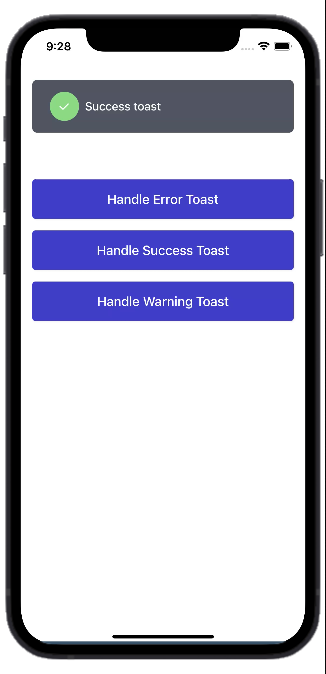
ToastMessage
Description:
This component allows you to add notifications to your app.
Samples
Try using Expo: https://snack.expo.dev/@jguilhermesl/amplifi-ui---mobile---toastmessage?platform=ios
import * as React from 'react';
import { View, SafeAreaView } from 'react-native';
import { ToastMessage, Button } from '@amplifiui/mobile';
import tw from './services/tw';

interface PropsToastState {
  state: boolean;
  label: string;
  type: 'error' | 'success' | 'warning';
}

export default function App() {
  const [toast, setToast] = React.useState<PropsToastState>({
    state: true,
    label: '',
    type: 'success',
  });

  const handleToast = (
    type: 'error' | 'success' | 'warning',
    label: string
  ) => {
    setToast({
      state: true,
      label,
      type,
    });
  };

  return (
    <SafeAreaView>
      <View style={tw`mx-4`}>
        <Button
          onPress={() => handleToast('error', 'Error toast')}
          tw={tw}
          style={tw`mt-40`}
          children="Handle Error Toast"
        />
        <Button
          onPress={() => handleToast('success', 'Success toast')}
          tw={tw}
          style={tw`mt-4`}
          children="Handle Success Toast"
        />
        <Button
          onPress={() => handleToast('warning', 'Warning toast')}
          tw={tw}
          style={tw`mt-4`}
          children="Handle Warning Toast"
        />
        <ToastMessage
          duration={200}
          timeout={2000}
          tw={tw}
          show={toast.state}
          children={toast.label}
          type={toast.type}
          showCallback={(value: boolean) => setToast({
            ...toast,
            state: value
          })}
        />
      </View>
    </SafeAreaView>
  );
}
Props
| Variable | Value Type | Default | Mandatory | Notes |
|---|---|---|---|---|
| tw | Tailwind Function | _ | _ | |
| style | Tailwind Style | _ | This style is applied to the container View. | |
| iconStyle | Tailwind Style | _ | This style is applied to the icon View. | |
| textStyle | Tailwind Style | _ | This style is applied to the toast text. | |
| children | string | _ | _ | |
| show | boolean | _ | Defines whether the toast appears or not. | |
| duration | number | 1000 | Defines the duration that the toast takes to appear. | |
| showCallback | (value: boolean) => void | _ | Function that will perform the callback to make the notification temporary. | |
| timeout | number | 4000 | Defines the duration of the toast | |
| icon | SVG string | _ | Defines the icon of the toast. | |
| type | 'success' | 'warning' | 'error' | 'success' | Defines the type of the toast. | |
| iconSize | number | _ | Defines the size of the icon. |
Spinner
Description:
Samples
Props
SwipeCarousel
Description:
This component allows you to add notifications to your app.
Samples
Try using Expo: https://snack.expo.dev/@jguilhermesl/amplifi-ui---mobile---toastmessage?platform=ios
import * as React from 'react';
import { View, SafeAreaView } from 'react-native';
import { ToastMessage, Button } from '@amplifiui/mobile';
import tw from './services/tw';

interface PropsToastState {
  state: boolean;
  label: string;
  type: 'error' | 'success' | 'warning';
}

export default function App() {
  const [toast, setToast] = React.useState<PropsToastState>({
    state: true,
    label: '',
    type: 'success',
  });

  const handleToast = (
    type: 'error' | 'success' | 'warning',
    label: string
  ) => {
    setToast({
      state: true,
      label,
      type,
    });
  };

  return (
    <SafeAreaView>
      <View style={tw`mx-4`}>
        <Button
          onPress={() => handleToast('error', 'Error toast')}
          tw={tw}
          style={tw`mt-40`}
          children="Handle Error Toast"
        />
        <Button
          onPress={() => handleToast('success', 'Success toast')}
          tw={tw}
          style={tw`mt-4`}
          children="Handle Success Toast"
        />
        <Button
          onPress={() => handleToast('warning', 'Warning toast')}
          tw={tw}
          style={tw`mt-4`}
          children="Handle Warning Toast"
        />
        <ToastMessage
          duration={200}
          timeout={2000}
          tw={tw}
          show={toast.state}
          children={toast.label}
          type={toast.type}
          showCallback={(value: boolean) => setToast({
            ...toast,
            state: value
          })}
        />
      </View>
    </SafeAreaView>
  );
}
Props
| Variable | Value Type | Default | Mandatory | Notes |
|---|---|---|---|---|
| tw | Tailwind Function | _ | _ | |
| style | Tailwind Style | _ | This style is applied to the container View. | |
| iconStyle | Tailwind Style | _ | This style is applied to the icon View. | |
| textStyle | Tailwind Style | _ | This style is applied to the toast text. | |
| children | string | _ | _ | |
| show | boolean | _ | Defines whether the toast appears or not. | |
| duration | number | 1000 | Defines the duration that the toast takes to appear. | |
| showCallback | (value: boolean) => void | _ | Function that will perform the callback to make the notification temporary. | |
| timeout | number | 4000 | Defines the duration of the toast | |
| icon | SVG string | _ | Defines the icon of the toast. | |
| type | 'success' | 'warning' | 'error' | 'success' | Defines the type of the toast. | |
| iconSize | number | _ | Defines the size of the icon. |
Amplifi Labs
This library is being developed by Amplifi Labs. To know more about our company, please, access our website.