
介绍


一套面向移动端的布局解决方案。
目标:不再写任何布局 CSS 代码
特性:
- 支持栅栏布局,并可自定义
BreakPoints - 弹性的容器计算,完美适配各类屏幕(手表/手机/平板/桌面)
- 大小布局模式拆分,逻辑清晰,布局灵活
- 完美支持小程序(微信、支付宝、钉钉)

大布局
-
<Page>: 页-
<Page.Header>: 序章 -
<Page.Content>: 内容 -
<Page.Footer>: 终章
-
-
<Section>: 章 -
<Block>: 区块
小布局
-
<Cell>: 单元格,主轴默认为 垂直方向的 flex 排版 -
<Row>: 行 -
<Col>: 列 -
<Grid>: 网格
段落&文本
-
<P>: 段落 -
<Text>: 文本
大布局模式
用于在页面栅栏系统的上构建出整个页面的骨架,其最终产物的是一组响应式布局的空容器。
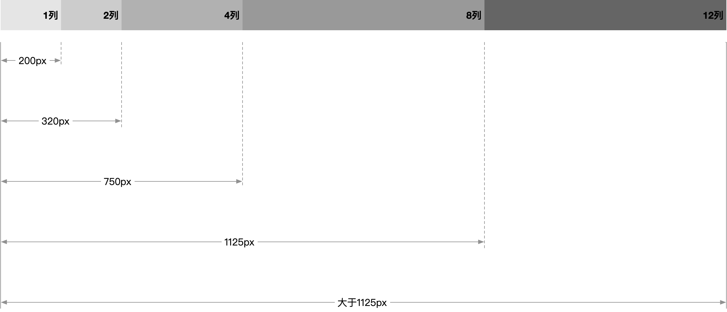
代码:
<Page
  breakPoints={[
    {
      width: 200,
      maxContentWidth: 200,
      numberOfColumns: 1,
    },
    {
      width: 320,
      maxContentWidth: 320,
      numberOfColumns: 2,
    },
    {
      width: 750,
      maxContentWidth: 750,
      numberOfColumns: 4,
    },
    {
      width: 1125,
      maxContentWidth: 1125,
      numberOfColumns: 8,
    },
    {
      width: Infinity,
      maxContentWidth: Infinity,
      numberOfColumns: 12,
    },
  ]}
>
  <Section>
    <Block span={6}>...</Block>
    <Block span={6}>...</Block>
  </Section>
</Page>
Block 列宽计算规则
组件会根据页面宽度自动计算栅栏数量和 Block 的列宽,计算逻辑为:

以屏幕宽度从 12 列模式收缩到 8 列为例,
6,4,2,4 布局, 子元素的列宽会经历如下调整:

小布局模式
小布局指按照 Row、Col 和 Grid 相互嵌套的方式,将 Block 内部切割为多个内容区域的规范和操作方式。
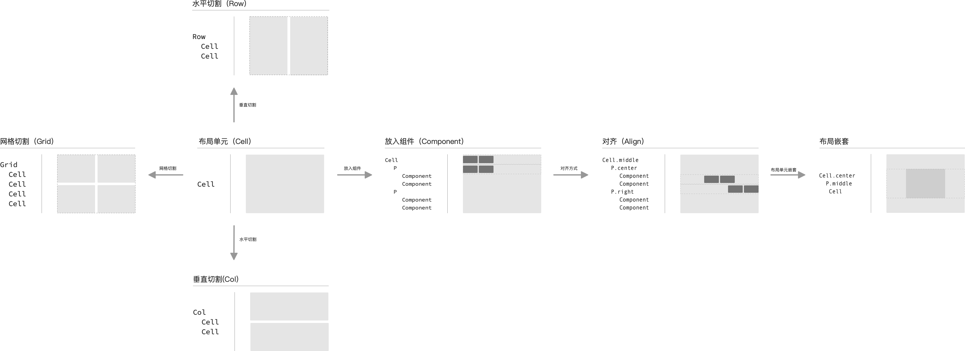
独立单元格

<Cell />横向拆分

<Row>
  <Cell />
  <Cell />
</Row>
纵向拆分

<Col>
  <Cell />
  <Cell />
</Col>
网格拆分
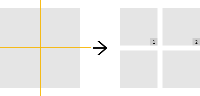
<Grid cols="{2}">
  <Cell />
  <Cell />
  <Cell />
  <Cell />
</Grid>
复合拆分

<Row>
  <Cell />
  <Col>
    <Cell />
    <Cell />
  </Col>
</Row>
段落&文本
在单个 Cell 中对组件进行横向排版。如文本居中对齐:
<p align="center">
  <Text type="h1">文本</Text>
  <Text type="body1">文本</Text>
  <button>button</button>
</p>
使用
1. 安装
npm install @alifd/mobile-layout --save2. 导入 Fusion Mobile 主题
引入 Fusion Mobile 的主题,此主题可以通过 Fusion 站点定制生成,或者使用默认主题:
import { Page, Section, Block, Row, Cell, P, Text } from '@alife/mobile-layout';
import { Button } from '@alifd/meet';

// 导入一套 Fusion 移动端主题 (参见 Fusion 官网介绍)
import '@alifd/meet/es/core/index.css';

<Page>
  <Section>
    <Block span={2}>
      <Row>
        <Cell>
          <Button>按钮 1</Button>
        </Cell>
        <Cell>
          <Button>按钮 2</Button>
        </Cell>
      </Row>
    </Block>
    <Block span={2}>
      <Cell verAlign="middle">
        <P align="right">
          <Text>文本</Text>
          <Text>文本</Text>
        </P>
      </Cell>
    </Block>
  </Section>
</Page>;
3. 注意事项
建议使用 “自然布局” 为整个页面布局,以达到最优效果,所有的内容都渲染在支持的容器中
API
Page
页面
| 参数 | 含义 | 类型 | 默认值 |
|---|---|---|---|
| prefix | CSS 类名前缀, | string | pro-layout- |
| noPadding | 禁用页面内边距,包括 Header, Content, Footer | Boolean | false |
| noBlockCorner | 禁用区块的边角(通常在无页面内容间隙时使用) | Boolean | false |
| sectionGap | Header、Footer、Nav、Aside 和章节之间间隙 | Number | - |
| blockGap | Section 中栅栏布局间隙 | Number | - |
| gridGap | 小布局间隙(包含行、列、网格布局) | Number | - |
| children | 子元素 | RaxNode | - |
| breakPoints | 断点信息 | BreakPoint[] |
- |
| onBreakPointChange | 断点变更回调 | (curBreakPoint, oldBreakPoint, breakPoints)=>void |
BreakPoint
断点配置信息,通过传入一组断点信息,来配置页面在不同页面尺寸下的展示模式(栅栏列数 + 内容区域最大宽)。
| 参数 | 含义 | 类型 | 默认值 |
|---|---|---|---|
| width | 断点适配的最大屏幕宽度 | Number | - |
| maxContentWidth | 适配屏幕下最大内容宽度 | Number | - |
| numberOfColumns | 栅栏列数 | Number | - |
Page.Header
序章
| 参数 | 含义 | 类型 | 默认值 |
|---|---|---|---|
| mode | 背景色 'lining' / 'surface' / 'transparent' | Enum | surface |
| noBottomPadding | 隐藏默认底部内边距 | Boolean | - |
| divider | 展示分割线 | Boolean | - |
| children | 子元素 | RaxNode | - |
Page.Footer
终章
| 参数 | 含义 | 类型 | 默认值 |
|---|---|---|---|
| mode | 背景色 'lining' / 'surface' / 'transparent' | Enum | surface |
| noTopPadding | 隐藏默认顶部内边距 | Boolean | - |
| divider | 展示分割线 | Boolean | - |
| fixed | 固定在底部 | Boolean | |
| children | 子元素 | RaxNode | - |
Page.Content
内容
| 参数 | 含义 | 类型 | 默认值 |
|---|---|---|---|
| children | 子元素 | RaxNode | - |
Section
章
| 参数 | 含义 | 类型 | 默认值 |
|---|---|---|---|
| title | 标题 | RaxNode | - |
| titleAlign | 标题位置,可选值 left/center | Enum | - |
| extra | 附加区域(标题右侧) | RaxNode | - |
| gap | 自定义内部区块(Block)的间隙 | Number | - |
| children | 子元素 | RaxNode | - |
Block
区块(节)
| 参数 | 含义 | 类型 | 默认值 |
|---|---|---|---|
| mode | 背景模式,可选值 transparent(自动移除内边距和标题)/surface/lining | Enum | - |
| title | 标题 | RaxNode | - |
| titleAlign | 标题位置,可选值 left/center | Enum | - |
| extra | 附加区域(标题右侧) | RaxNode | - |
| divider | 展示标题与内容之间的分割线 | Boolean | - |
| bordered | 展示边框 | Boolean | - |
| noPadding | 移除内边距 | Boolean | false |
| span | 列宽 | Number | - |
| width | 指定宽度 | Number | - |
| contentClassName | 有标题时,内容区域的样式名 | string | - |
| contentStyle | 有标题时,内容区域的自定义样式 | CSSProperties | - |
| children | 子元素 | RaxNode | - |
Row
行
| 参数 | 含义 | 类型 | 默认值 |
|---|---|---|---|
| width | 指定宽度 | Number | - |
| autoFit | 根据内容自适应宽度(当作为行列布局的子元素时生效) | Boolean | - |
| verAlign | 垂直对齐方式, 可选值:top/middle/bottom/stretch/baseline | Enum | - |
| gap | 自定义元素间间距 | Number | - |
| children | 子元素 | RaxNode | - |
Col
列
| 参数 | 含义 | 类型 | 默认值 |
|---|---|---|---|
| autoFit | 根据内容自适应宽度(当作为行列布局的子元素时生效) | Boolean | - |
| align | 水平对齐方式, 可选值:left/center/right/stretch | Enum | - |
| gap | 自定义元素间间距 | Number | - |
| children | 子元素 | RaxNode | - |
Grid
网格
| 参数 | 含义 | 类型 | 默认值 |
|---|---|---|---|
| cols | 指定列数 | number | |
| rows | 指定行数 | number | |
| minWidth | 单元格最小宽度 | number | |
| maxWidth | 单元格最大宽度 | number | |
| rowGap | 单元格行间距, 可选值: small/medium/large/数值 | Enum | |
| colGap | 单元格列间距, 可选值: small/medium/large/数值 | Enum | |
| renderItem | 手动渲染单个单元格内容 | (rowIndex,colIndex)=>RaxNode | |
| children | 子元素,默认应为 Cell
|
RaxNode | - |
Cell
单元格,其内容默认为 flex 纵向布局
| 参数 | 含义 | 类型 | 默认值 |
|---|---|---|---|
| width | 指定宽度 | Number | - |
| autoFit | 根据内容自适应宽度(当作为行列布局的子元素时生效) | Boolean | - |
| gap | 自定义内部元素的行解析 | Number | 0 |
| align | 内容水平对齐方式, 可选值: left/center/right | Enum | - |
| verAlign | 内容垂直对齐方式, 可选值: top/middle/bottom/space-between/space-around/space-evenly | Enum | - |
| block | 使用 block 布局 |
Boolean | - |
| children | 子元素 | RaxNode | - |
区别:
<Cell>设置 gap 时,每一行的高度是自适应的<Col>设置 gap 时,默认每一行的高度是等分的
Space
空间间隙
| 参数 | 说明 | 类型 | 默认值 |
|---|---|---|---|
| direction | 组件自身布局模式,可选: hoz/ver
|
Enum | hoz |
| size | 尺寸, 可选: small/medium/large/Number
|
Enum | medium |
| children | 子元素 | RaxNode |
P
段落
| 参数 | 说明 | 类型 | 默认值 |
|---|---|---|---|
| align | 水平方向对齐模式 left/center/right/space-between/space-around/space-evenly | Enum | 'left' |
| verAlign | 垂直方向对齐模式 top/middle/bottom/baseline | Enum | 'baseline' |
| spacing | 子元素间保持水平间距, 可选: small/medium/large/false | Enum | medium |
| verMargin | 除 Text 节点外子元素间保持垂直外边距 | Boolean | true |
| beforeMargin | 段前外边距(第一个子元素无效) | Number | 0 |
| afterMargin | 段尾外边距(最后一个子元素无效) | Number | 0 |
| children | 子元素 | RaxNode | - |
Text
文本
| 参数 | 说明 | 类型 | 默认值 |
|---|---|---|---|
| type | 约束字体大小 overline/caption/body1/body2/title/h1/h2/h3/h4/h5/h6 | Enum | |
| delete | 添加删除线样式 | Boolean | false |
| mark | 添加标记样式 | Boolean | false |
| underline | 添加下划线样式 | Boolean | false |
| strong | 是否加粗 | Boolean | false |
| code | 添加代码样式 | Boolean | false |
| color | 颜色 | String | - |
CSS 变量
| 变量名 | 说明 | 默认值 |
|---|---|---|
--color-transparent |
前景色 | transparent |
--color-surface |
前景色 | #fff |
--color-lining |
衬色 | #f0f0f0 |
--page-padding-lr |
页面左右内边距 | var(--s-3) |
--page-padding-tb |
页面上下内边距 | var(--s-3) |
--page-header-divider-color |
header 分割线颜色 | var(--color-line1-1) |
--page-block-corner |
区块圆角尺寸 | var(--corner-0) |
--page-block-padding-lr |
区块左右内边距 | var(--s-3) |
--page-block-padding-tb |
区块上下内边距 | var(--s-3) |
--page-section-title-font-color |
章节标题颜色 | var(--color-text1-4) |
--page-section-extra-font-color |
章节附加内容文本颜色 | var(--color-text1-2) |
--page-block-title-font-color |
区块标题颜色 | var(--color-text1-4) |
--page-block-extra-font-color |
区块附加内容文本颜色 | var(--color-text1-2) |
--page-section-gap |
章间隙 | var(--s-3) |
--page-block-gap |
区块间隙 | var(--s-2) |
--page-block-border-width |
区块边框宽度 | var(--line-1) |
--page-block-border-color |
区块边框颜色 | var(--color-line1-1) |
--page-grid-gap |
小布局间隙 | var(--s-1) |
--page-p-small-spacing |
段落子元素的水平小间距 | var(--s-1) |
--page-p-medium-spacing |
段落子元素的水平中间距 | var(--s-2) |
--page-p-large-spacing |
段落子元素的水平大间距 | var(--s-4) |
--page-p-el-margin |
段落子元素的上下间距 | var(--s-1) |
--page-p-font-color |
段落默认字体色 | var(--color-text1-4) |
在大布局模式下,如果需要支持较大屏幕, 则 CSS 单位需要视情况选择
rpx或px