

Notice
Only support storybook 4 and newer
Installation
yarn add storybook-addon-styled-component-theme --devAdd to .storybook/addons.js
import 'storybook-addon-styled-component-theme/dist/src/register'; // v1.1.0^

import 'storybook-addon-styled-component-theme/dist/register'; // v1.0.7
addDecorator to .storybook/config.js
import {addDecorator} from '@storybook/react';
import {withThemesProvider} from 'storybook-addon-styled-component-theme';

const themes = [theme1, theme2];
addDecorator(withThemesProvider(themes));
or
addDecorator to stories
import {withThemesProvider} from 'storybook-addon-styled-component-theme';
const themes = [theme1, theme2];
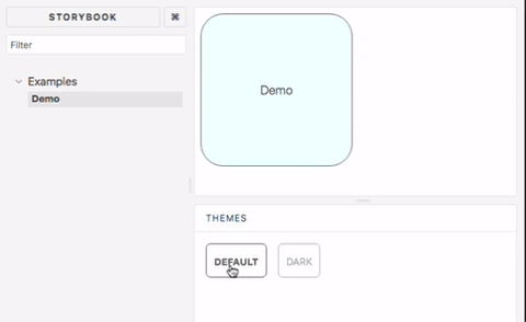
storiesOf("demo", module)
.addDecorator(withThemesProvider(themes))
.add("demo div", () => <div>DEMO</div>);Remind
Make sure every theme with name property
Contributing
yarn
yarn build:watch
yarn serve