
Share Product
About The Component
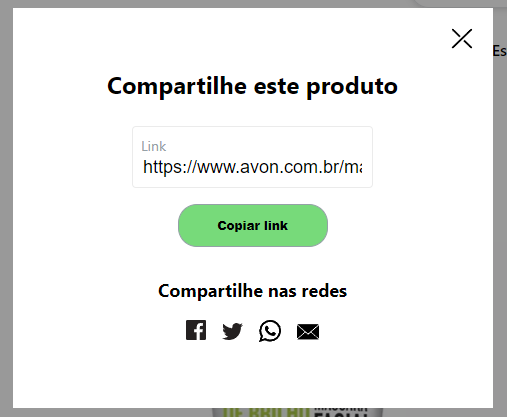
This component aims to generate product sharing links in an agnostic way..
Getting Started
This component can be used anywhere you want in ecommerce, in a responsive and agnostic way.

- Mobile
- Desk
Installation
To use Share Product install the package via yarn or npm and import it wherever you want to use it.
- Install package
yarn add @acctglobal/shareproduct or npm installUsage
- Import component
import ShareProduct from '@acctglobal/shareproduct';- Just call the component and pass with a children to customize label.
<ShareProduct
  shareWebSocials="Compartilhar"
  shareProductText="ShareText"
  ShareIcon={ShareIcon}
  CloseIcon={CloseIcon}
  productURL={'LinkUrl'}
  shareLinks={shareLinks}
/>
Styling
There are one way to customize the component
By data styles
[data-open-modal-button] {
  display: flex;
  align-items: center;
  cursor: pointer;
  font-size: 14px;
  text-decoration: none;
  color: #000;
}| Data for styles |
|---|
[data-open-modal-container] |
[data-open-modal-button] |
[data-open-modal-icon] |
[data-open-modal-text] |
[data-modal-background] |
[data-modal-container] |
[data-close-modal-button] |
[data-close-modal-icon] |
[data-modal-share-product-text] |
[data-modal-product-link-container] |
[data-modal-product-text] |
[data-modal-product-link-input] |
[data-modal-copy-link-button] |
[data-modal-share-links-container] |
[data-modal-links-social] |
[data-modal-share-link] |
[data-modal-share-link-icon] |
[data-additional-overlay] |
Props
| Parameter | Type | Description |
|---|---|---|
productURL |
string |
Mandatory. onClick function to the button |
share |
string |
Optional. string optional change share text |
shareProductText |
string |
Optional. string optional change shareProductText |
productLinkText |
string |
Optional. string optional change productLinkText |
shareWebSocials |
string |
Optional. string optional change shareWebSocials text |
ShareIcon |
() => JSX.Element |
Optional. function return JSX.Element ShareIcon, has default ShareIcon if not specified you icon |
CloseIcon |
() => JSX.Element |
Optional. function return JSX.Element CloseIcon, has default CloseIcon if not specified you icon |
shareLinks |
Array |
Mandatory. Array contain object with 4 elements [{ target: string, name: string, url: string, SocialIcon: () => JSX.Element }] |
target |
string |
Optional. target link to share as default has '_blank' |
name |
string |
Mandatory. id link name |
url |
string |
Mandatory. url to share link to social network |
SocialIcon |
() => JSX.Element |
Mandatory. Desired social network icon |
AdditionalOverlay |
boolean |
Optional. Adds an additional overlay for customization. Created to show the overlay behind the share modal and making it possible to close it when clicking outside the modal |
Contributing
If you have a suggestion that would make this better, please fork the repo and create a pull request. You can also simply open an issue with the tag "enhancement". Don't forget to give the project a star! Thanks again!
- Fork the Project
- Create your Feature Branch (
git checkout -b feature/AmazingFeature) - Commit your Changes (
git commit -m 'Add some AmazingFeature') - Push to the Branch (
git push origin feature/AmazingFeature) - Open a Pull Request
- And don't forget to update the changelog
Contact
Tiago Albuquerque - tiago.albuquerque@acctglobal.com
Acknowledgments
Use this space to list resources you find helpful and would like to give credit to. I've included a few of my favorites to kick things off!