
Product Description
About The Component
This component generates description tabs agnostically, for products.
Getting Started
This component can be used anywhere you want in ecommerce, in a responsive and agnostic way.

- Mobile - after applying styles
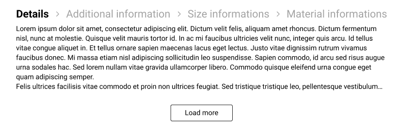
- Desk - after applying styles
Installation
To use Product Description install the package via yarn or npm and import it wherever you want to use it.
- Install package
yarn add @acctglobal/productdescription or npm installUsage
- Import component
import ProductDescription from '@acctglobal/productdescription';- Just call the component and pass with a children to customize label.
<ProductDescription loadMore="Load More" descriptionTabs={descriptionTabs} />Styling
The CSS file that is shown in the Storybook is inside the project and was used here to show the basic functioning of the component. Initially the Component comes without any style and this css file can be used as an initial template.
There are one way to customize the component.
By data styles
[data-sf-nav-container] {
  margin: 0 auto;
  width: 100%;
  place-content: space-between;
}| Data for styles |
|---|
[data-sf-product-description-container] |
[data-sf-product-description-item] |
[data-sf-nav-container] |
[data-sf-nav-item] |
[data-sf-nav-link] |
[data-sf-nav-title] |
[data-sf-nav-title-active]="true" |
[data-sf-nav-title-active]="false" |
[data-sf-description-container] |
[data-sf-description-container-active]="true" |
[data-sf-description-container-active]="false" |
[data-sf-description-text] |
[data-sf-description-button] |
[data-sf-description-show-more]="false" |
[data-sf-description-show-more]="true" |
[data-sf-product-description-container-name |
[data-sf-product-description-item-desk] |
[data-sf-nav-link-desk] |
[data-sf-nav-title-desk] |
[data-sf-product-description-container-description] |
[data-sf-description-container-desk] |
[data-sf-description-button-desk] |
[data-sf-description-text-desk] |
Props
| Parameter | Type | Description |
|---|---|---|
maxHeight |
number |
Mandatory. max Height to condition for text to load more information |
loadMore |
string |
Optional. Button text to load more information |
shareLinks |
Array |
Mandatory. Array contain object with 2 elements [{ name: string, description: string}] |
name |
string |
Mandatory. Description tab title |
description |
string |
Mandatory. Product description |
Contributing
If you have a suggestion that would make this better, please fork the repo and create a pull request. You can also simply open an issue with the tag "enhancement". Don't forget to give the project a star! Thanks again!
- Fork the Project
- Create your Feature Branch (
git checkout -b feature/AmazingFeature) - Commit your Changes (
git commit -m 'Add some AmazingFeature') - Push to the Branch (
git push origin feature/AmazingFeature) - Open a Pull Request
- And don't forget to update the changelog
Contact
Tiago Albuquerque - tiago.albuquerque@acctglobal.com
Acknowledgments
Use this space to list resources you find helpful and would like to give credit to. I've included a few of my favorites to kick things off!