Dialog
A flexible javascript popup dialog.
dialog.open({
        title: 'Dialog Title',
        source: 'Body content can be (HTML, CSS selector, DOM element, or URL)',
    }).then(...);
Features
- Easy to use.
- Lazy loading (3kb initial page load).
- Usable as a webpack/ES6 module or a pre-built browser bundle.
- Handles multiple programming scenarios and content sources.
- Simple HTML structure and easy custom styling using CSS3 variables.
- Dialogs can be 'modal', and/or can be layered on top of each other.
- Implements the 'Promise' interface, allowing sequential notifications.
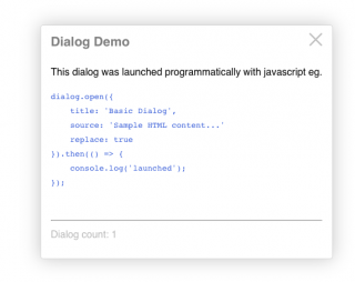
Demo
Try meInstallation
Dialog is a javascript package built for and using the ES6 module system, but it's also provided as a pre-built, minified browser package (in this package's "dist" folder).Browser
- Download & copy this package's "dist" folder into your web server's public folder eg.
public/js/dist/*. - Rename "dist" to "dialog" eg.
public/js/dialog - Load the dialog script at the end of your web page (before the closing
bodytag) like this:
<body>
    ...

    <script src="/js/dialog/dialog.js"></script>
</body>
</html>
- When the browser loads, dialog will be attached to the browser's global window object. Use it anywhere in your scripts like this:
<button>Target</button>

<script>
    dialog.open();          // Display the dialog cheat sheet

    ...

    dialog.closeLast();     // close the on-top dialog

    ...

    dialog.closeAll();

</script>
ES6 module
Install the dialog package into your project using npm:$ cd to/your/project $ npm install @aamasri/dialog
Then import and use it in your project's ES6 modules:
Static import
import dialog from 'dialog';function helloWorld() { dialog.open({ title: 'Greetings', source: 'Hello World' }); }
Dynamic import
Leveraging Webpack's on-demand (lazy) loading and code-splitting:import(/* webpackChunkName: "dialog" */ 'dialog').then((dialog) => {
dialog.closeAll();
dialog.open(...
});
Dialog Functions
dialog.open({ .. }).then((dialogElement) => { .. }) // create a new dialog
dialog.close(dialogElement) // close a specific dialog instance
dialog.closeAll() // close all dialogs
dialog.closeLast() // close the on-top dialog
Dialog.open Options
Here's another example with different options; eg. to load/display a fragment of the HTML returned by a URL: dialog.open({
title: `${userName}'s User Profile`,
source: userUrl,
fragment: '.contact-info'
modal: true,
onClose: function() { alert: `Don't hesitate to call ${userName}!`; }
}).then( function(dialogElement) {
console.log('fyi the contact info dialog just launched');
window.setTimeout( function() {
dialog.close(dialogElement);
}, 10000);
});
Here's the full list of dialog.open options:
| Option | Type | Description | Default |
|---|---|---|---|
| title | string | undefined | dialog title, else source element title attribute | "Missing Title" |
| source | string | object | undefined | the content source: html content, selector, url, or element | usage instructions |
| fragment** | string | undefined | selector by which to extract a portion of the source HTML | |
| modal** | boolean | undefined | dialog background blurring & dimming | false |
| iframe | boolean | undefined | if the source is a url, whether to load it in an iFrame. Adds a full-screen link. | false |
| fullscreenUrl | string | undefined | forces a full-screen button (or for case that the fullscreen url differs from the source url) | false |
| replace | boolean | undefined | whether to close any existing dialogs or layer up | false |
| persistent | boolean | undefined | whether ESC key or blur events close the dialog | false |
| onClose | function | string | undefined | callback function or eval(string) to execute after dialog dismissed | |
| classes | string | undefined | additional classes to apply to the dialog container element | |
| attributes | string | undefined | attributes to apply to the dialog container element eg. 'data-ignore-events="true"' |
Notes
1. To create a chrome-less dialog (ie. one with no padding or header, where the specified content completely fills the dialog box), simply omit the title option. 2. If loading a URL fails then it may be due to a CORS issue (if it's for a different domain).** it is recommended to use the "iframe" or "fragment" options when loading a URL that returns a FULL HTML document.
This is because HTML documents cannot be nested without an iframe; not specifying the "iframe" or "fragment" option will cause the dialog to reload the URL in an iframe (which may unnecessarily increase the dialog load time).
Dialog Styling
The dialog's default CSS styles may easily be themed to fit your application. Change any of these default styles in your CSS :root or body scope::root {
--dialogBoxShadow: 0 0 28px #CCC;
--dialogBoxShadow: 0 0 28px #CCC;
--dialogBoxShadow: 0 0 28px #CCC;
--dialogBackground: #FFF;
--dialogBorder: 1px solid #DDD;
--dialogBoxShadow: 0 0 28px #CCC;
--dialogBorderRadius: 4px;
--dialogFontFamily: Helvetica, Verdana, sans-serif;
--dialogLineHeight: 1.8;
--dialogTitleSize: 1.3rem;
--dialogTitleColor: #888;
--dialogTitleWeight: bold;
--dialogModalBackground: rgba(170, 170, 170, 0.3);
--dialogModalOpacity: 0.3;
Package Management
Dialog supports npm under the name @aamasri/dialog.
NPM
$ npm install @aamasri/dialog --save
Dependencies
Dialog depends on 2 external packages:- jquery
- animejs
- @aamasri/dom-utils
- @aamasri/busy-js
Invoking the dialog() function will dynamically load these dependencies at run-time (if these scripts don't already exist on the page) and they'll be added to the global window object.
If your page already loads the jQuery, animejs, @aamasri/busy-js, or @aamasri/dom-utils packages, dialog will use them instead.
Publishing Updates
- Increment the "version" attribute of `package.json`.
- Update the "versionDescription" string of `package.json`.
- Re-build the browser output bundle...
npm run build-production
...and observe that webpack completed with no errors.
- Test the bundle by loading page: "dist/index.html" in a browser (setup a development webserver).
- Publish to the git repository and npm package registry:
npm run publish
Authors
- Ananda Masri
- And awesome contributors