AlertPal
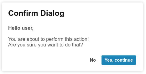
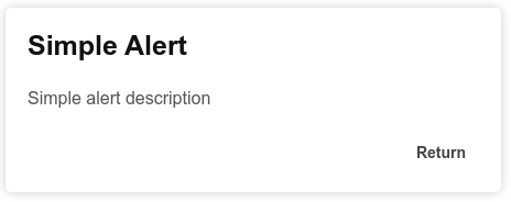
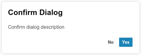
AlertPal, a lightweight JavaScript alerts system, offering regular alerts, confirm dialogs, and side messages/notifications.
Features:
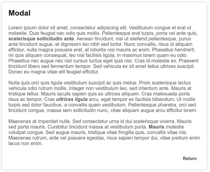
- Features simple alert pop-ups, confirm dialouges and a larger modal
- Includes messages that slide in from the top right corner of the screen, which can be styled as Error messages, Success messages and more (See below for details)
- Choose from a Light and Dark CSS file
- Modern and responsive flat designs
- ~1kb file size, meaning a fast component for any application
- Works on all major browsers
Examples:
Getting Started:
Installation
-
Install with NPM:
$ npm i @r-tek/alertpal
If you are using a bundler like Webpack, you can import the module:
// ES6
import alertpal from '@r-tek/alertpal';

// OR

// CommonJs
const alertpal = require('@r-tek/alertpal');
For now, you'll need to bring in the CSS file through one of the methods below.
-
Using the CDN via JsDelivr:
<script>
	type="text/javascript" src="https://cdn.jsdelivr.net/npm/@r-tek/alertpal@2.1.0/build/alertpal.min.js"
</script>
Light-mode CSS File:
<link
	rel="stylesheet"
	type="text/css"
	href="https://cdn.jsdelivr.net/npm/@r-tek/alertpal@2.1.0/build/alertpal_light.min.css"
/>
Dark-mode CSS File:
<link
	rel="stylesheet"
	type="text/css"
	href="https://cdn.jsdelivr.net/npm/@r-tek/alertpal@2.1.0/build/alertpal_dark.min.css"
/>
- Alternatively, you could clone/download the repository. Under the /build directory, include the
alertpal.min.jsand, either thealertpal_light.min.cssoralertpal_dark.min.cssin your project.
Usage
<!-- This will be used to trigger the alert -->

<button id="myButton">Trigger Alert</button>

<script type="text/javascript">
	/*
	 * In most cases, calling the alert will require you pass a parameter
	 * The parameter will be be an object of optional properties
	 * These are different for each type of alert
	 * See the link below this code block for the API
	 */

	// Here I define the object
	const objectParam = {
	    title: 'My Alert',
	    description: 'This is my alert pop-up'
	    cancel: 'OK'
	};

	/*
	 * Below I then call the method on the Alertpal Object to create an alert
	 * I pass my object as the parameter
	 */

	Alertpal.alert(objectParam);
</script>
Types of Alerts:
Simple Alert
Confirm Dialog
Modal
Message
API Information:
For full documentation on how to use the AlertPal function, follow the link belw to the AlertPal API:
https://r-tek.github.io/alertpal/documentation.html
Changelog:
You can check out the changelog for information on the latest updates here:
https://github.com/R-TEK/alertpal/blob/master/CHANGELOG.md
Contribution:
Read the contribution files for details on developing with the project. You can find the file here:
https://github.com/R-TEK/alertpal/blob/master/CONTRIBUTING.md
You can also contribute by issuing any bugs you have found or ideas for new features/optimizations to improve the component. You can do this by going to the issues page and posting your bug / feature. Once I have read the issue, I'll add it to a Trello road map. With the road map you can vote for items I have added if you like that feature too, and you can view what has been accepted/rejected, what I'm working on and what has been completed.
License:
The MIT License - see the link below for more details:
https://github.com/R-TEK/alertpal/blob/master/LICENSE
© R-TEK


